
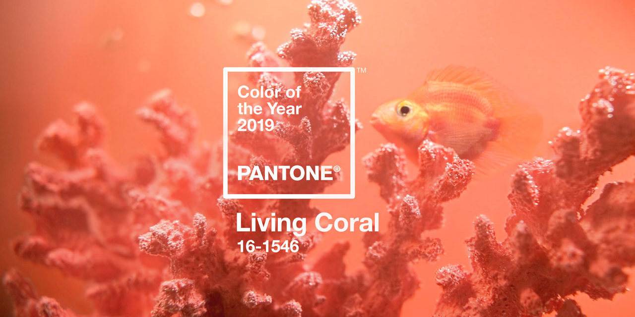
Life affirming coral hue energizes and enlivens with a softer edge
CARLSTADT, NJ – December 6, 2018 – Pantone, provider of professional color standards and digital solutions for the design industry, today announced PANTONE 16-1546 Living Coral as the Pantone® Color of the Year 2019, an animating and life-affirming shade of orange with a golden undertone. We get energy from nature. Just as coral reefs are a source of sustenance and shelter to sea life, vibrant yet mellow PANTONE 16-1546 Living Coral embraces us with warmth and nourishment to provide comfort and buoyancy in our continually shifting environment.
In reaction to the onslaught of digital technology and social media increasingly embedding into daily life, we are seeking authentic and immersive experiences that enable connection and intimacy. Sociable and spirited, the engaging nature of PANTONE 16-1546 Living Coral welcomes and encourages lighthearted activity. Symbolizing our innate need for optimism and joyful pursuits, Pantone 16-1546 Living Coral embodies our desire for playful expression.
Courtesy of Pantone
Representing the fusion of modern life, Pantone Living Coral is a nurturing color that appears in our natural surroundings and at the same time, displays a lively presence within social media.
Color is an equalizing lens through which we experience our natural and digital realities and this is particularly true for Living Coral. With consumers craving human interaction and social connection, the humanizing and heartening qualities displayed by the convivial Pantone Living Coral hit a responsive chord.
— Leatrice Eiseman Executive Director of the Pantone Color Institute
Pantone 16-1546 Living Coral emits the desired, familiar and energizing aspects of color found in nature. In its glorious, yet unfortunately more elusive, display beneath the sea, this vivifying and effervescent color mesmerizes the eye and mind. Lying at the center of our naturally vivid and chromatic ecosystem, Pantone Living Coral is evocative of how coral reefs provide shelter to a diverse kaleidoscope of color.
Adobe Stock x Pantone Color of the Year 2019. Courtesy of Pantone
“Color enhances and influences the way we experience life,” said Laurie Pressman, Vice President of the Pantone Color Institute. “As a shade that affirms life through a dual role of energizing and nourishing, Pantone 16-1546 Living Coral reinforces how colors can embody our collective experience and reflect what is taking place in our global culture at a moment in time.”
In Interior Décor and Furnishings When used as a bold statement in settings and décor, Living Coral fosters immersive experiences such as pop-up installations and interactive spaces, tied to a playful spirit. As a color linked to tactility and human connection, Pantone Living Coral in shag rugs, cozy blankets and lush upholsteries create a warm, comforting and nurturing feeling in the home. With its ebullient nature, Pantone Living Coral adds a dramatic pop of color to any room setting whether in decorative accessories, tabletop, or on the wall.
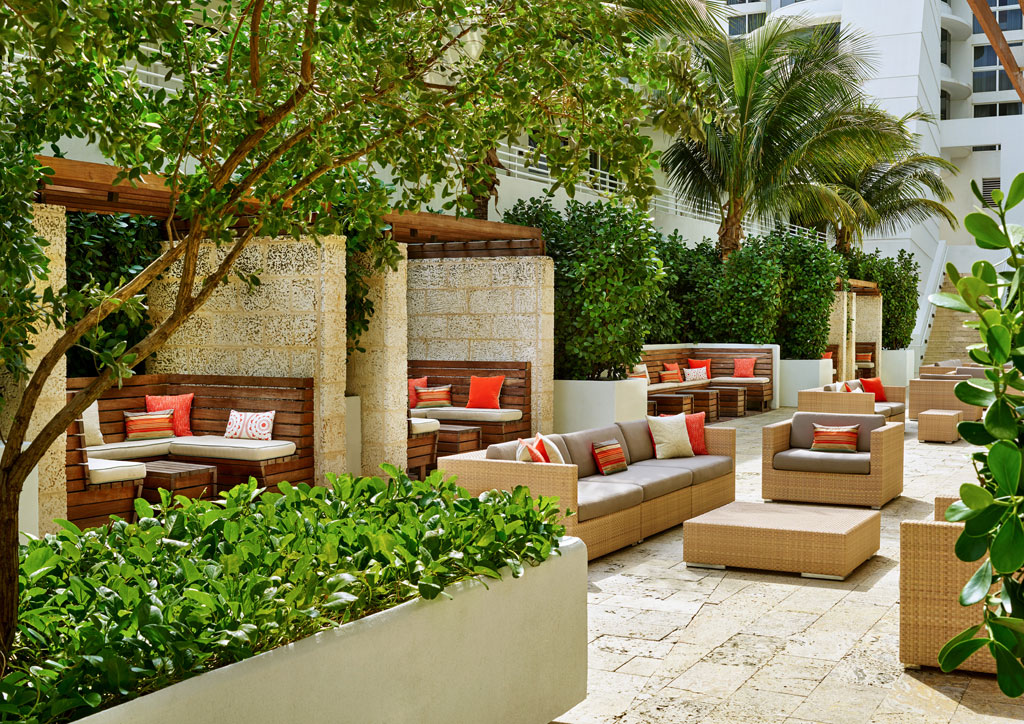
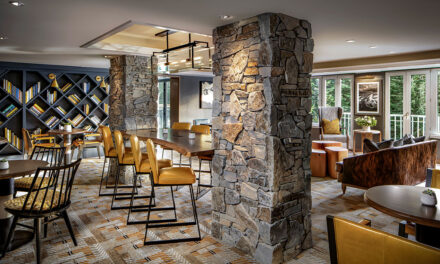
Tribute Portfolio: Royal Palm South Beach Hotel. Courtesy of Pantone
In Product Design Living Coral is naturally suited for product across all ages and genders. Materials with texture and convivial colors such as Pantone 16-1546 Living Coral appeal to our desire for products exhibiting humanizing and heartening characteristics.
In Social Media An organic shade, Living Coral is striking in digital mediums, evoking the same inspirational feeling ignited by our natural surroundings. Living Coral’s vibrancy and buoyancy captivates our attention in social media and digital design.
In Fashion and Accessories Living Coral inspires experimentation and playful expression in both men’s and women’s street and runway styles. The warm shade suggests comfort and positivity in simple color stories, but becomes more explorative and effervescent in patterns, textures and even monochrome looks. An appealing accent shade, Pantone Living Coral provides a striking contrast across the color spectrum.
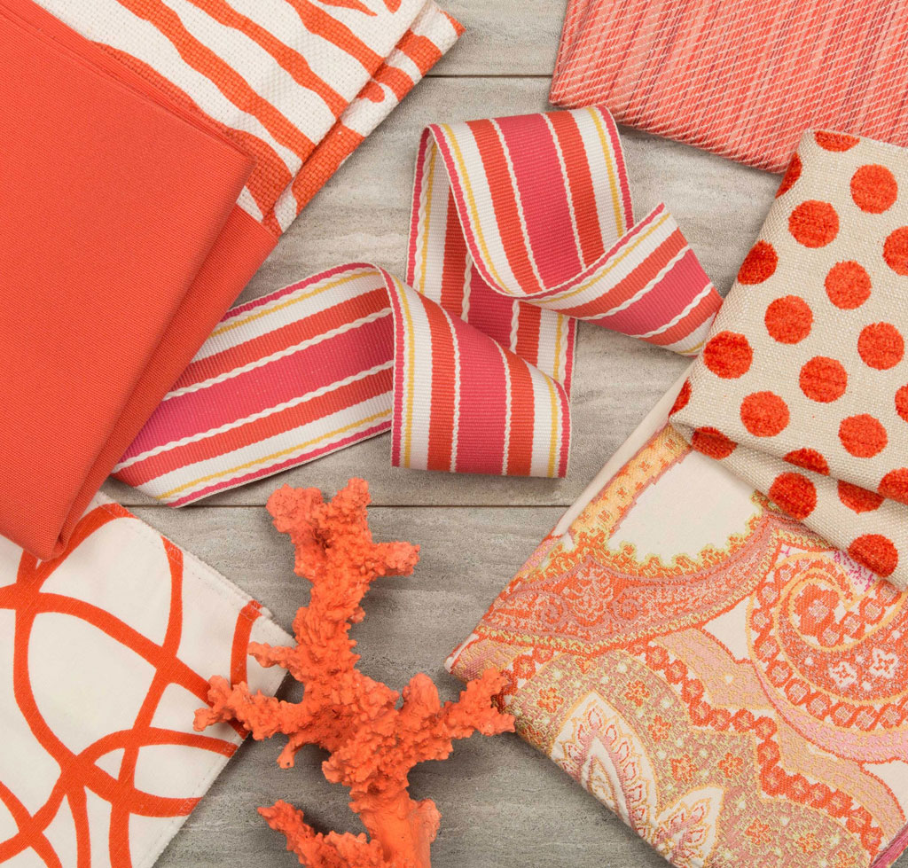
Kravet is an industry leader in to-the-trade fabric and furnishings, offering a wide range of colors, patterns and textures in every design style. Courtesy of Pantone
In Beauty As a life-affirming hue that complements all skin tones, Pantone Living Coral brings natural color to beauty in blush, eye and lip. Uninhibited, playful looks are also emboldened by Living Coral, which, as the center of a kaleidoscope of color, encourages experimentation in beauty with palettes, textures, shimmers and sheens.
In Packaging Design Living Coral is naturally ideal for packaging applications. Warm and welcoming, this life affirming shade invites us to reach out and touch.
Five color palettes featuring PANTONE 16-1546 Living Coral 1 :
FOCAL POINT

Immediately drawing our attention like a beacon of light, PANTONE Living Coral warmly engages, vivifying the palette as it becomes the focal point in this understated and upscale, composed and cool color grouping.
SHIMMERING SUNSET

Bold and brilliant, a palette evocative of the dazzling portrait of color splashed across the sky as the sun rises and sets, one where PANTONE Living Coral energizes and enlivens, adding to our feelings of pleasurable warmth.
SYMPATICO

Paying homage to skin tones around the world and the shades we use to enhance our complexions; Sympatico is comprised of a beautiful array of colors that humanize; fusing together a panoply of international skin tones with those soft and warm colors we layer on to create that healthy glow.
TRIPPY

A palette of hallucinogenic shades with dizzying effects, the wildly hedonistic color range we see in Trippy is pure and unadulterated; an exuberant range of joyful color that speaks to irrepressible fun and spontaneity that includes the life affirming PANTONE Living Coral.
UNDER THE SEA
Awash in color suggestive of the watery environment that lies beneath a tropical island paradise, Under The Sea places PANTONE Living Coral at the center of our naturally vivid and chromatic ecosystem, evocative of how coral reefs embrace with their warmth and nourishment and provide shelter to a diverse kaleidoscope of colorful sea life.
Tribute Portfolio x Pantone Color of the Year
Among the joyful pursuits that Living Coral symbolizes, travel tops the list – often creating experiences that enable human interaction and social connection. In celebration of Living Coral as the 20th Pantone Color of the Year, Pantone has partnered with Tribute Portfolio, Marriott International’s newest collection of independent and characterful hotels, to create a first-of-its-kind pop-up pantry that will allow people to experience an immersive tribute to color at select hotels around the world. Together, Tribute Portfolio and Pantone will introduce a series of interactive Pantone pantries in indie-spirited and creative communities around the world, beginning at Art Basel Miami at the Royal Palm South Beach Miami Resort and then traveling to The Alida Hotel in Savannah, Georgia and The Slaak Rotterdam, in The Netherlands next year.
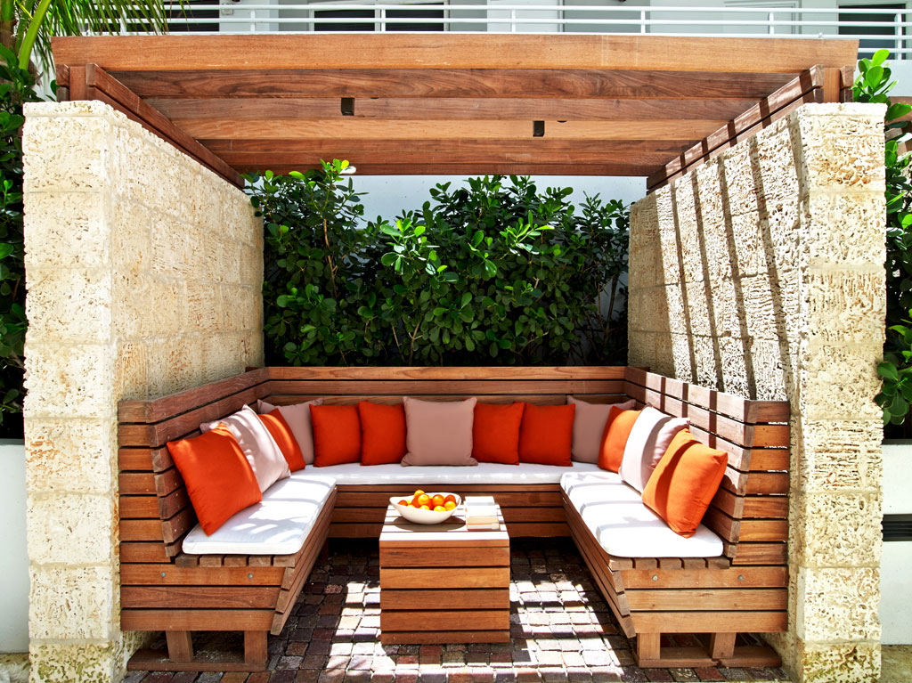
Aptly named for its communal nature and colorful design, the Pantone Pantry by Tribute Portfolio will debut at Art Basel in Miami Beach at the Royal Palm South Beach Miami Resort and will travel to new Tribute Portfolio hotels next year. Courtesy of Pantone
Adobe Stock x Pantone Color of the Year 2019
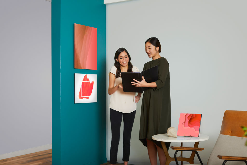
For the second year in a row, Pantone has partnered with Adobe Stock to offer a curated Color of the Year collection to inspire and assist the creative community. Living Coral illustrates a natural, yet dynamic and energizing tone that is perfect for designers across verticals looking to energize and enliven creative elements with a softer edge. With more than 125 million visual assets, Adobe Stock is an amazing resource for creatives to seek visual inspiration and creative development.

Adobe Stock x Pantone Color of the Year 2019. Courtesy of Pantone
Material ConneXion, a SANDOW company & Pantone
Across the Design industry, effectively bringing PANTONE 16-1546 Living Coral to life in product design requires consideration of both color and the material to which it will be applied. To underscore the relationship between color and material, and increase efficiencies within the design process, Pantone has partnered with Material ConneXion, a global materials and innovation consultancy. By working with Material ConneXion, designers and suppliers can source the solutions that will meet consumer demands and deliver on their design vision while also supporting their business.
Limited Edition Pantone Color of Year 2019 Guides
In celebration of the 20th anniversary of the Pantone Color of the Year announcement, special collections of Pantone Formula Guides and Fashion, Home + Interiors Color Guides will be available for a limited time. Guides will feature commemorative Color of the Year covers, information on the 2019 selection and history of past Colors of the Year enclosed within the guide. Pantone Color of the Year 2019 Formula Guides ($160) for graphic, print and packaging designers and Fashion, Home + Interiors Color Guides ($205) for fashion and product designers, are available in limited quantities from Pantone.com and through authorized distributors worldwide.
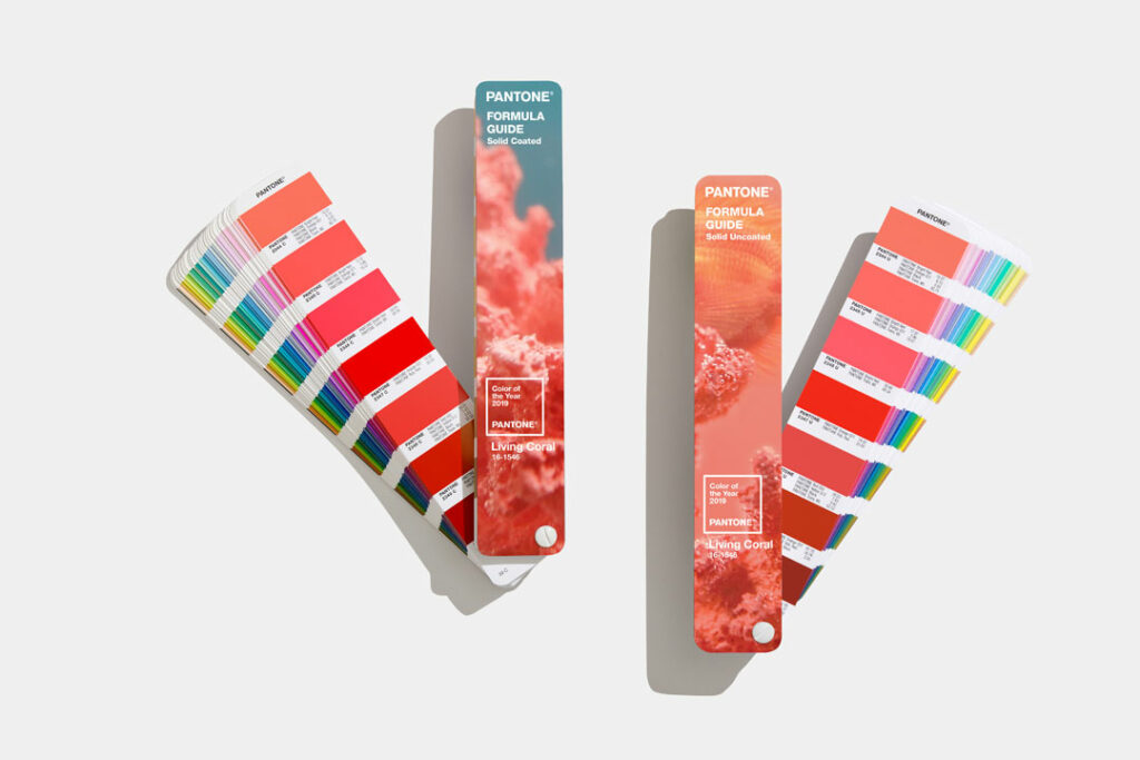
Limited Edition Pantone Living Coral Formula Guides
About the Pantone Color of the Year
The Color of the Year selection process requires thoughtful consideration and trend analysis. To arrive at the selection each year, Pantone’s color experts at the Pantone Color Institute comb the world looking for new color influences. This can include the entertainment industry and films in production, traveling art collections and new artists, fashion, all areas of design, popular travel destinations, as well as new lifestyles, playstyles, and socio-economic conditions. Influences may also stem from new technologies, materials, textures, and effects that impact color, relevant social media platforms and even up-coming sporting events that capture worldwide attention. For 20 years, Pantone’s Color of the Year has influenced product development and purchasing decisions in multiple industries, including fashion, home furnishings, and industrial design, as well as product, packaging and graphic design. Past selections for Color of the Year include:
PANTONE 18-3838 Ultra Violet (2018)
PANTONE 15-0343 Greenery (2017)
PANTONE 15-3919 Serenity and PANTONE 13-1520 Rose Quartz (2016)
PANTONE 18-1438 Marsala (2015) PANTONE 18-3224 Radiant Orchid (2014)
PANTONE 17-5641 Emerald (2013) PANTONE 17-1463 Tangerine Tango (2012)
PANTONE 18-2120 Honeysuckle (2011)
PANTONE 15-5519 Turquoise (2010)
PANTONE 14-0848 Mimosa (2009) PANTONE 18-3943 Blue Iris (2008)
PANTONE 19-1557 Chili Pepper (2007)
PANTONE 13-1106 Sand Dollar (2006)
PANTONE 15-5217 Blue Turquoise (2005)
PANTONE 17-1456 Tigerlily (2004)
PANTONE 14-4811 Aqua Sky (2003)
PANTONE 19-1664 True Red (2002)
PANTONE 17-2031 Fuchsia Rose (2001)
PANTONE 15-4020 Cerulean (2000)
The color selected as our Pantone Color of the Year 2019 was taken from the Pantone Fashion, Home + Interiors Color System, the most widely used and recognized color standards system for fashion, textile, home, and interior design.
For more information on the Pantone Color of the Year for 2019, please visit www.pantone.com/color-of-the-year-2019.
About The Pantone Color Institute™
The Pantone Color Institute is the business unit within Pantone that highlights top seasonal runway colors, forecasts global color trends, advises companies on color for product and brand visual identity. Through seasonal trend forecasts, color psychology, and consultative color consulting, the Pantone Color Institute partners with global brands to leverage the power, psychology, and emotion of color in their design strategy.
About Pantone
Pantone provides a universal language of color that enables color-critical decisions through every stage of the workflow for brands and manufacturers. More than 10 million designers and producers around the world rely on Pantone products and services to help define, communicate and control color from inspiration to realization – leveraging advanced X-Rite technology to achieve color consistency across various materials and finishes for graphics, fashion and product design. Pantone Standards feature digital and physical color specification and workflow tools. The Pantone Color Institute™ provides customized color standards, brand identity and product color consulting as well as trend forecasting inclusive of Pantone Color of the Year, Fashion Runway Color Trend Reports, color psychology and more. Pantone B2B Licensing incorporates the Pantone Color System into different products and services, enabling licensees to communicate and reproduce certified Pantone values and improve efficiencies for their users. Pantone Lifestyle brings color and design together across apparel, home, and accessories. Learn more at www.pantone.com and connect with Pantone on Instagram, Facebook, Pinterest, and LinkedIn.
About Tribute Portfolio
Launched in 2015, Tribute Portfolio is Marriott International’s newest collection brand, offering exceptional independent hotels around the globe. With a focus on selecting hotels with captivating design and vibrant social scenes, Tribute Portfolio aims to attract travelers looking for fresh travel experiences that reflect their own individuality. From boutique resorts like Inn at Rancho Santa Fe in California, to urban locales such as Apollo Hotel in Amsterdam, each Tribute Portfolio hotel offers experiences filled with details and elements worth sharing. Tribute Portfolio is proud to offer access to Marriott International’s award-winning loyalty program, Marriott Rewards ® which includes Ritz Carlton Rewards ®. Members can now link their Starwood Preferred Guest® accounts at members.marriot.com for instant elite status matching and unlimited points transfer. For more information on Tribute Portfolio, please visit www.tributeportfolio.com.
About Material ConneXion
Material ConneXion, a SANDOW company, is a global materials and innovation consultancy that helps clients create the products and services of tomorrow through smart materials and design thinking. Material ConneXion is the trusted advisor to Fortune 500 companies, as well as forward-thinking agencies and government entities seeking a creative, competitive, or sustainable edge. With locations in Bangkok, Bilbao, Daegu, Milan, New York, Skövde, and Tokyo, Material ConneXion’s international network of specialists provides a global, cross-industry perspective on materials, design, new product development, sustainability, and innovation. Material ConneXion maintains the world’s largest subscription-based materials library with thousands of innovative materials and processes—an indispensable asset to a wide audience of users.
1 This section is from Pantone “How to Use the Pantone Color of the Year 2019” https://www.pantone.com/color-intelligence/color-of-the-year/color-of-the-year-2019-palette-exploration

