|
Location Northern California, USA Project Address 370 Santa Teresa St. Stanford, Project Type Public Gallery Square Feet 4,000 sq ft Year of Completion 2014 Design Team Aidlin Darling Design Awards 2015 Design Merit Award American Society of Landscape Architects w/Andrea Cochran Landscape, 2015 Citation Award American Institute of Architects, 2015 Honor Award International Interior Design Association and 2015 Best of Competition Winner, 42ND Annual Interior Design Competition |
The Windhover Contemplative Center is a public gallery on Stanford’s campus designed to be a spiritual refuge for the Stanford community, “intend[ing] to offset the personal cost that can be entailed by students, faculty and staff striving to reach the pinnacle of their fields.”
The building was designed in conjunction with Nathan Oliveira’s Windhover series: five paintings inspired by kestrels swooping above the Stanford foothills. Susan Duca and her husband, the main patrons, commissioned the building with the intention that it would pair art and nature to help facilitate contemplation, seeing it as a way to “recenter oneself”. Located in the center of the campus, the building is easily accessible to the entire Stanford community, while the building’s form ensures access to the artwork and surrounding landscape even during off-hours.
PROJECT DESCRIPTION
A professor at Stanford for over 30 years, Nathan Oliveria had strong ties to the community. His Windhover series and their monumental scale provide the foundation for the building design.
From the beginning, student, staff, and faculty were consulted for the design. Aidlin notes, “Students wanted to use the space. We met with them early on and talked to them about their needs. Everyone has different patterns for when they are stressed out. Undergrads have different views than graduates.”
Based on these differing needs, the final design offers multiple spaces and pathways for contemplation and reflection regardless of time of day. Working in conjunction with other campus-wide wellbeing efforts, Windhover helps to promote student, faculty, and staff wellbeing.
SECTION
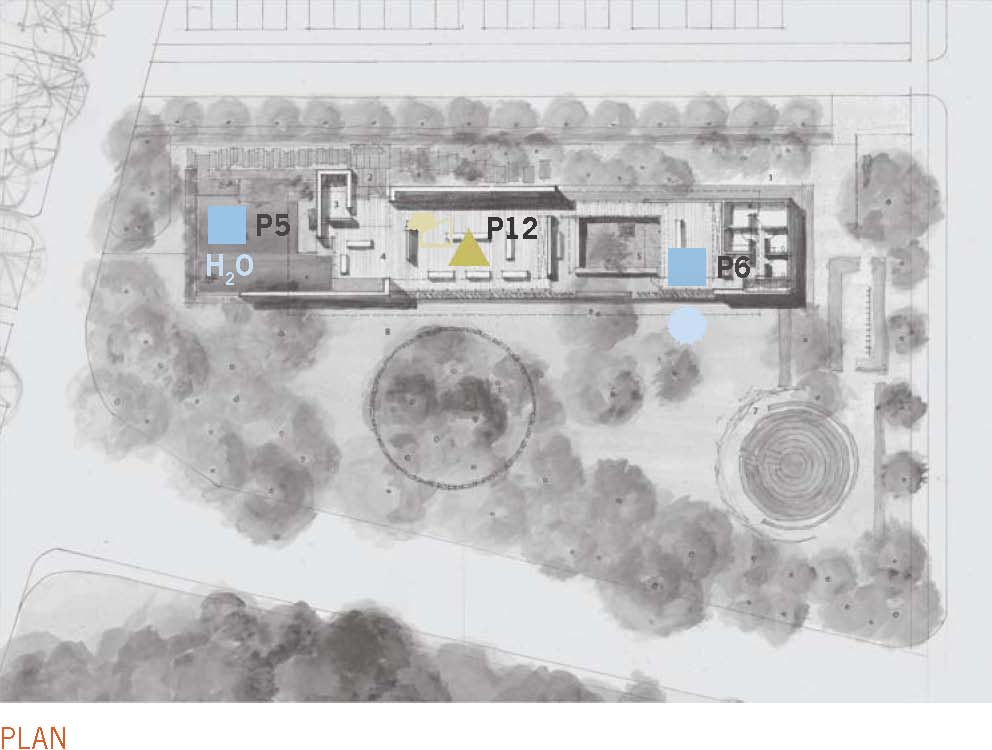
The plan illustrates the intentional indirect procession of the visitor. Arriving at the north end, the visitor walks along the west wall, entering at the southwest corner. They then move through the space heading north. This creates very strong refuge conditions.Drawing: © Aidlin Darling Design
The natural incline of the site creates a subtle irelationship with the floor plate and ground. The southern end of the building is roughly 3 feet above the ground. This separation from the ground plan is further emphasized by the transition in materials from gravel to pavers to concrete to wood. Drawing: © Aidlin Darling Design
*See plan details below.
[P12] REFUGE
From the material selection to the spatial layout, much of the design focuses on the refuge pattern. Each element reinforces the feeling that this is a place for withdrawal from environmental conditions and the main flow of activity on campus, in which the individual is protected from behind or overhead.
The building is nestled in a forested area of Stanford’s campus and blends in with its setting. Visitors enter from the north along a narrow path between the rammed earth exterior wall and an allée of ginkgo trees. As the visitor moves into the space, the materiality of the ground plan changes: “The sound of walking from the gravel, to concrete pavers, to hand scrapped wood oak floors, the tactility of all that is very different.” The change in materials amplifies exterior noise to highlight the quiet interior.
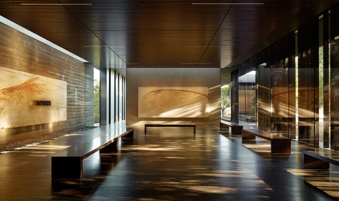
This begins to separate the visitor from the ground plane, welcoming them into the cave-like interior. The procession turns 180 degrees and heads north, pulling visitors further into the space to reach the gallery. Once in the gallery, the materials and color palette reinforce that this is a contemplative refuge. Hand-scraped oak wood floors and slat wood ceilings enclose the space, while rammed earth walls provide further protection.
In the first contemplative space, visitors are given sliver views of oak groves and an outdoor water garden to the south. While the galleries are enclosed, each has two or more means of egress, preventing the visitor from feeling trapped. Visitors are provided small, individual cushions and encouraged to sit on the floor or benches, reinforced through the matching hand-scraped oak.
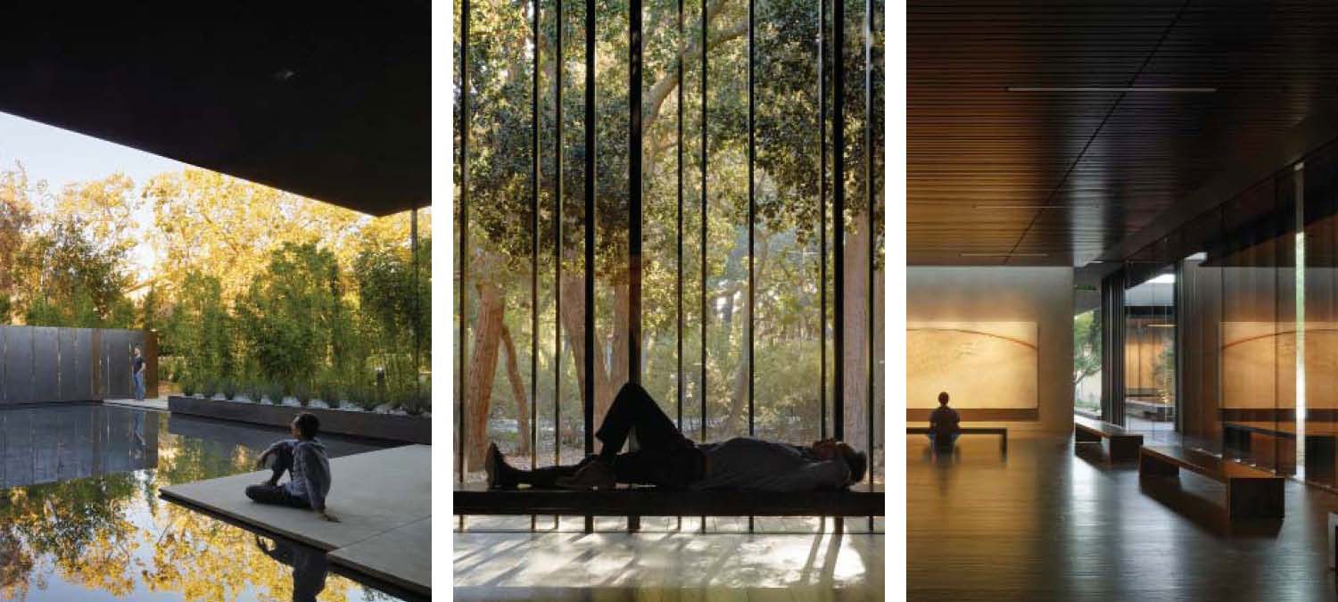
Left: A reflection pool at the southern end of the building offers outdoor meditation and contemplation. P1 P2 P4 P5. Center: Dynamic and diffuse light bounces off vertical louvers onto wood flooring and matching benches. The dark finishes emphasize the light and shadow. P1 P3 P6 P8 P9. Right: The interior finishes use dark woods and dynamic light to create drama and a sense of shelter, while playing off the color palette of the Windhover series. P6 P9 P11 P12. All photos: Courtesy of Aidlin Darling Design/Photographer: © Matthew Millman Photography
[P1] VISUAL CONNECTION WITH NATURE
The interlocking processional spaces take the visitors through a series of three stereometric refuges, each interrupted by two open-air courtyards. These two types of space play off one another: one has extensive views out across the landscape, while the other has indirect and diffuse lighting with opaque rammed earth walls and slivers of distant landscaping between 50 and 100 feet away. Benches are positioned in relation to views and artwork, providing access to both.
Outdoors, the landscape architect created nesting locations to view the artwork. There is a water garden to the south, and an exterior garden and outdoor deck to the north. This mix of spaces allows visitors to decide how they want to interact with the landscape and building in response to their personal preferences.
[P6] DYNAMIC AND DIFFUSE LIGHT
The artwork and spatial composition were designed in conjunction. The monumental size of the paintings influences the scale of the room, placement of skylights, and the building’s overall north-south linear orientation. As Aidlin explains, “Each painting has a skylight. The intention is to have the paintings be washed with indirect light. The background materials are dark, and the paintings themselves are washed in light.”
Vertical louvers along the eastern wall mimic the non-rhythmic layering of tree trunks while casting dynamic shadows along the dark oak flooring. This eastern orientation leverages the path of the sun to move the shadows across the interior during the day, connecting visitors to the sun’s diurnal patterns.
Curatorial standards require motorized louvers, scrims, and filters for the light.
Artificial ceiling lighting is intentionally kept off during daylight hours, and slowly turns on based on light levels within the space. At night, the structure transitions into a light box, ensuring campus safety and allowing for evening and night views of the art from the exterior.
[P9] MATERIAL CONNECTION WITH NATURE
Material choices play a significant role in the user experience of the space. Almost all surfaces are composed of materials and elements from nature that, through minimal processing, reflect the local ecology and geology to create a distinct sense of place. The various shades of earthtoned materials were chosen to play off the natural colors of the surrounding landscape. Aidlin notes, “It was critical to Nathan Oliveira that the space feel organic, not like a stark white museum.”
The space is composed primarily of three materials: stained oak, rammed earth, and glass. The stained oak brings the interior light down to create a grotto condition. The dark interior accentuates the presence of the bright natural light and the colored oil paintings. Rammed earth walls use a mix of various materials to create elegant striations, rooting the structure both physically and symbolically to the site. Glass is used to connect the spaces visually but separate them processionally. This entices the visitor to move through the space, following the glass until there is an opening.
The floor and benches are made of the same hand-planed stained oak, and individual cushions are provided at the entry. The material selection communicates to visitors that it is okay to sit on the wood. From the gravel at the entry to the trees in the courtyard, each object is carefully chosen to create a continuous color palette to reinforce a calming atmosphere, enhancing the main refuge pattern.
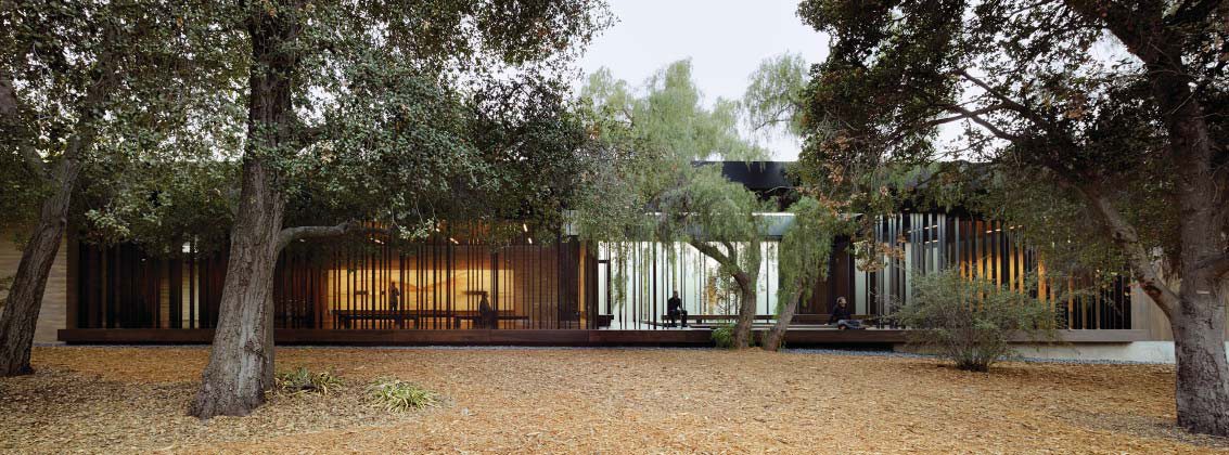
A view from the landscape with various interior light conditions layered together and a central pass-through courtyard. P1 P2 P4 P9. Courtesy of Aidlin Darling Design. Photographer: © Matthew Millman Photography
STANFORD WELLNESS AND THE BUILT ENVIRONMENT
Findings from the Stanford University Wellbeing Task Force reported that “the prevalence and complexity of student mental health issues has grown in recent years both nationally and at Stanford. Increasingly, [Stanford is] seeing students struggle with mental health concerns ranging from self-esteem issues and developmental disorders to depression, anxiety, eating disorders, selfmutilation behaviors, schizophrenia and suicidal behavior.”
| [P1] | Visual Connection to Nature. Lower blood pressure and heart rate, improved mental engagement/attentiveness, positively impacted attitude and overall happiness |
| [P6] | Dynamic and Diffuse Light. Positively impacted circadian system functioning, increased visual comfort. |
| [P9] | Material Connection with Nature. Decreased diastolic blood pressure, improved creative performance, improved comfort. |
| [P12] | Refuge. Improved concentration, attention and perception of safety. |
Engaging the larger community, the Wellbeing Task Force states, “Supporting student mental health and well-being falls within the province of all of us—faculty, staff, and students—and that this recognition is crucial to student success and the University’s mission as a leading research and teaching institution.”
The impact of mental health issues on an individual student can be devastating both socially and academically. Furthermore, the implications are far-reaching for the entire campus community, as well as for academic and clinical support services.
The creation of Windhover is one of many campus initiatives aimed at supporting mental health and wellbeing. While none of these mental health issues can be solved with the built environment alone, many studies show that an individual’s environment can play a key role in their wellbeing.
With this in mind, Windhover designers looked to the building’s design to provide mental health and wellbeing services, and convince the school’s Board of the design’s potential.
As Joshua Aidlin said, “The building was highly progressive for its time. The Board wasn’t convinced that they needed it—until studies by the Wellbeing Task Force came out. It wasn’t just a building for art; they started to realize it is much greater than just art work. It was about regaining health, balance, and wellness.”
The predominate biophilic patterns used provide a range of potential wellbeing benefits and help pair the Task Force’s goals with the final built form. Windhover encourages visitors to shed the stresses of the outside world by providing a safe, calming environment that engages the mind. According to the Stanford News, Windhover has become a favorite spot for many students since its opening in October 2014.
*PLAN
Nature in the Space
- [P1] Visual Connection with Nature. All interior spaces have visual connection to adjacent landscape
- [P2] Non-Visual Connection With Nature. Exterior courtyards, meditation labyrinth, floor texture
- [P3] Non-Rhythmic Sensory Stimuli. Landscaping habitat
- [P4] Access to Thermal & Airflow Variability. Exhttps://prismpub.com/wp-admin/post.php?post=43256&action=edit&revision=43293#terior courtyards, seating near reflection pool
- [P5] Presence of Water. Reflection pool
- [P6] Dynamic & Diffuse Light. Dark natural materials and building orientation leverage solar orientation
- [P7] Connection with Natural Systems. Deciduous ginkgo trees along entry path
Natural Analogues
- [P8] Biomorphic Forms & Patterns. Vertical louvres mimicking tree trunks
- [P9] Material Connection with Nature. Stone, wood, glass, and rammed earth structural and surface finishes
- [P10] Complexity & Order. Not significantly represented in design
Nature of the Space
- [P11] Prospect. Three foot elevation change at north end of building
- [P12] Refuge. Buildng set in the landscape and larger campus, 180° circulation from south to north, accentuates refuge condition
- [P13] Mystery. Entry switchback creates visual intrigue
- [P14] Risk/Peril. Not significantly represented in design
Editor’s Note
This case study was originally published by Terrapin Bright Green https://www.terrapinbrightgreen.com and can be found at Windhover Contemplative Center. PRISM extends its gratitude to Terrapin Bright Green for sharing this article with PRISM’s readers.
About Terrapin Bright Green
Terrapin Bright Green is an environmental consulting and strategic planning firm committed to improving the human environment through high performance development, policy, and related research, in order to elevate conversations and help break new ground in thinking creatively about environmental opportunities to shape the outcome of large-scale planning and design projects around the world. Visit us at www.terrapinbrightgreen.com
Aidlin Darling Design
Aidlin Darling Design bridges the demands of artistic endeavor, environmental responsibility, functional pragmatics, and financial considerations. As a multidisciplinary firm, they believe that innovations discovered through the process of design and construction can be applied to projects of any scale, use, or purpose.

