
Category: 2019 Color Trends
2019 Colors
What the experts are saying
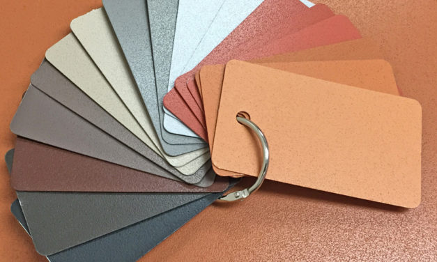
2019 Color Trends in Multi-family Design
by Dee Schlotter, PPG senior color marketing manager, architectural coatings
With an increase of multi-family housing developments in the United States, we’re seeing urbanization, immigration, and technology playing major roles in the direction of the color, design, development and maintenance of these space. Densification and co-living are driving forces in the multi-family market, as Millennials are looking to recreate the comfort and community-centric experiences of their college days, while many empty-nest Boomers are looking to downsize into “executive” housing. Convenience and proximity to experience-based retail is an attractive amenity. Convenient dining, entertainment, fitness and other non-traditional storefronts available to multi-family building residents and the broader community are becoming priority as people choose to depend less on cars and more on alternative types of transportation such as shared bicycles and Uber. The luxury of being able to live where you work and play is just one of the driving forces behind the uptick in multi-family housing developments.
To understand how to make conducive design decisions and color choices in multi-family spaces relevant for both Millennials and Boomers, PPG developed a special color trends report for designers and architects to reference for their upcoming projects. PPG’s 2019 multi-family color trends forecast brings this housing shift to the surface and explores how it influences consumers’ attitudes toward their present and future living accommodations. Read more


Architectural color trends: conceptual inspiration to practical application
by Tammy Schroeder, LEED® Green Associate; Linetec
People rely on sight more than any other sense to take in information. The modern world makes it easier and more important than ever to share visual information. Color affects the interpretation of this visual information – both in terms of comprehending and remembering its meaning, and in relating and reacting to it. The color choice for a building’s exterior not only affects the people who work, shop, learn, heal and live inside it, but also those in neighboring buildings and even those passing by it.
The color choice for a building’s exterior may be determined, in part, by community standards, regional preferences, historic requirements or brand identities. The right color is largely an aesthetic, and often subjective, decision. Specifying, producing and applying a finish to match the chosen color combines performance-driven, technical expertise and artistically minded creativity. Read more
Using Universal Design to Create a Space Accessible by All
by Sue Wadden, director of color marketing at Sherwin-Williams
According to AARP, one in five Americans will be 65 or older by 2030. These knowledgeable shoppers bring significant buying power and financial resources to upgrade their spaces and improve their communities. However, whether they are out locally in public spaces or looking to downsize, they may not think about how universal design can affect their daily lives. And, as we become more aware, builders, architects and designers are increasingly being called upon to renovate and design spaces for people of all generations and abilities to enjoy.
This is where universal design comes into the picture, enabling professionals to suggest subtle touches that can make aging in place easier, without sacrificing style, such as decorative grab bars in the bath, cabinet storage that pulls out, and two-level counter heights for easy access whether standing or sitting in a wheelchair. Other subtle but important design strategies can include choosing colors that are easier for older eyes to see and that add contrast for easier navigation, and installing purposeful lighting that increases safety.
By incorporating the principles of universal design, and gaining a better understanding of the role of color, sheen and lighting on aging eyes, professionals can create environments that not only meet their clients’ needs, but work for all ages and abilities. Read more

Architectural color trends: conceptual inspiration to practical application
People rely on sight more than any other sense to take in information. The modern world makes it easier and more important than ever to share visual information. Color affects the interpretation of this visual information – both in terms of comprehending and remembering its meaning, and in relating and reacting to it. The color choice for a building’s exterior not only affects the people who work, shop, learn, heal and live inside it, but also those in neighboring buildings and even those passing by it.
Read More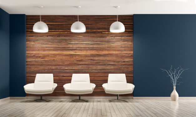
Diamond Vogel announces 2019 Color of the Year
Diamond Vogel’s 2019 Color of the Year is Day Spa (0634), a saturated navy that connects spaces, cultures, and generations. Day Spa’s flexibility delivers color that is comfortable when used for interiors or sets a mood of timeless luxury for exteriors. This powerful accent showcases one’s personal style and creates a dramatic backdrop for daily living.
Read More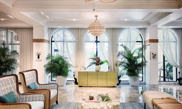
Transformation and reinvention: White Elephant Palm Beach
Elkus Manfredi Architects’ transformation of a historic hotel into White Elephant Palm Beach debuts a fresh, contemporary design voice to Palm Beach while preserving the best of the hotel’s classic Mediterranean Revival architecture.
Read More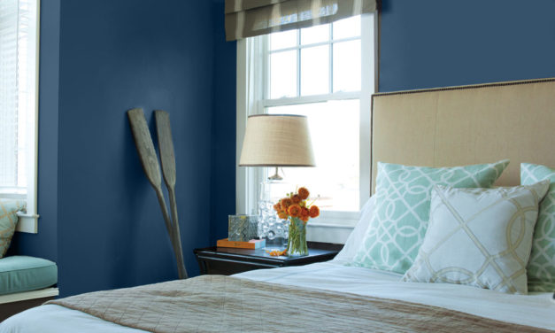
A Classic Choice: Kelly‐Moore Paints Names “Peacock Blue” Its 2019 Color of the Year
“From a psychological perspective, Peacock Blue is a color that can optimize concentration, encourage deep meditation and even improve sleep.” said Mary Lawlor, Manager of Color Marketing. “The design community’s overwhelming choice of Peacock Blue as COTY 2019 is no surprise, as it’s always a safe bet as a strong neutral that can enhance any room with these powerful qualities.”
Read More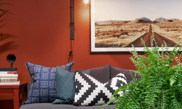
Dunn-Edwards Paints Names “Spice of Life” Color of the Year for 2019
Dunn-Edwards has announced its 2019 Color of the Year – Spice of Life – a dark, browned, fire brick red with orange undertones. “Spice of Life is an outgoing, confident hue that adds drama and stimulates the senses,” explained Sara McLean, color expert and stylist for Dunn-Edwards. “It’s a celebration of what makes life interesting and exciting. Spice of Life makes a bold statement with a melding of diverse and global cultural influences.”
Read More
AkzoNobel embraces the sweet life with Spiced Honey – Color of the Year 2019
Spiced Honey was unveiled earlier last month by AkzoNobel as the Color of the Year for 2019. The shade was selected following expert research into global trends, insights and consumer behavior.
Read More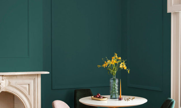
PPG brand brings the outside in with 2019 Color of the Year: Night Watch
“Night Watch’s ability to invoke a deep connection to nature is universal, which allows the hue to be versatile for a variety of spaces and design segments – from healthcare to commercial and residential design,” adds Schlotter. “The color can be incorporated into interiors as a focal accent wall in a bedroom or dining room, and it pairs nicely with gold or brass accents and décor. It can be especially impactful in places without any view or tie to the outdoors, like the end of a windowless hallway of a hospital. For exteriors, Night Watch is a gorgeous alternative to the trending black or deepest blue-black, and it works well as an accent on doors and shutters.”
Read More
How to Use 2019 Color Trends to Boost Productivity and Increase Energy in Commercial Spaces
When designing for spaces where we work, learn and more, using the latest color trends effectively is key to creating interiors that help people be as productive and comfortable as possible. Inspired by the latest trends and the 2019 Sherwin-Williams Colormix® Color Forecast, the following are tips for transforming clients’ spaces across business, education, health care and hospitality environments with the power of color.
Read More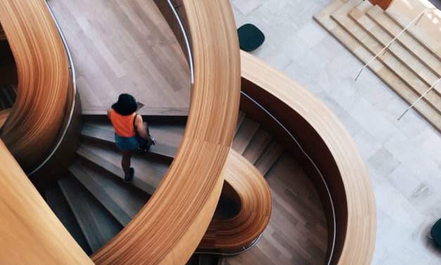
Sherwin-Williams reveals 2019 market-specific color trend collections
Influenced by everything from the latest fashion trends to the surrounding environment, color trends are always changing. Inspired by these trends and the 2019 Colormix® Color Forecast, Sherwin-Williams has created 23 new palettes to help professionals transform their clients’ spaces with the power of color. These palettes were created for the Healthcare, Commercial, Education, Multifamily, Hospitality, New Residential and Home Owners Association markets.
Read More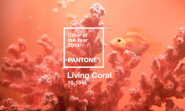
Pantone Announces PANTONE® 16-1546 Living Coral as Color of the Year 2019
Pantone announced PANTONE 16-1546 Living Coral as the Pantone Color of the Year 2019, an animating and life-affirming shade of orange with a golden undertone. Sociable and spirited, the engaging nature of PANTONE 16-1546 Living Coral welcomes and encourages lighthearted activity. Symbolizing our innate need for optimism and joyful pursuits, Pantone 16-1546 Living Coral embodies our desire for playful expression.
Read More
2019 Color Trends in Multi-family Design
To understand how to make conducive design decisions and color choices in multi-family spaces relevant for both Millennials and Boomers, PPG developed a special color trends report for designers and architects to reference for their upcoming projects. PPG’s 2019 multi-family color trends forecast brings this housing shift to the surface and explores how it influences consumers’ attitudes toward their present and future living accommodations.
Read More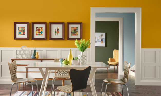
Using Universal Design to Create a Space Accessible by All
By incorporating the principles of universal design, and gaining a better understanding of the role of color, sheen and lighting on aging eyes, professionals can create environments that not only meet their clients’ needs, but work for all ages and abilities.
Read More