
Category: 2020 Color Trends
2020 PAINT COLOR TRENDS
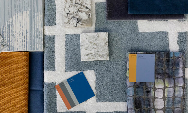
A new decade of color exploration inspires Sherwin-Williams color collections
Inspired by global trends in fashion, culture and interior design, Sherwin-Williams’ color collections draw inspiration from the palettes in the 2020 Colormix Forecast and were specifically curated for the New Residential, Commercial, Hospitality, Healthcare, Education, Multifamily and Homeowners Associations markets.
Read More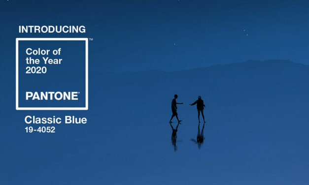
Announcing the PANTONE Color of the Year 2020: PANTONE 19-4052 Classic Blue
Imprinted in our psyches as a restful color, PANTONE 19-4052 Classic Blue brings a sense of peace and tranquility to the human spirit, offering refuge. Aiding concentration and bringing laser like clarity, PANTONE 19-4052 Classic Blue re-centers our thoughts. A reflective blue tone, Classic Blue fosters resilience.
Read More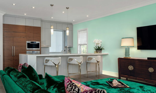
Pratt & Lambert unveils Songbird as 2020 Color of the Year
Pratt & Lambert® announced yesterday that it has unveiled Songbird (117C) as the 2020 Color of the Year. Crisp and clean, this vibrant mint shade speaks to the increasing desire to imbue natural colors with energy.
Read More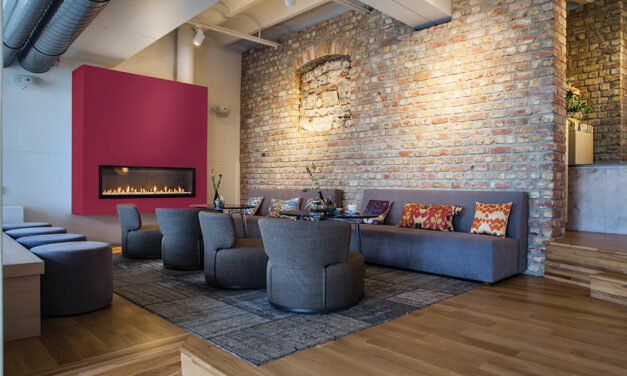
Revitalizing feeling of nature inspires tomorrow’s life-care destinations
Dee Schlotter, senior color marketing manager, PPG paint brand, discusses paint color trends in senior care living in her article “Revitalizing feeling of nature inspires tomorrow’s life-care destinations” published on PRISM. “As generations enter various stages of their life, their preferences and senses continuously change. Color choices often relate to a moment in time, how we feel and even how we remember certain experiences. Unlike many current assisted care facilities, paint color palettes for senior living developments will become more sophisticated over the coming decade, with infusions of modern architecture, colors and nature-inspired elements. Future life-care developments will soon mimic those of high-end hotels and resorts, as baby boomers and Generation X have refined expectations for their living spaces. From staff and services to design and décor, these communities will offer a relaxing, worry-free environment and a sense of being on permanent vacation, and color choices help contribute to the complete experience.”
Read More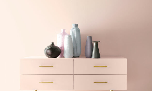
Benjamin Moore welcomes a new decade with “First Light 2102-70,” its Color of the Year 2020
“We selected First Light 2102-70 as our Color of the Year 2020 to represent a new dawn of idealism, design and living,” said Andrea Magno, Benjamin Moore Director of Color Marketing and Development. “First Light 2102-70 reflects a new definition of the home – a shift in mindset from the material to satisfying the core needs in life: community, comfort, security, self-expression, authenticity and ultimately, optimism.”
Read More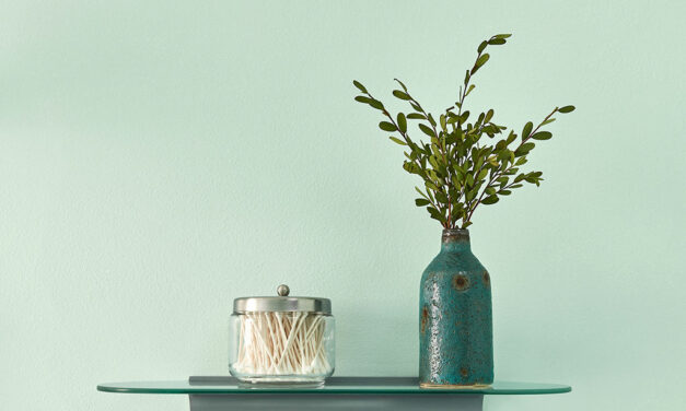
Valspar® announces 2020 Colors of the Year inspired by nature
“Earth’s prescription for the chaotic, busy lives we all live is to bring the tranquility of nature and the outdoor world into the home. That’s exactly what we set out to accomplish when forecasting the 2020 Colors of the Year,” says Sue Kim, Valspar Color Marketing Manager at Sherwin-Williams. “Take Mint Whisper, for instance. The crisp shade brings a sense of peace — and nature’s positivity — indoors.”
Read More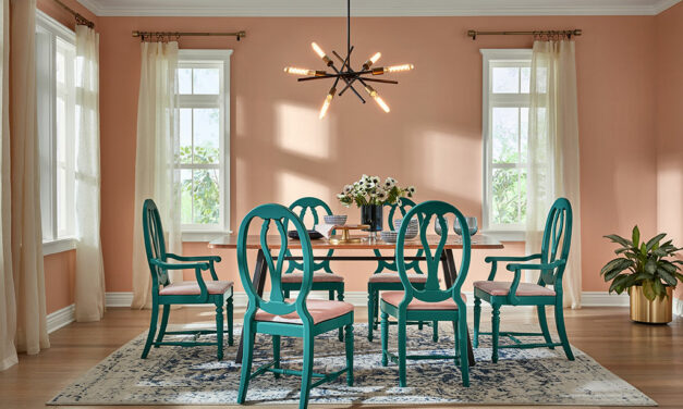
HGTV HOME® by Sherwin-Williams announces its 2020 Color Collection of the Year
“2020 is the year to create a glamorous home space, one that welcomes you in with open arms every time you walk through the door and continues to wow you,” says Ashley Banbury, HGTV HOME by Sherwin-Williams Senior Color Designer. “Romance, our distinguished Color of the Year, is a soft and dreamy blush hue that evokes serenity while simultaneously making a statement. It can be mixed and matched with any of the colors found within the Simply Blissful Color Collection to seamlessly coordinate in the home.”
Read More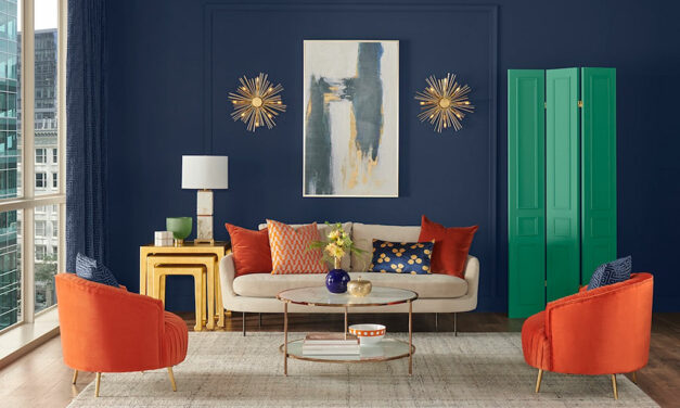
Look to the Skies: Sherwin-Williams Naval to guide next decade of design
Sherwin-Williams is announcing the 2020 Color of the Year: Naval SW 6244, a rich navy hue that strikes a balance between calm and confident. Naval is where the glamour of Art Deco meets the serenity of a yoga studio, pairing the contemporary desire to treat ourselves with the practice of self-care.
Read More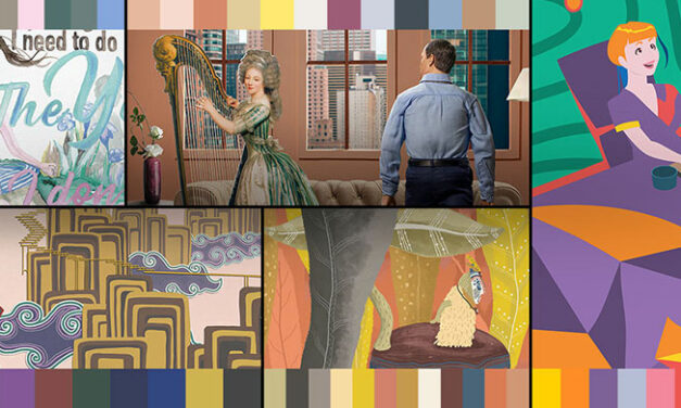
Dunn-Edwards Paints releases 2020 Color and Design Trends Report, Optimistic Endeavors
Dunn-Edwards Paints has released its 2020 Color and Design Trends Report, Optimistic Endeavors, which defines five key themes of how culture has influenced the design world.
Read More
Behr Paint’s 2020 Color of the Year brings us “Back to Nature”
Today, Behr Paint announced its 2020 Color of the Year, Back to Nature S340-4: a restorative, meadow-inspired green. Influenced by our innate desire to connect with nature, this biophilic shade imparts a fresh sense of vitality. Just as plants release oxygen into the air, incorporating an ecological green in the home helps purify and promote a balanced space—bringing the outside, inside.
Read More
Color in balance: A look at design in 2020
Sherwin-Williams announces its annual Colormix® Forecast, a collection of 45 hues that bring joy, serenity and focus to the mind, body and spirit. Sherwin-Williams states this year’s standout hues are expressed through five inspirational and balanced color collections that warmly welcome a new decade in home and commercial design: Alive, Mantra, Play, Haven and Heart.
Read More
Find ease, restfulness with PPG brand’s 2020 Color of the Year: Chinese Porcelain
In a world where sleep is viewed as a luxury and the anxiety of a fast-paced life is all too real, it is only fitting that PPG paint brand’s 2020 Color of the Year, Chinese Porcelain (PPG1160-6), offers escapism in today’s technologically driven society. Hand-selected by PPG’s global color experts, the shade is a blend of cobalt and moody ink blue that imparts calmness and restful sleep while also offering the spirit of hopefulness – a precious commodity in a restless world.
Read More
Behr Paint reveals 2020 Color Trends palette, forecasting revitalizing appeal across the globe
“Each color in the 2020 Color Trends palette evokes an organic beauty that resonates with both modern and traditional commercial environments, from renovated industrial office spaces to hospitality venues,” says Erika Woelfel, Vice President of Color and Creative Services at Behr Paint Company. “As residential and commercial design trends continue to blend, this eclectic palette of balanced neutrals, earthy greens, lavish oranges and more will offer professional designers and DIYers an opportunity to transform spaces into experiences that not only enhance the aesthetic of an environment, but impact how people feel.”
Read More