
Sherwin-Williams announces 21 color collections designed to help professionals create beautiful spaces through color to ring in the new decade. Inspired by global trends in fashion, culture and interior design, the collections draw inspiration from the palettes in the 2020 Colormix Forecast and were specifically curated for the New Residential, Commercial, Hospitality, Healthcare, Education, Multifamily and Homeowners Associations markets.
“Today’s professionals are responsible for everything from budgeting to customer service to designing dream spaces, so it’s important for us to provide easy resources that can inspire them every day,” said Michael Plank, director of color marketing and design services at Sherwin-Williams. “We created these market-specific palettes to ultimately help professionals create beautiful projects – whether it’s a child’s first classroom, a family’s new home or the office of a start-up company.”
Each segment incorporates three palettes that will help designers and professionals create an inviting environment in the space around them.
Commercial Segment. Palette name: Bold Revival. Colors used: Auric SW 6692, Foxy SW 6333, Alaea SW 7579, Cape Verde SW 6482. Design credit: Andrea Schumacher, Andrea Schumacher Interiors
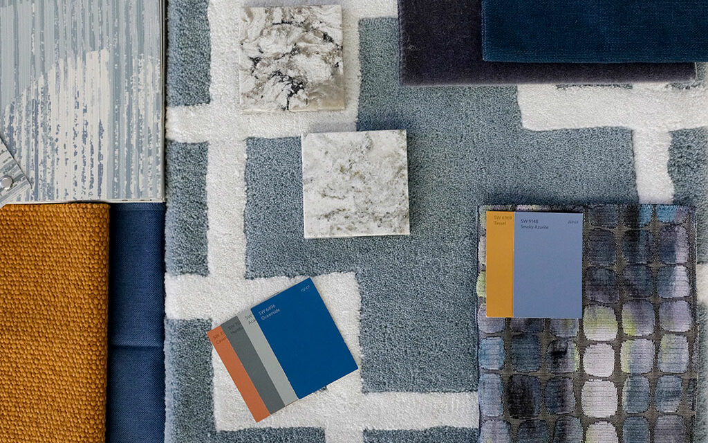
New Residential
The colors among the three New Residential palettes are inspired by different regions across the country. From playful energetic tones to dark “new neutrals” such as SW 6244 Naval, the colors in these palettes will empower professionals and homeowners to incorporate different tones and colors into homes.
Perfect accents meet tried and true for a hint of nostalgia in the Refreshing Recollect palette – a collection grounded in energetic and classic tones along with pops of color. The Nature’s Transformation palette inspires escape through deep and earthy colors that evoke respite and confidence for a timeless design. With influences of serenity and humanity, the Relaxing Sanctuary palette brings balance into exterior and interior areas alike with soft and chalky tones balanced by darker hues.
Commercial
As the lines between residential and commercial blur, there is an increased desire to add elements of comfort and respite in the workplace and other spaces outside of where people live. The colors in the Commercial palettes help to create spaces in which employees and visitors can feel at home.
The soft pale pink and mint pastel tones in Soft Scandi, inspired by Nordic simplicity, create an inviting atmosphere. The spirited Vibrant Splash palette delivers a bold collection of colors that exude energy and creativity with playful tones such as SW 6860 Eros Pink. Inspired by giving historic structures new life through sustainable initiatives, the Bold Revival palette is a sophisticated collection of dramatic jewel tones designed to revive styles of the past.
Palette name: Bold Revival. Colors used: Homburg Gray SW 7622, Naval SW 6244, El Caramelo SW 9106, Malabar SW 9110. Design credit: Andrea Schumacher, Andrea Schumacher Interiors
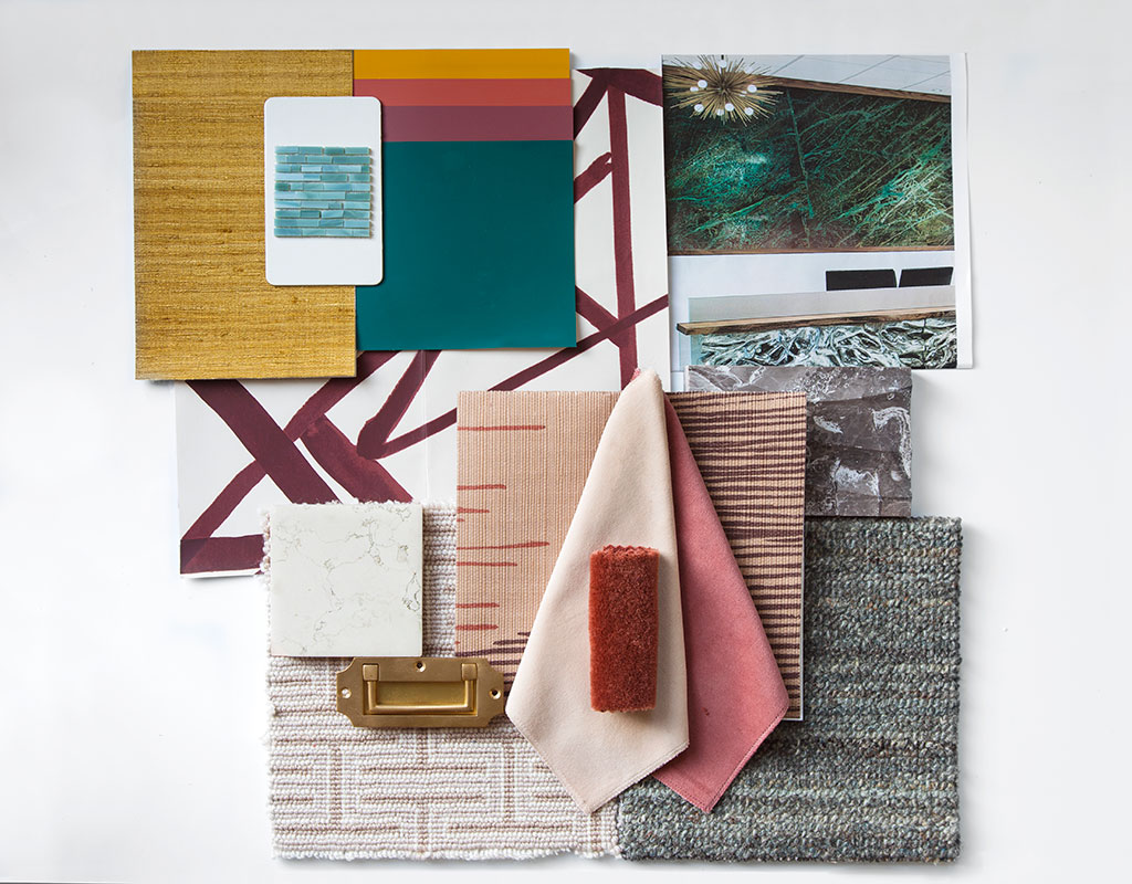
Hospitality
From outdoor environments to historical landmarks, the use of color in the Hospitality palette enhances spaces for guests from across countries and cultures. Whether with SW 9117 Urban Jungle or SW 6860 Eros Pink, these hues showcase the significant variety of trends in hospitality spaces.
An oasis of natural landscaping can be achieved with tones from the Breezy Sunset palette, inspired by biophilic elements that help to bring the outdoors in. Invite tropical vibes with the bright and photogenic colors in Pool Party, which add a feeling of warmth and happiness to any space. Classic design meets luxury and elegance though Reinvented Classics, a palette that brings a sense of past design styles into hotel lobbies or cafes by incorporating deep jewel tones to create impressive backdrops.
Palette name: Breezy Sunset. Colors used: Caramelized SW 9186, Urban Jungle 9117, Secret Cove SW 9058. Design credit: Niki Broyn, Nikibi Design
Healthcare
Trading in neutrals for pops of color can transform a space for healing. The colors included in the three Healthcare palettes are both soothing and optimistic to make guests and patients feel at home and at ease so they can focus on their care no matter the journey ahead.
Lively bright tones come together in Bright Spirit, welcoming a playful aura that engages patients and their families throughout the healing journey. Shades of sunwashed hues and subtle blues are incorporated in the Calm Comfort palette, achieving a homey feeling for patient rooms or nurse stations. The deep and bold earthy tones in Rich Earth balance darker colors and neutral hues that can stand out on their own or complement the elements of any space, from a corridor to a private room.
Education
Seeking to inspire and encourage students, the Education palettes help to energize and also provide comfort to individuals as they explore the world around them through learning. From daycare to high school, selecting the right colors can impact how students learn and grow in a space.
Organic tones for those seeking sustainability can be found in Sunwashed Study, a palette that incorporates natural colors taken from the earth’s seasonal cycles – inviting students to collaborate, study and unwind. Enhance the sense of well-being for students around them with Outside In, a variety of tones looking to bring inspiration from landscapes and bright natural elements into interiors. Add a positive pop of color for any age group with Cheerful Curiosity, a fresh interpretation of the rainbow that brings out the kid in everyone through orange, green and blue hues.

Pallete name: Outside In. Colors used: Drizzle SW 6479, Viva Gold SW 6367, Henna Shade SW 6326, Nurture Green SW 6451, Dusty Heather SW 9073, Broccoflower SW 9039, Chivalry Copper SW 6353, Bluebird Feather SW 9062. Design credit: Christi Barbour, Barbour Spangle Design; photo credit: Maria West Photography
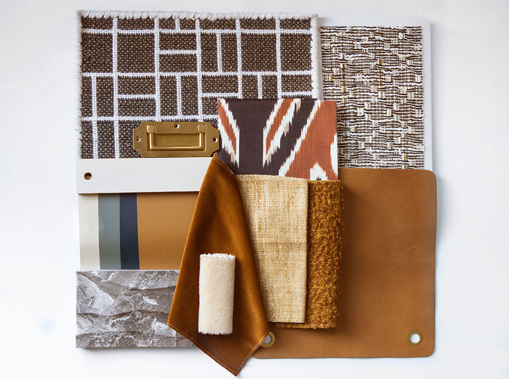
Multifamily
The tones in the Multifamily color collections are designed to appeal to the mind, body and spirit for each corner of a resident’s home, from the lobby to the exterior of the building.
Everyday Eclectic combines simple living and clean spaces from whites to matte black, embracing minimalism throughout the design. Good Vibes showcases tones reminiscent of a natural Zen garden, combining light airy hues in which the mind and body can unwind. Vibrant Future offers pops of color with saturated hues that awaken the senses of the world around us.
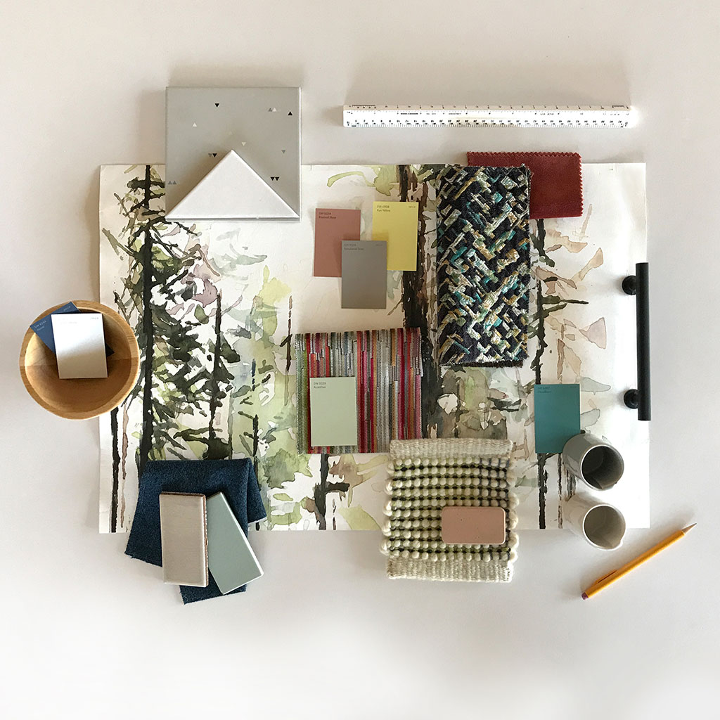
Palette name: Good Vibes. Colors used: Naval SW 6244, Origami White SW 7636, Acanthus SW 0029, Functional Gray SW 7024, Roycroft Rose SW 0034, Fun Yellow SW 6908, Cloudburst SW 6487. Design credit: Martha Dayton, Martha Dayton Design
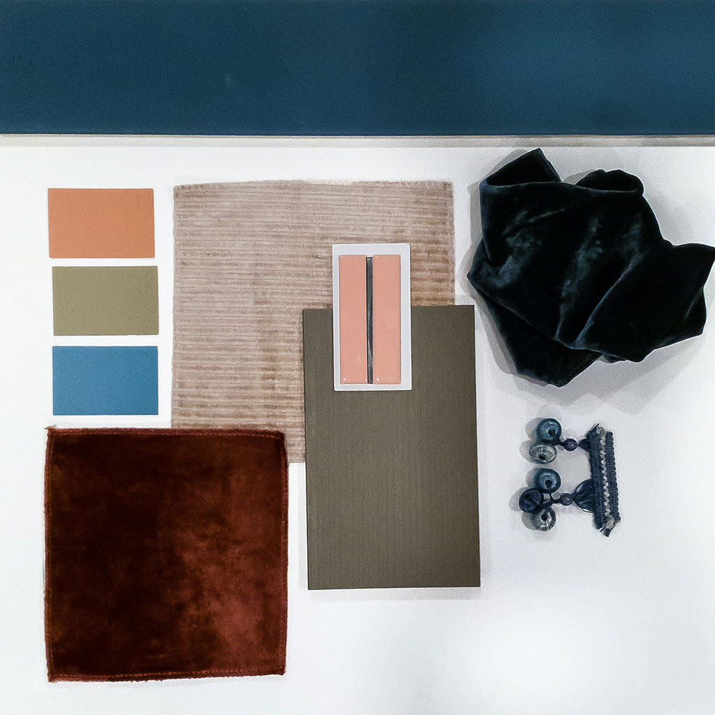
Homeowners Association
The palettes curated for Homeowners Associations give members an opportunity to facilitate living spaces for their communities, offering a variety of atmospheres through softer or bolder color combinations.
Colors from Renewed Light promote relaxation and comfort using chalky pastels paired with metal finishes to deliver a modern touch. The exuberant attitude of Energetic Aura takes color to the maximum by incorporating lively hues like bold dark greens and yellow tones. The earthy natural tones in Warm Invite balance blues and terracottas to create a warmth of feeling that turns every space into a familiar retreat.
For more information and to view the palettes, visit s-w.com/marketcolors.
Ask Sherwin-Williams™
For more than 150 years, Sherwin-Williams has been an industry leader in the development of technologically advanced paint and coatings. As the nation’s largest specialty retailer of paint and painting supplies, Sherwin-Williams is dedicated to supporting both do-it-yourselfers and painting professionals with exceptional and exclusive products, resources to make confident color selections and expert, personalized service at its more than 4,300 neighborhood stores across North America. For more information, visit sherwin-williams.com. Join Sherwin-Williams on Facebook, Twitter, Pinterest and Instagram.


