
As the American healthcare system continues to evolve in a predominately-digital world, affordability, acute care and behavioral health are just some of the many factors shaping the industry today. To elevate and enhance the patient experience in a field facing challenges, designers and architects are stepping in and producing innovative design solutions for healthcare facilities, using the transformative power of color to design spaces dedicated to wellness, recovery and rest.
Delivering value to patients and their families has become a critical part of healthcare design. Healthcare organizations can go only so far in affecting social issues, such as socio-economic status, housing and nutrition, so having relationships with community resources that can help to manage critical needs is considered a must-have for health systems. Urban design is also placing an emphasis on accessible and convenient healthcare by incorporating hospitals and treatment facilities at the center of urban development plans. Many hospitals today are embracing the trend of removing outpatient services from traditional, larger hospitals and moving them into more consumer-friendly, hospitality-influenced environments, like new medical buildings near shopping malls or transportation centers.
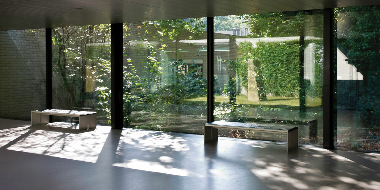
Another growing trend in healthcare design is to move away from the color palettes of days past that feel institutional or cold, and instead, create welcoming, home-like settings for patients who require long-term recovery. Using color schemes that promote healing, such as bright to mid-tone greens and blues, and incorporating biophilic design, like roof top gardens or an interior courtyard, is believed to accelerate healing, reduce stress and promote a general feeling of wellbeing, as well as improve clinical and operational outcome.

To understand the impact that color has on healthcare spaces, PPG has developed a specific healthcare color trends report for designers and architects to reference for upcoming projects. PPG’s 2020 healthcare color trends forecast brings to life the opportunities in the medical industry today, and how to best incorporate these various factors into health and wellness design. The colors are brought to life through the following three trend stories.
On the Move: This upbeat and happy color palette makes for a playfully sophisticated space, relying heavily on bright, lighthearted hues to create wayfinding paths and touches of joyfulness through unexpected color juxtapositions. Utilized most predominantly in pediatric units and in places that require an inviting environment, this theme takes mismatched hues like the PPG paint brand’s Brilliant Blue, Turner’s Yellow and Bleeding Heart, and creates welcoming and optimistic spaces tailored to young patients and their families.
At the Core: This color collection is calming, earthy and purposeful, ranging from muted mid-tones to brighter hues. Together they create a comforting and nurturing palette that puts the mind at ease – ideal for a healthcare setting like a cancer clinic or maternity ward. Brighter hues such as the PPG paint brand’s Cranapple and Carrot Cake feel rich when contrasted with Comfort, Graceful, Cool Concrete and Kangaroo Paw, which double as tinted neutrals, creating a balanced space for patients alternating between emotions of strength and vulnerability.
In the Know: With an emphasis on knowledge, responsibility and innovation, this theme represents those in the healthcare profession who are eager to change society while contributing to a future that is better than the past. Many newly built or renovated hospitals and healthcare facilities around the globe do more than just look after their patients – they also look after the environment. The palette acknowledges the convergence of technology and earthliness by featuring raw, natural hues like PPG paint brand’s Cinnamon Spice and Brown Clay, as well as organic, oxidized blue-greens like Celestial Blue and Summer Breeze.
While these color trends stories reflect various attitudes toward health and wellness, PPG’s 2020 Color of the Year, Chinese Porcelain, a blend of cobalt and moody ink blue, transcends all three themes. With its ability to impart calmness, reduce anxiety and encourage sleep while also offering the spirit of hopefulness, Chinese Porcelain is the quintessential hue for healthcare settings. To learn more about PPG’s global color trends and 2020 Color of the Year, or to connect with a color consultant to explore how color can transform how color can transform healthcare, retail, hotels and homes in 2020, visit www.ppgpaints.com.
About the author

Dee Schlotter
Dee Schlotter, PPG senior color marketing manager, architectural coatings
Dee has worked for PPG for more than 25 years and manages the development of color platforms, systems and tools for brands such as PPG PAINTS™ and GLIDDEN® paints. She conducts national presentations to architects, designers, and consumers in the hotel, retail, new home construction and residential markets. She is a member of the PPG Global Color Styling Team that researches and forecasts colors for the architectural, automotive, aerospace, industrial and consumer products markets. Dee is a member of ASID, IIDA and NKBA.
PPG’s architectural coatings business in the U.S. and Canada is an industry leader in residential and commercial coatings, delivering the latest technologies and operational advancements through its strong portfolio of brands. It manufactures and sells interior and exterior paints, stains, caulks, repair products, adhesives and sealants for homeowners and professionals. Its distribution network includes more than 15,000 touchpoints through company-owned stores, independent dealer locations and all major home improvement centers across the U.S. and Canada. Visit ppg.com/ac for more information.

