
Currently, 10,000 baby boomers turn 65 every day and in the next 23 years, it’s estimated that America will need approximately two million more housing units to meet senior living needs. Generation X, the generation born after the baby boomers between early 1960s to mid-1970s, will start to enter their mid-70s. In the years to come, these generations will eventually be searching for the best lifestyle for their retirement, which will differ from current retirees and senior citizens. They may seek the option to live in semi self-serve environments, while others will prefer those that require more amenities and pampering. No matter the choice, the space’s color and its emotional influence will play a part in this important life decision.
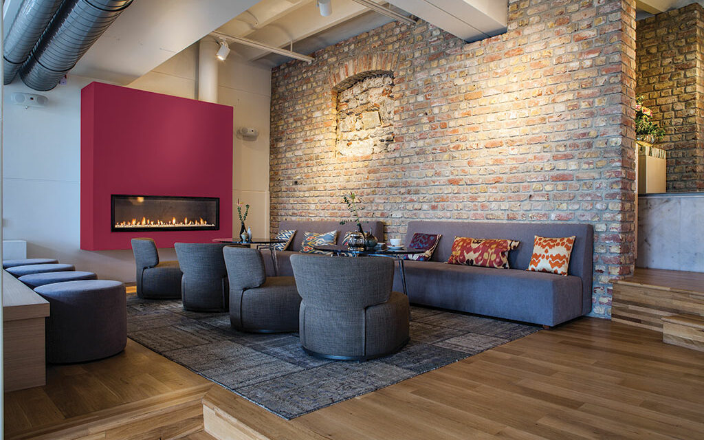
As generations enter various stages of their life, their preferences and senses continuously change. Color choices often relate to a moment in time, how we feel and even how we remember certain experiences. Unlike many current assisted care facilities, paint color palettes for senior living developments will become more sophisticated over the coming decade, with infusions of modern architecture, colors and nature-inspired elements. Future life-care developments will soon mimic those of high-end hotels and resorts, as baby boomers and Generation X have refined expectations for their living spaces. From staff and services to design and décor, these communities will offer a relaxing, worry-free environment and a sense of being on permanent vacation, and color choices help contribute to the complete experience. Rich greens and deepened reds, such as Midnight Clover (PPG1138-7), Copenhagen (PPG1137-4), Ferris Wheel (PPG1059-5) and Sienna Red (PPG1057-6), are appealing to these resort-style senior developments because they pack just enough color while maintaining a calming, nature-forward backdrop.
Whether it be in plant or paint form, greens are essential. Finding easy and numerous ways to simulate the feeling of being immersed in nature will become a growing must-have for generations looking to age well. Future senior living communities will establish a significant blend of nature and natural elements, focusing on biophilic design ideals including garden courtyards, barn-house style community buildings and outside dining. With this in mind, a natural color palette on the interior and exterior of the facility can mimic the feeling of being in nature – both revitalizing and soothing. Night Watch (PPG1145-7) is a perfect hue that allows designers, architects and ultimately, residents, to bring the healing power of the outdoors into a space. The dark green hue pulls our memories of natural environments to the surface to recreate the calming, invigorating euphoria we feel when in nature. Earthy orange-brown paint colors such as Prairie Fire (PPG1071-6) and Spiced Cider (PPG1068-7) also link our minds to wooded environments and help us to feel reassured and grounded.
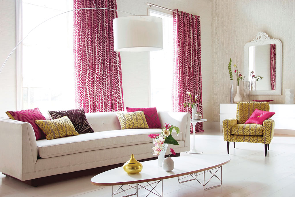
When choosing an environment for life’s next stage, many will also seek spaces dedicated to wellness and simplicity, with organic elements including natural stone finishes, woven accents and no-fuss cottons. Soft grayed tones, such as Steel Me (PPG1018-1), and deep blues and greens, such as Yucca (PPG1143-5), are reassuring and peaceful when paired with sandy beige architectural elements and décor, while brighter hues can be more invigorating and awakening. PPG’s 2020 Color of the Year, Chinese Porcelain (PPG1160-6), a blend of cobalt and moody ink blue, is the perfect hue for assisted living developments, as it imparts calmness, reduces anxiety and encourages sleep while also offering the spirit of hopefulness.
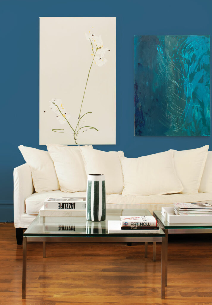
Chinese Porcelain (PPG1160-6). Courtesy of PPG
Forthcoming senior living developments will utilize refined designs and decorative elements to promote and encourage holistic wellness through both public and private spaces. Architects and designers can incorporate cool hues and soft, subtle textiles with tranquil color palettes to create spaces that are as calming and restful as they are rejuvenating and refreshing.
About the author
 Dee Schlotter
Senior color marketing manager, PPG paint brand
Dee has worked for PPG for more than 25 years and manages the development of color platforms, systems and tools for brands such as PPG PAINTS™ and GLIDDEN® paints. She conducts national presentations to architects, designers, and consumers in the hotel, retail, new home construction and residential markets. She is a member of the PPG Global Color Styling Team that researches and forecasts colors for the architectural, automotive, aerospace, industrial and consumer products markets. Dee is a member of ASID, IIDA and NKBA.
PPG’s architectural coatings business in the U.S. and Canada is an industry leader in residential and commercial coatings, delivering the latest technologies and operational advancements through its strong portfolio of brands. It manufactures and sells interior and exterior paints, stains, caulks, repair products, adhesives and sealants for homeowners and professionals. Its distribution network includes more than 15,000 touchpoints through company-owned stores, independent dealer locations and major home improvement centers across the U.S. and Canada. Visit www.ppgpaints.com.

