
No design trend is more influential and ubiquitous than color. Color has the power to impact moods and communicate our values and personalities without saying a word. Needless to say, the colors you choose to cover the walls of your home or business have a significant effect on the people in the space. Not only do trending colors create a visually appealing space, but they can help give commercial spaces a competitive edge in attracting visitors and customers. Staying abreast of color trends and their influences helps to shape forward-thinking design.
A big trend in recent years, Scandinavian design, will continue to inspire color choices in 2018. Characterized by simplicity and functionality, Scandinavian design is also known for its use of light and neutral colors. However, deep, rich colors are beginning to find their place among these light-infused spaces, as people are looking to create a new sense of vitality and visual interest in their homes and businesses. We are starting to see a shift in preferences from the absence of color to the presence of it.
So what is driving this change from light and simple to complex and colorful? Color trends play off a variety of influences — nature, fashion, global trends, and pop culture are just a few. In 2018, there will be three major social trends bleeding into the design sphere and determining what colors consumers prefer: mindfulness, wanderlust, and technology. These influences draw upon the thoughts and experiences that help choose color. While distinct, all three trends are a reflection of where color and design will be headed in the coming year.
Mindfulness
Mindful living has become a priority in many people’s lives as we begin to see health as more than an aspect of our physical well-being. Mindfulness means being aware of all aspects of your life, and being conscious of how you live it. In design, this trend is about creating a sanctuary – a space that is minimalist and meditative, feeling “off the grid,” without necessarily being so.
Creating this sense of peace through color can be achieved with soft greens, sand, complex grays that calm the mind, and hazy botanicals that bring nature indoors. The ever-popular “millennial pink” plays perfectly with this trend.
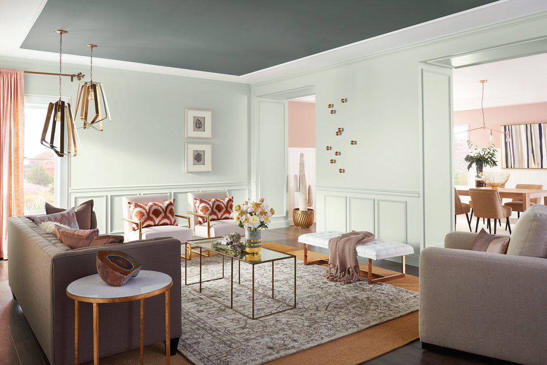
Sherwin-Williams 2018 Colormix® palette Sincerity
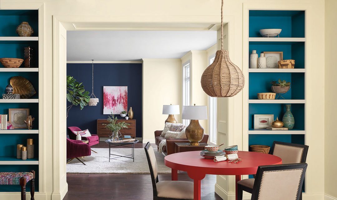
Wanderlust
Wanderlust is the desire to make connections with people and places we don’t yet know. It’s a celebration of cultures, folklore, and the sense of community we have when we feel a part of the world. The increased ease of travel and communication through social media and the internet have inspired people to expand their horizons, and they want bring that feeling back home with them.
For a space that feels like it’s been around the world and back, look to pops of peacock, exotic fuchsia and earthy browns. Sherwin-Williams 2018 Color of the Year, Oceanside, is the embodiment of this trend.
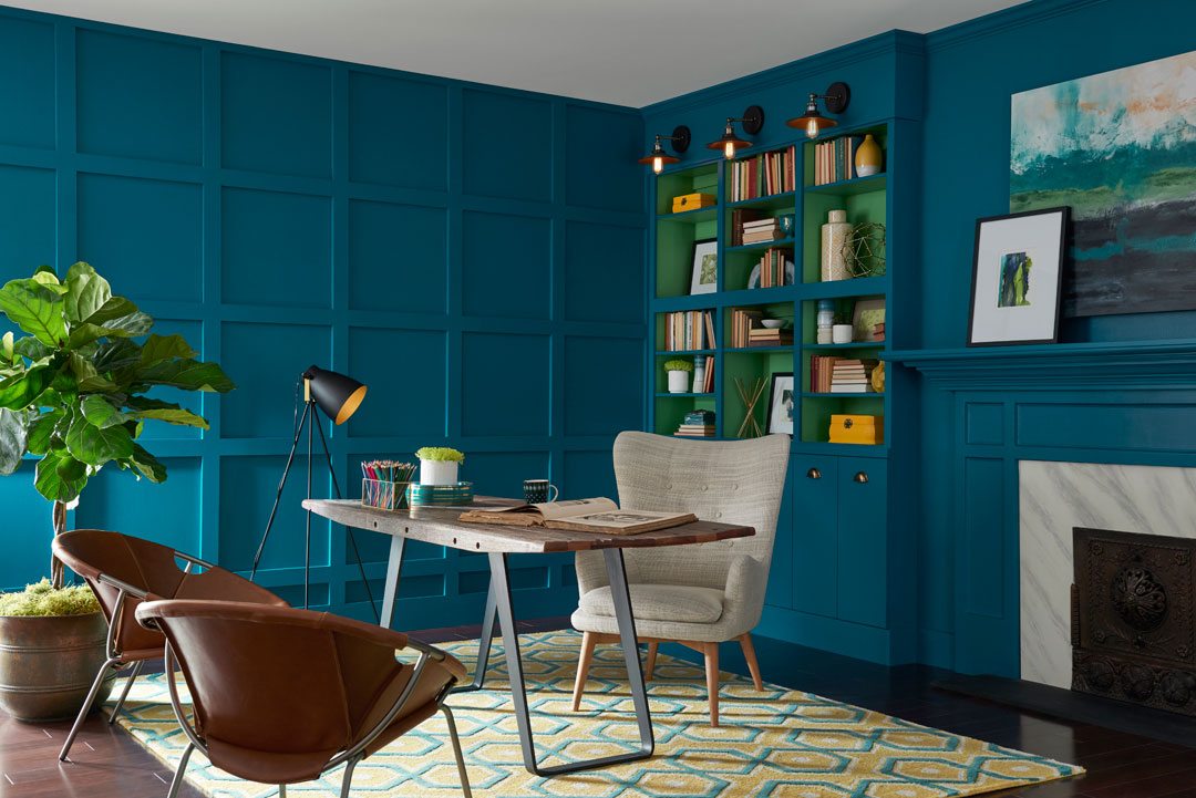
Sherwin-Williams 2018 Color of the Year Oceanside
Technology
Another major trend driving changes in color and design is technology. Innovations in the tech realm have made virtual reality mainstream, increased our productivity, and made the world more connected than ever. No matter the outcomes of advances in technology, the ideas that inspired them are wholly utopian and modern. To be inspired by technology is to crave positivity and playfulness.
Spaces can embrace this trend by using bright orange, violet, vibrant greens and watery blues. The rise in popularity of “Gen Z yellow” is an expression of this idealism.
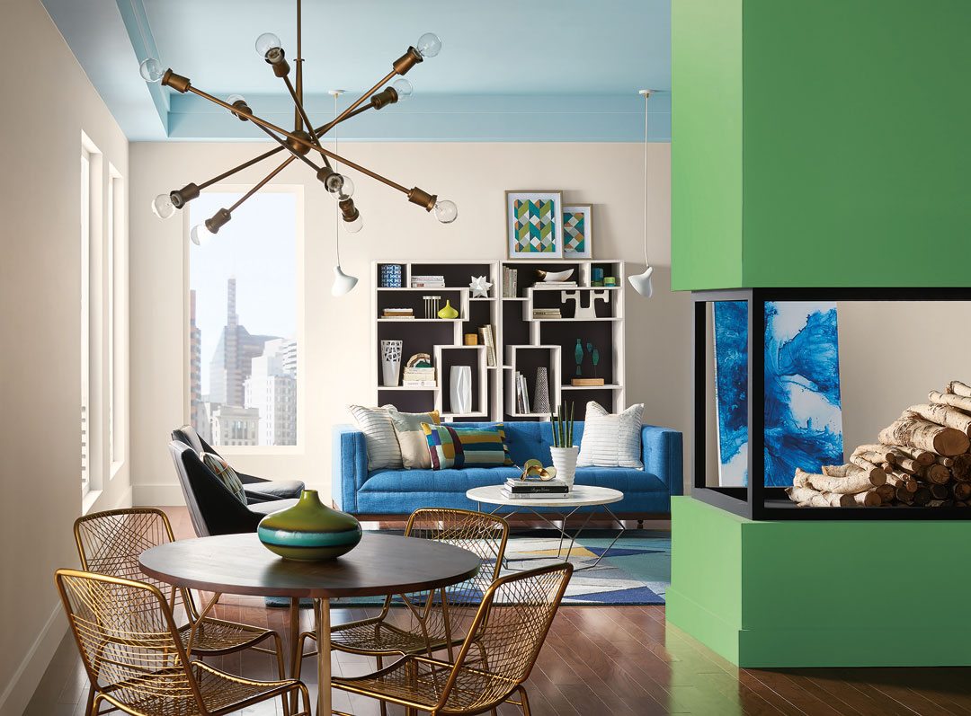
Sherwin-Williams 2018 Colormix® palette Connectivity
Color trends play out differently in different industries, and even in different areas of the home. For example, neutral colors are still dominating exteriors, where experimenting with trends is costlier. But expect these trends to have influences everywhere.
If you’re still stumped about color, there are many resources available to make color selection simpler. Every year, Sherwin-Williams creates curated palettes to make selecting on-trend colors easy. The 2018 Colormix® Forecast was inspired by the global trends discussed here. You can also find the perfect color for your style and needs with tools like the ColorSnap visualizer.
About the author
Sue Wadden
Director of Color Marketing

Sue Wadden is Sherwin-Williams’ director of color marketing for The Paint Stores Group. As the expert on color for Sherwin-Williams, she is responsible for the company’s overall philosophy of color leadership, plays a key role in leading world color trend forecasting, oversees the ColorSnap® color selection system, research and development of all palettes, the Colormix®Color Forecast and Color of the Year, advises Sherwin-Williams STIR® magazine, and engages with media on all topics related to color and design.
Wadden began her career at Sherwin Williams in 1998 as an interior designer and color marketing specialist. She then became a senior color marketing designer for the company, prior to being named color marketing and design manager for Sherwin-Williams Diversified Brands Group, which includes Krylon, Dutch Boy, Pratt & Lambert and HGTV HOME™ by Sherwin-Williams at Lowe’s.
Wadden holds a Bachelor of Arts degree in interior design from the Cleveland Institute of Art. She is active in the Color Marketing Group, the Color Association of the United States, the American Society of Interior Design and the Interior Design Society.

