Paint color is a powerful tool in impacting not only the aesthetic ambience of a space, but it also has the potential to impact the emotions or experience one has in the space. We see this in our own personal homes and in professional settings. I find that color is also particularly important in educational settings to stimulate learning, promote imagination and encourage creative thinking. As a leader in paints, coatings and color, PPG global color experts come together each year to discuss and forecast what will trend in color so that a wide variety of our customers can utilize this information in both residential and commercial designs, including educational facilities. PPG’s 2017 educational color trends report, backed by customer data and expert insights, includes color palettes that foster inspiring educational spaces.
How can architects and designers use color to create spaces that help eliminate mental noise and foster individual thinking and growth? To answer this question, PPG identified trending paint colors to help create balanced environments that break down the traditional ambience of a classroom and cultivate a true space for learning.
This idea of balancing elements can be used by educational facilities of all types, from daycares to collegiate levels, and from traditional grand architecture to more modern, open spaces. PPG developed four color trend stories as macro topics, which include paint colors trends seen across various industries and are not secluded to education. However, each addresses a variety of “classroom” types: Hourglass, which embodies a design nostalgia that is refocused into a contemporary world; ES/Sense, created to address a shift in behavior – away from overexposure to social media and online content; ImPower, which breaks convention and asks us to accept new codes of thinking as well as new codes for design; and Biocentric, which marries the organic trend with a new emerging trend of cosmic exploration.
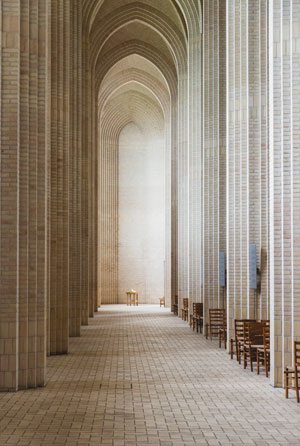 Keep classics relevant yet distinguished: With growth and competition in educational categories, classic academic institutions must find new ways to thrive. Designers and architects can accomplish this by mixing ideas and creating a more balanced aesthetic that still evokes distinction, drawing on the roots of the past but updating hues for a more contemporary spirit. Replace mallard green paint colors with foliage tones, such as PPG Paints Castle Stone PPG1128-7 or Globe Artichoke PPG1128-7. Switch classic, burnt reds for clay and burgundy hues, like Cider Toddy PPG1207-7 and Burgundy Wine PPG1053-7. To make the look more modern, blend in a healthy dose of neutrals such as warm grays like Pewter Mug PPG1004-5 and Sheffield Gray PPG1041-6 or with classic black, Black Magic PPG1001-7.
- Create serenity through balance: As technology and constant connection can create burnout for students and teachers, color can provide environments that allow the mind to rest and retreat. To minimize the noise and restore clarity and balance to learning environments, hone in on natural elements with watery blue tones like PPG Paints Kaleidoscope PPG1160-4, and greens like Gale Force PPG10-08 and Dusty Aqua PPG10-29 in the PPG Paints ES/Sense palette. A color story balanced between warm and cool tones create a subtle, washed out effect to strongly evoke feelings of serenity.
- Bridge formal education with social learning: For more creative spaces, embrace the idea of not letting a specific idea define your color palette. Design can help bring to life the rejection of polarities and blending of formal and social learning. The PPG Paints brand’s ImPower trend color palette reflects the dark (PPG Paints Bark 1007-7), the light (Crushed Pineapple PPG1213-7), and everything in between. Energetic brights like PPG Paints Parachute PPG1218-5 and Bermuda PPG1150-6 sit next to subtle mid tones. Classic reds like Rum Punch PPG1190-7 and blues bump up against mixed blue-greens and green-yellows, such as Parachute PPG1218-5. Clean colors sit next to grayed hues, pushing the boundaries of change.
- Align natural and artificial environments: Create a higher sense of harmony between manmade and natural environments and an environment that fosters a better work/life balance through a balance of out-of-this-world and organic colors. The BioCentric palette dazzles with a balance of space-inspired hues, like Black Flame PPG1043-7, and saturated organics ranging from ultra-blacks, like Black Magic PPG1001-7, to gray to muted pastels like PPG Paints Brigade PPG1152-6, Violet Verbena PPG1169-5 and Ancestral PPG1047-4, with added organic yellows like Dilly Dally (PPG1213-6), oranges like Sesame Crunch PPG1198-7, and pink-orange hues, such as Buffalo Trail PPG1202-5.
These color trend stories demonstrate how current trends are expected to play out in educational settings in 2017 and beyond, and serve as resources for designers and architects for upcoming projects, no matter what unique challenges they face. To learn more about the PPG Paints 2017 education color trends report, or to connect with a color consultant to explore how color can transform healthcare, retail, hotels and homes in 2017, visit www.PPGVoiceofColor.com.
About the author
Dee Schlotter
Sr. Color Marketing Manager, PPG Architectural Coatings, United States
Dee has been at PPG for 25 years and manages the development of color platforms, systems and tools for brands such as PPG PAINTS™, OLYMPIC® Paints and GLIDDEN® Paints. She conducts dozens of national presentations to architects, designers, and consumers in the hotel, retail, new home construction and residential markets. She is a member of the PPG Global Color Styling Team that researches and forecasts colors for the architectural, automotive, aerospace, industrial and consumer products markets. Dee is a member of ASID, IIDA, and NKBA.

