Founded in 1985, not-for-profit health system Mainline Health has become a reliable fixture in Pennsylvania because of its high-performance hospitals and healthcare centers across the state. To support its rapid growth, Mainline Health enlisted the help of Francis Cauffman Architects (FCA) to expand its latest facility: the Lankenau Medical Center Emergency Department, an acute care hospital and medical complex located in Wynnewood, Pennsylvania. Over the past 20 years, FCA has had a long-lasting partnership with Mainline Health, completing projects across six hospital campuses and a variety of outpatient sites—including the renovation of Lankenau Medical Center’s existing Emergency Department in 1997. Lankenau’s newest expansion opened in January 2020.
The 30,985-square-foot new addition, combined with a complete renovation of the existing 16,000-square-foot department, intends to streamline the way the emergency department evaluates, sorts, treats, and releases its patients for a more efficient experience. The expansion increases the number of treatment bays so the facility can better serve its community as well as accommodate the institution’s steady growth. It significantly improves the hospital’s capacity to address wide-ranging illnesses and injuries with more treatment spaces, as well as optimize staff workflow. The new design aims to improve operations across the facility, reducing wait times and ensuring that Mainline Health provides a superior patient experience.
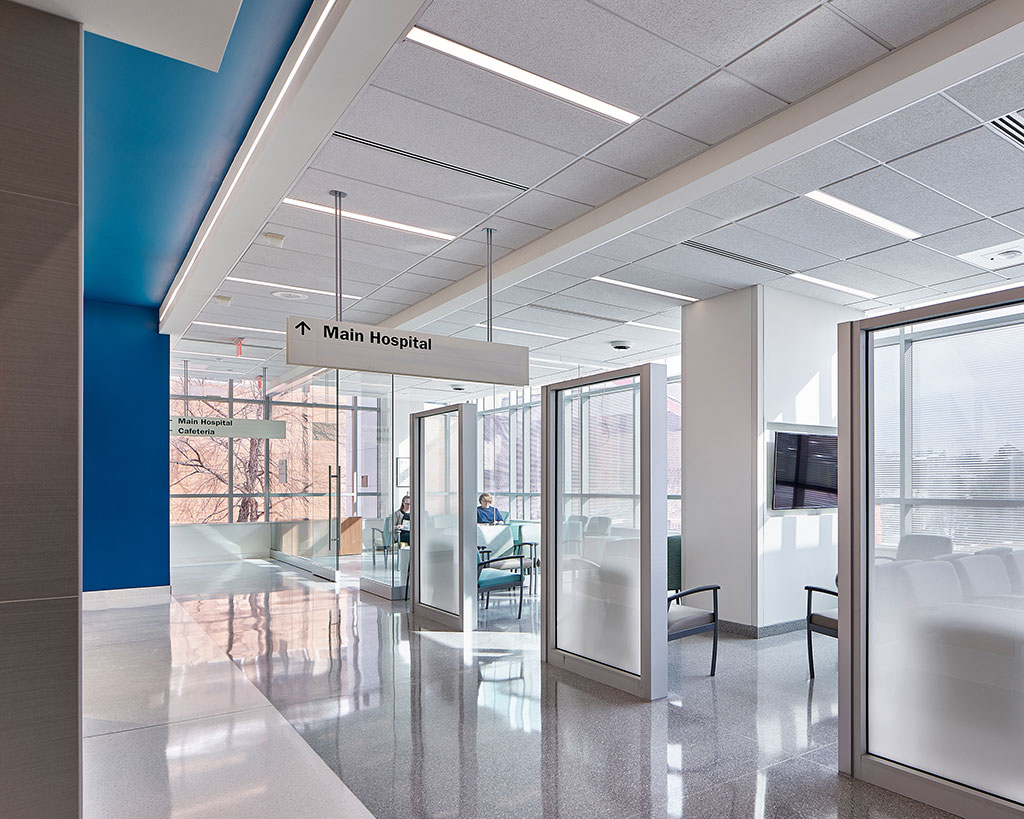
Photo credit: Jeffrey Totaro
Designed for the Site
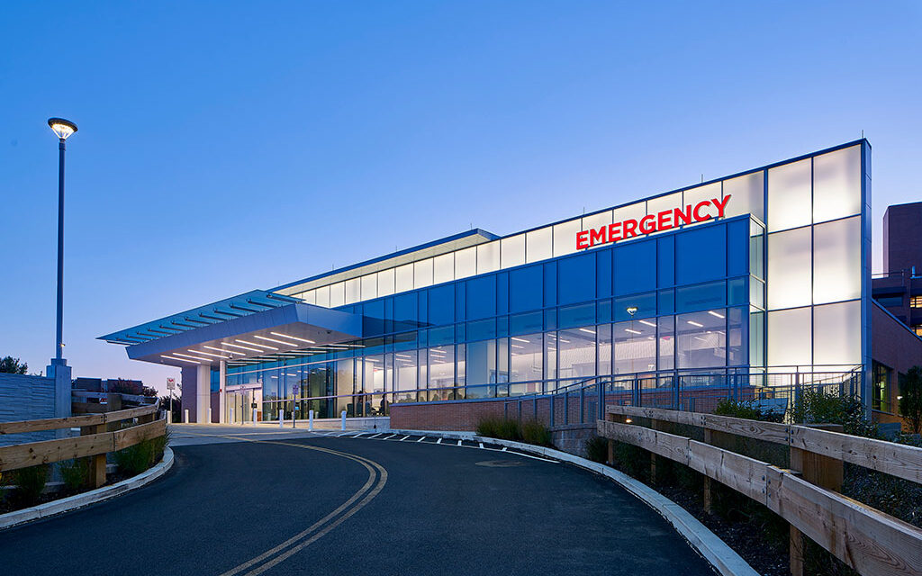
Due to an existing steep slope on the site, the design team outfitted the front of the building with a backlit screen wall that functions as a landmark, making the department easier for patients to visually locate. To keep within the spirit of the original modernist campus buildings designed in the 50s and 60s, the design team utilized Lankenau Medical Center’s locally-produced custom brick to define the exterior of the building.
The interior of the emergency department is configured into three distinct treatment paths, based on patient acuity level—nearly doubling the existing number of treatment areas to 53. One path is a “Super Track” area, arranged in pods, to more efficiently treat patients with minor injuries or illnesses. A second path consists of three trauma bays for severely injured patients, while the third path consists of 31 acute treatment rooms that allow medical staff to quickly attend to patients with potentially life-threatening conditions.
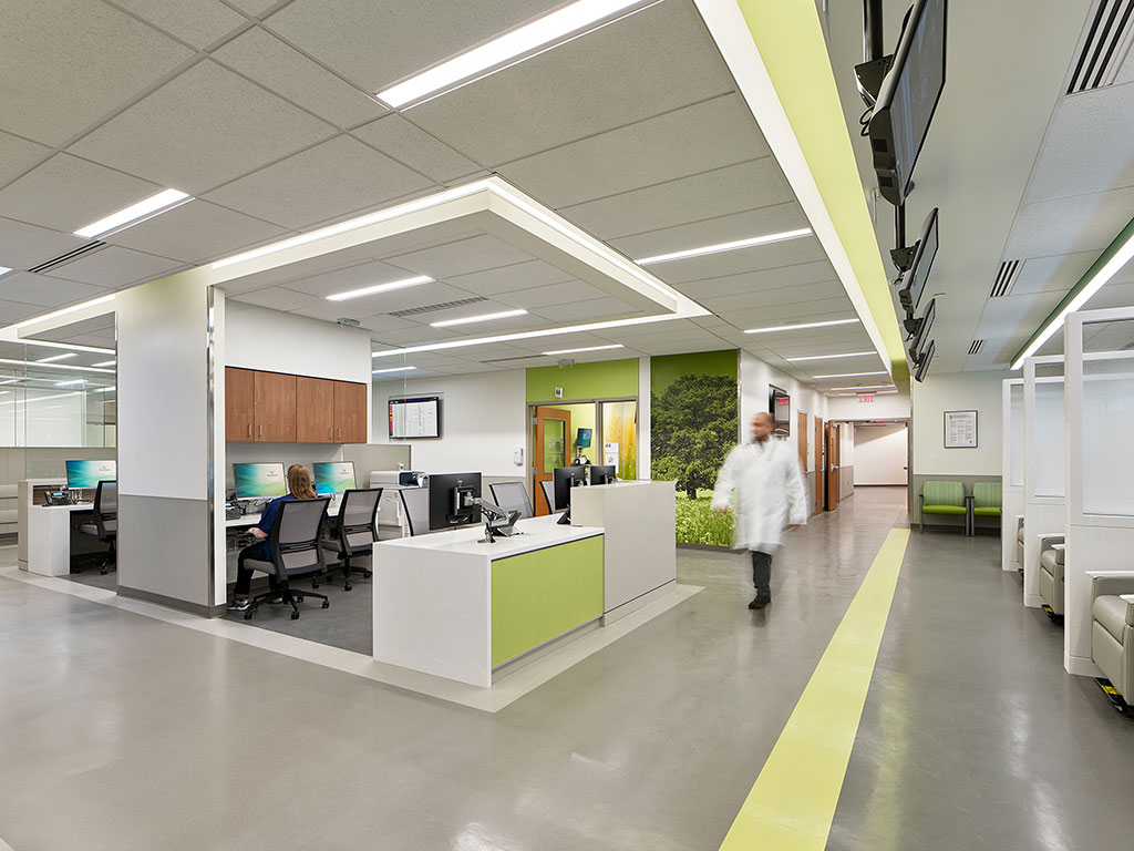
Photo credit: Jeffrey Totaro
Pods are designated to provide care for specific treatment paths. The pods consist of treatment spaces, clinical teams, and clinical support spaces to support each unit. Pods are interconnected so that, as numbers of patients increase, adjacent pods can be utilized. Each pod is accessed from a major corridor for ease of wayfinding, and is designated with a combination of a color, lettering, and graphics. These areas now allow for flexibility as patient numbers fluctuate throughout the day, providing greater flexibility for the staff of the emergency department. The Super Track pods are adjacent to a large Results Waiting area which is a key component in efficient patient flow for the lower acuity patient, allowing the staff to address more patient volume in the tight footprint.
Designed for the Environment
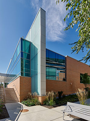
Photo credit: Jeffrey Totaro
As Mainline Health requires all facilities to meet LEED standards, the Lankenau Medical Center ED was designed with LEED certification in mind. In order to achieve this, FCA outfitted the space with low-emitting furniture, finishes, and maximized indoor air quality. The facility also features a green roof for rainwater management and visual aesthetics by providing patient floors looking down onto the roof with a view of green space. An aggressive construction waste management plan resulted in 85-percent of waste diverted away from the landfill. Skylights and clerestory windows providing borrowed light into otherwise dark interior spaces provide building inhabitants access to daylight. This was a key feature that the administration wanted for their staff, who often work long shifts that span days and nights.
As an expansion project, FCA was faced with challenges that came with the existing space, which was equipped with older, less efficient HVAC systems and utilities. Ultimately, the team determined it was best to separate the energy usage from the remainder of the existing buildings to understand how well the new one-story addition would perform. The total anticipated energy savings will be 21.2 percent over a baseline hospital.
Designed for Inspiration
Graphics were selected using Philadelphia’s renowned architecture and culture as a main source of inspiration. Colors in shades of yellow, green, purple, orange, and blue were paired with graphics to differentiate each of the pod treatment areas. A cool gray and white base palette helps these accent colors pop. Each Treatment Pod is assigned a specific iconic image at the entry from the major corridor circulation and then paired with a softer more abstract graphic located within each treatment room. In a clinical environment the printed wall protection provides an element of art within the spaces while still providing the cleanable, durable surfaces that are required in these intense environments.
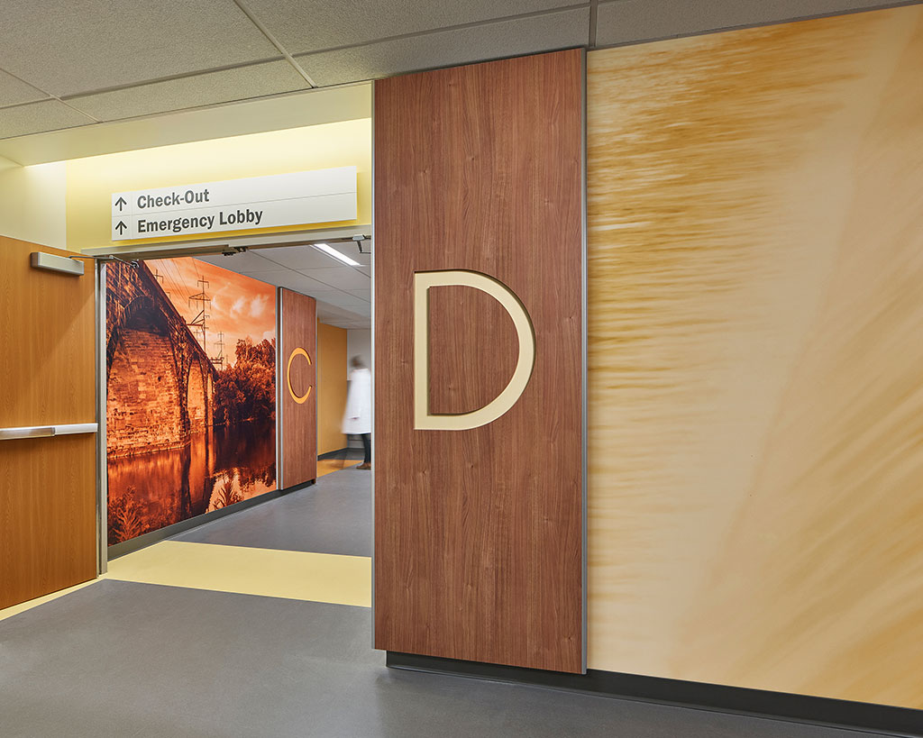
Photo credit: Jeffrey Totaro
Designed for Everyone
As one of the goals for the expansion is to better serve the community, special care was taken to ensure that the facility was designed for everyone—including the growing geriatric community. The clear wayfinding images and letters, both externally with the backlit screen highlighting the new entrance and internally with the combination of color, make it easy for people to navigate the ED. From a planning perspective, it was taken into consideration how geriatric patients often present to Emergency Departments by ambulance despite acuity level. All patients are initiated through a care sequence that includes a nurse and registrar to assign patients to the appropriate flow. The nursing component to this entry is key to help mitigate error.
The environment is also key. From the colors that are clear and contrast appropriately to stand out without overwhelming to the lighting that can be bright without being glaring and incorporates natural daylight to help maintain calming circadian rhythms. Floors are low sheen and minimally patterned to prevent distracting glare, while also designed with slip resistant materials and resilience in mind to help prevent and mitigate injuries from falls. A clear, well designed, easily navigable and well-lit space, the new Emergency Department helps to mitigate disorientation that a geriatric patient might experience.
Related:
Healthcare design post COVID-19
Francis Cauffman Architects helps repurpose supermarket into Virtua Samson Cancer Center in Moorestown, N.J.

