Eighteen new Sherwin-Williams Palettes Specially Curated for Use in Six Segments
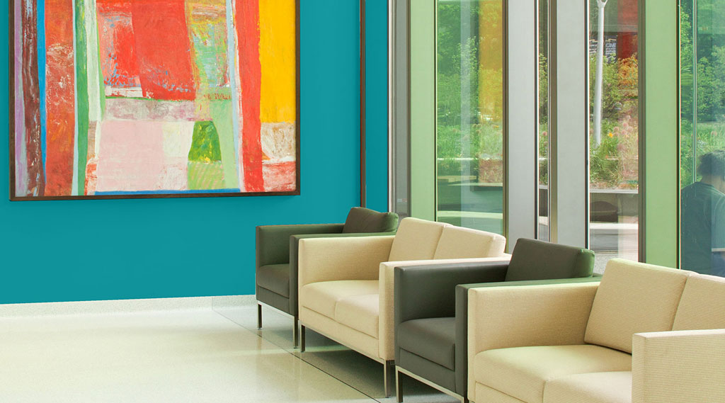
CLEVELAND (DEC. 13, 2017) — Color can make a positive impact on a space and its inhabitants. Drawing on the latest color trends from the 2018 Colormix® Color Forecast, Sherwin-Williams created new, specially curated palettes specifically for the New Residential, Commercial, Multifamily, Healthcare, Hospitality and Education markets – providing even more resources to professionals. Three unique palettes for each market segment show how greater color forecasting trends apply to these spaces for the coming years.
“Our goal is to provide professionals inspiring and practical resources — these palettes offer the best of the latest color trends combined with insights on the specific needs and attributes of each market segment,” said Michael Plank, director of color marketing and design at Sherwin-Williams. “We look forward to seeing how professionals incorporate the palettes in their designs to create even more transformative spaces.”

Sherwin-Williams’ Native Species palette.
New Residential
Inspired by the ongoing struggle of balancing the fast pace of technology and the need to decompress, the New Residential palettes were designed to help create restful and quiet spaces that also feel energetic and bright. The calming colors of the Refined Minerals palette work well in designing spaces intended for relaxation. In addition, there has been a progression of how spaces are used and utilized within the home. For example, man caves have evolved to include designated “she sheds” in the home as an outlet for women to relax and practice creative hobbies. Kitchens are being influenced by the rising popularity of the foodie movement and the growing interest in cooking, creating the need for a modern twist on the classic design by incorporating pops of color into the space. The energetic colors of the Hi-Def Drama palette, along with the bold, confidence tones of Worldly Charm, are ideal for creating these areas within the home.
Commercial
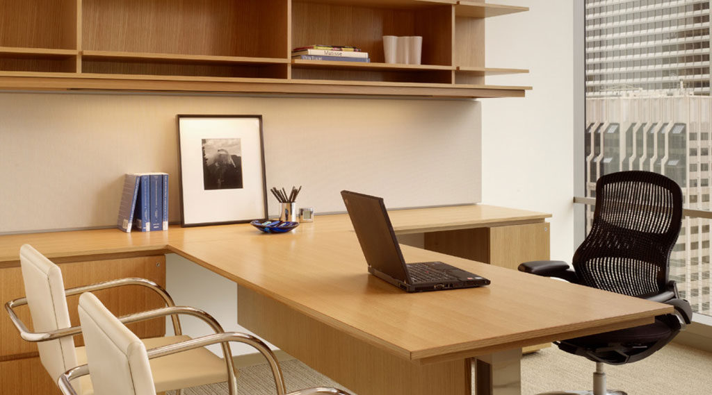
Driven by the fashion industry, commercial spaces need to appeal to a broad audience. Since most commercial projects are focused on interiors, these spaces have the flexibility to be more adventurous with color, texture and materials. These palettes create welcoming environments for retail, offices or other commercial markets. The Crafted Calm palette was inspired by existing spaces, such as warehouses, that are being retrofitted in and work great with the location’s native elements, such as exposed brick and concrete. The muted pastel colors in the Native Species palette was inspired by the fascination with popular colors such as millennial pink, which are making their way into office and retail spaces. Influenced by the world of sports, the bright, notice-me colors of the Athletic Energy palette can be found everywhere from fashion to makeup and now, commercial spaces.
Sherwin-Williams’ Crafted Calm palette.
Multifamily
The Multifamily collection was influenced by the trend of people moving into the city and works for various lifestyles, demographics or residential applications. Residents want to spend less time in their apartments and more time exploring their neighborhoods. In addition, the idea that walls have to be painted white is diminishing, as more and more residents expect their spaces to reflect their individual style. The Global Adventure palette was inspired by local culture and crafts of cities. The high-energy colors of the Virtual Pop palette were inspired by the virtual world of artificial intelligence and technology, while the calming colors of the Soft Minimalism palette encourage residents to unplug when they have been connected for too long.
Healthcare
Healthcare settings are unique in that they help rehabilitate, stabilize and inspire those who are on their path to wellness. As a result, the residential market will always influence the health care industry because people want to feel at home, even if they are at a hospital or long-term living facility. For public zones, office and hospitality design are major influencers and drivers behind the vibrant colors of the Focused Energy palette, which help to guide and engage. The Composed Organics palette was influenced by the need for privacy while in a heathcare setting and features earthy tones for a quiet, calming feel. For interior finishes, guests want to feel special and taken care of, inspiring the Warm Welcome palette for high-end hotels and sophisticated homes.

Sherwin-Williams’ Warm Welcome palette.
Hospitality
Whether it’s worldly or local, the Hospitality palettes were influenced by multigenerational travel and take guests on a journey that feels unique and luxurious. Guests, specifically millennials, want their hotel to reflect the neighborhood they are staying in and expect selfie-worthy spaces to take pictures in. The rich shades of the Vibrant Voyage palette are inspired by the need for global influence, while the preppy and lightly tinted hues of Easy Sophistication meet the desire for understated luxury. While traveling, guests also want to have a space in which to unwind from a day of business or sightseeing. The hushed tones of the Nordic Calm palette portray a feeling of home, giving guests permission to sit back and relax.
Education
Designed to help stimulate learning for all ages, the Education palettes were inspired by everything from home accessories to kids’ fashion to mythical creatures. The Fresh Blooms palette was designed for kids and features colors that are not so attention-grabbing that they are distracting, and instead feature colors those children can grow with. For teens and tweens, the colors of the Varsity Bold palette are brighter and bolder and were influenced by fashion in addition to technology, school supplies and makeup. Designed with college-aged adults in mind, the colors of the Global Frequency palette are a mashup of a semester abroad to support the creative spark of these individuals.
To view the palettes, visit s-w.com/marketcolors.
Ask Sherwin-WilliamsTM
For more than 150 years, Sherwin-Williams has been an industry leader in the development of technologically advanced paint and coatings. As the nation’s largest specialty retailer of paint and painting supplies, Sherwin-Williams is dedicated to supporting both do-it-yourselfers and painting professionals with exceptional and exclusive products, resources to make confident color selections and expert, personalized service at its more than 4,200 neighborhood stores across North America. For more information, visit sherwin-williams.com. Join Sherwin-Williams on Facebook, Twitter, Pinterest and Instagram.

