Cuningham Group Architecture’s 50th anniversary is being marked by a renovation to the largest of the firm’s six U.S.-based offices in Minneapolis, Minnesota.
In the historic St. Anthony Main office complex along the Mississippi River, the renovation of the top two floors of the four-story office is part of a unifying branding effort across all Cuningham Group offices. The design came out of the firm’s need to address plans for future growth and expansion. It also responds to density and space equity issues by addressing the changing work styles of the nearly 200 Cuningham Group employees located in Minneapolis.
“After being in this location for over 20 years, the way we work has changed dramatically,” said Principal Jeff Mandyck AIA LEED® AP. “The power within the computer and the digital world forced us to look at who we are and how we operate, and we could no longer exist in the space we had.”
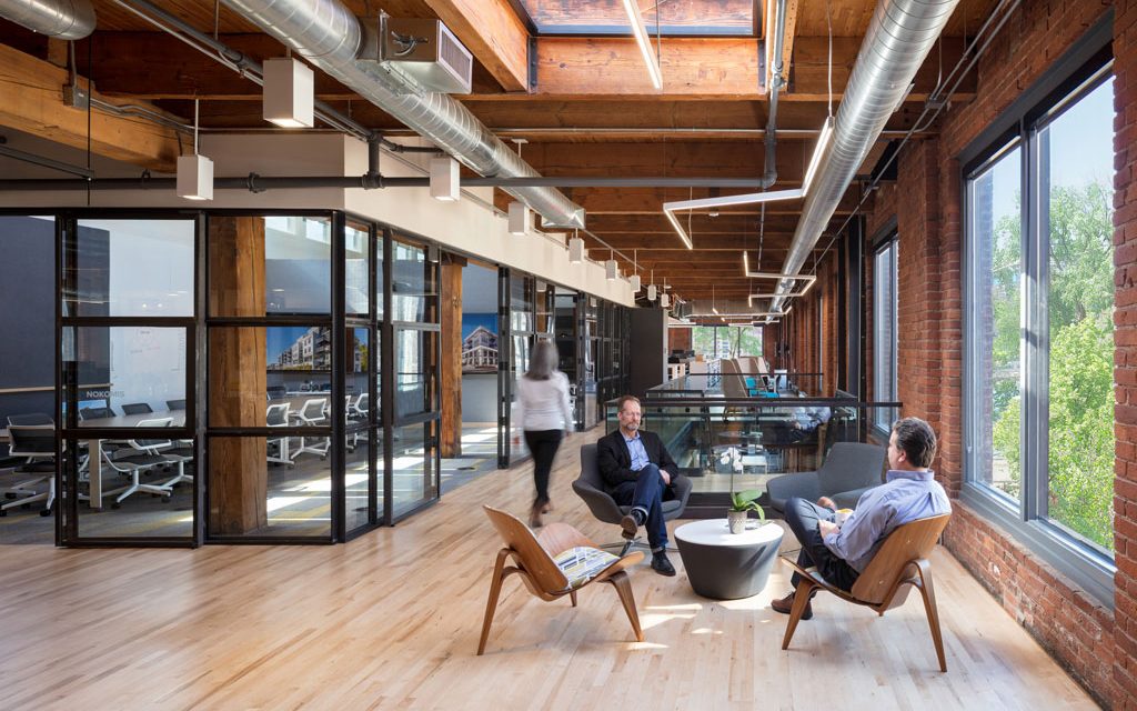
To open up the experience to the river and showcase the vast views of the Minneapolis downtown skyline, the design team moved the “spine” of the space from the center to the side along the expanse of windows. The design focuses on an open feature staircase, which is wide enough for quick conversations. Open table space and flexible seating arrangements along the windows also allow for meetings, quiet work space and gathering spots.
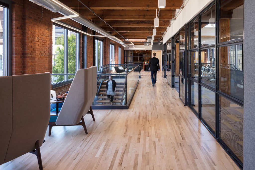
Photo credit: ©Cooperthwaite Photography
“Our former workspace was set up with walls separating the work stations from that shared center space,” said Senior Associate Pete Mikelson AIA LEED® AP. “With the office renovation, we wanted to flip that inside out, putting the shared spaces on the windows and removing walls to maximize daylight and views.”
The renovation process was unique in that Cuningham Group employees served as both the project’s designer and client. As a result, two separate teams, a “design team” and a “client team” were developed. The design team worked to implement the client team’s input and needs, just like any other Cuningham Group project.
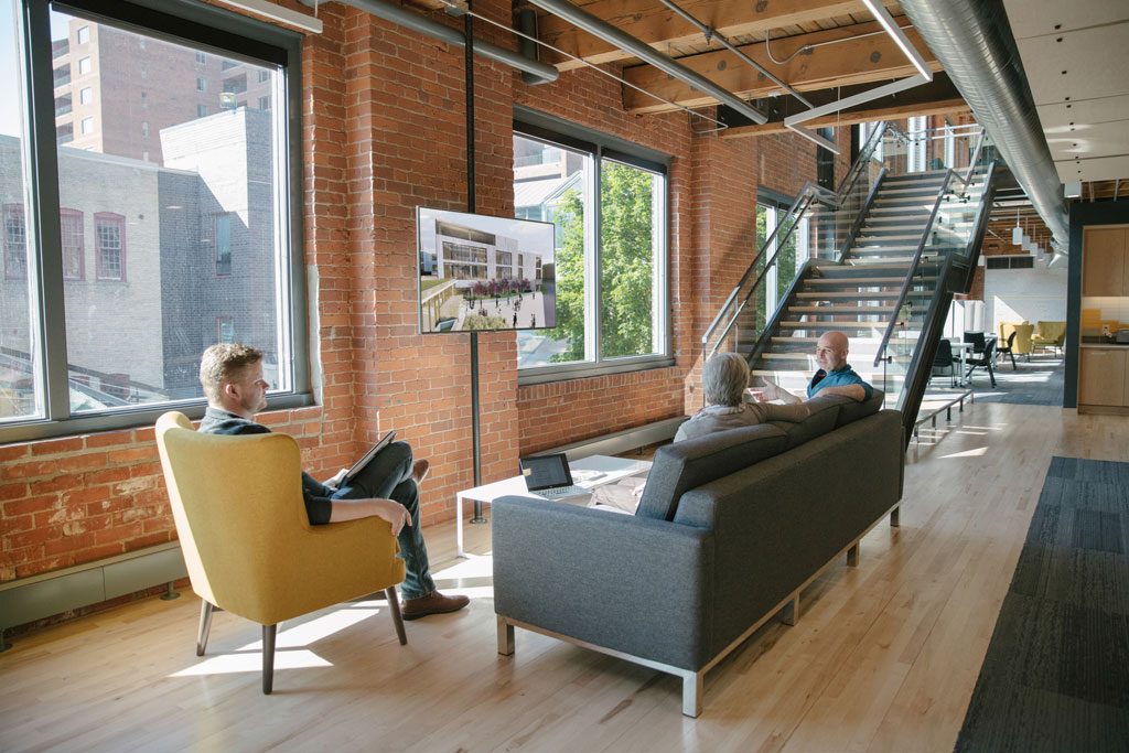
Photo credit: ©Cooperthwaite Photography
The design intent was to honor the building’s unique and historic structure by making simple, yet bold design moves that also elevate the firm’s brand. The focus was kept on the existing building structure and leverages the exposed timber and brick, which are a strong part of the office’s palette.
“The most important feature we wanted to preserve with the renovation was obviously this great historical context that we have around us,” Mikelson said. “The new elements and spaces we’ve added are designed to sit within the heavy timber structure and exposed brick walls, without obscuring them.”
The new environment is also client-focused, as it allows outsiders to get acquainted with the firm in ways that matter to them, whether it’s at the entry or back of house, and how the firm brings clients and partners through the design process.
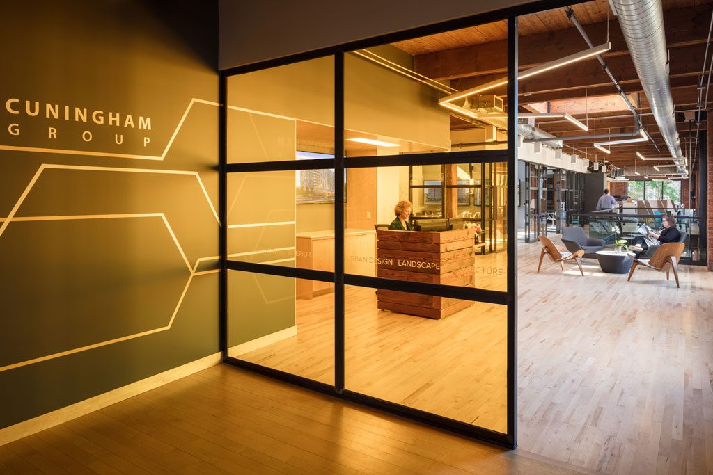
Photo credit: ©Cooperthwaite Photography
Cuningham Group followed the WELL Building Standard™ (WELL), which closely aligns with the firm’s long-standing commitment to the health and wellbeing of its employees. WELL is a building standard which focuses exclusively on the wellness of the people in buildings. It takes a holistic approach to health in the built environment by addressing behavior, operations and design. WELL design features include ergonomic work stations, acoustic comfort, thermal comfort, integrative design and adaptable spaces.
“As an interior designer and an employee, I’m excited and proud that Cuningham chose to pursue WELL,” said Senior Associate and Interior Designer Brittany Johnson. “By committing to the WELL standard, they put a stake in the ground that people come first.”
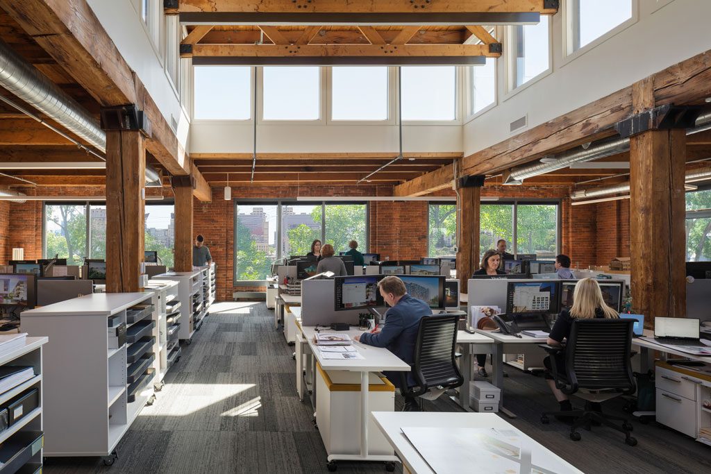
Photo credit: ©Cooperthwaite Photography
Other design features include:
Flexible and shared workspaces: The new office features several multi-functional, shared work and gathering places, including high-use kitchen spaces, informal sitting areas, and flexible furniture.
Strong attention to daylighting: In addition to wide expanses of windows in work and gathering spots, conference rooms feature clearstory windows and skylights.
Finish materials and furnishings: A simple palette of wood, felt and patterned carpet were intended to complement and soften the existing building materials without overwhelming them.
Lab space: A Collaboration Lab and Materials Library is situated in a central location on the second floor. Teams can easily pull materials and review them in various lighting, as well as experiment with new technologies and collaborate with large and small teams.

