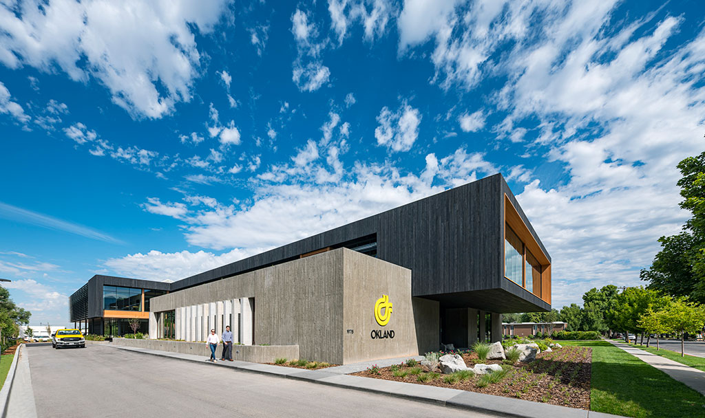
With roots that reach back to 1918, Okland Construction is a privatively-held, family-owned business that has left its mark of craftsmanship throughout North America. Following the partnership working on a multi-phased build-out of Adobe’s Lehi, Utah campus, Okland hired WRNS Studio to renovate and expand their existing headquarters. Using LEED, Living Building Challenge, and WELL, WRNS worked with Okland to craft a healthy, inspirational workplace that connects employees with one another and their natural environment. Strategies focused on using healthy, regional materials, maximizing daylighting and views, and creating a warm and engaging sense of place.
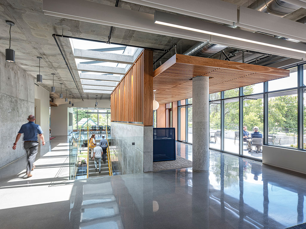
Photo credit: Tim Griffith Architectural Photographer
Drawing on Okland’s spirit of collaboration and origin as skilled carpenters and shipbuilders, material exploration defined the design process. Options were mocked up on site to review quality and ensure resiliency against the local Utah climate. The building’s existing brick was paired back, allowing for the introduction of contemporary building materials like Shou Sugi Ban wood cladding and cast-in-place concrete, specialties of Okland. Materiality also helped code the building: delineating formal from informal spaces and highlighting program hierarchy. The 1st floor Town Hall is clad in cast-in-place concrete, contrasting with the darker Shou Sugi Ban wood that wraps the 2nd floor. A glass and louver system on the existing 2nd floor allow natural light to flow into executive suites and to bring levity to the building’s volume.
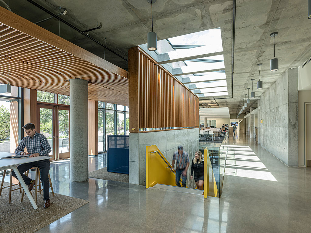
Photo credit: Tim Griffith Architectural Photographer
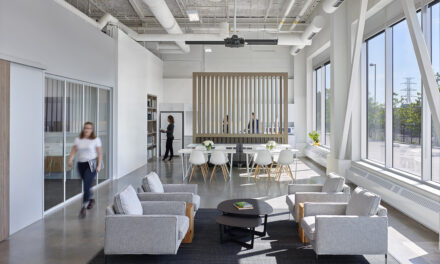
The intensification of color and materiality occurs at high-traffic spaces. Cherry wood, utilized as exterior window mullions, reappears in the reception and lounge areas, contributing warmth to the organic palate. To maintain a visual connection to the lush natural surroundings, the new addition shelters a courtyard planted with regionally-important red oak trees and lavender. A newly established atrium cuts through the existing building, instituting simplified connections between floors and allowing natural light to filter into subterranean rooms.
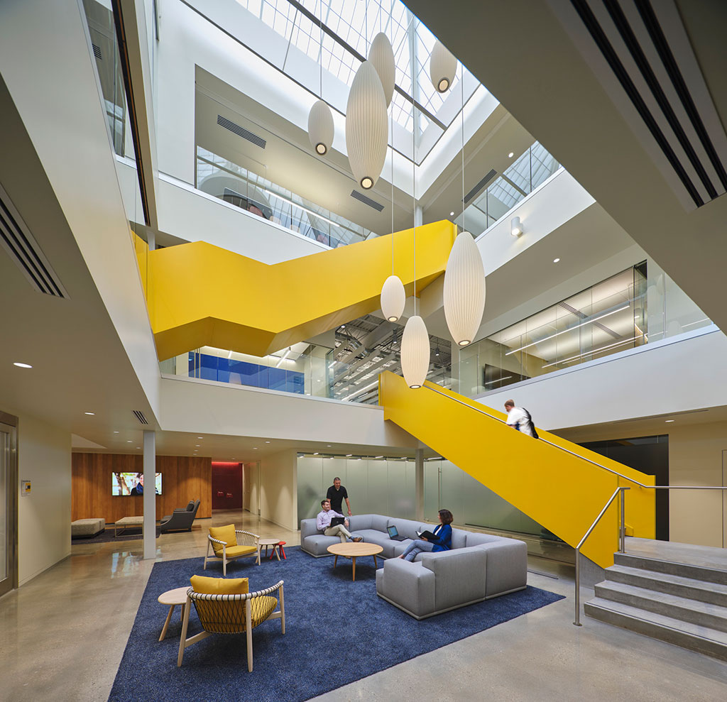
Photo credit: Tim Griffith Architectural Photographer
Concrete and tongue-and-grove black panels create continuity throughout the interior. The new addition extends forward, like a ship’s bow, nearly doubling the workspace, while a new entrance reorients the building, better integrating the modern form into the site’s residential setting.
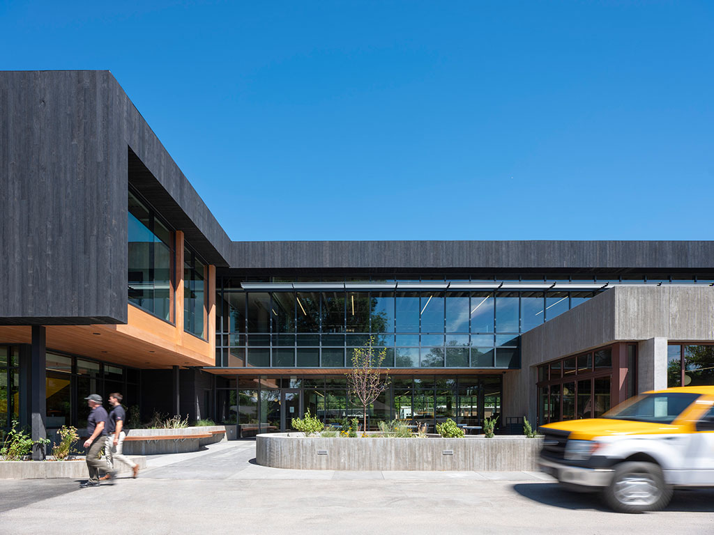
Photo credit: Tim Griffith Architectural Photographer
Woven throughout the interiors, the application of primary colors plays a key role in defining space. Red and blue is favored in gathering spaces. Woven red carpets create individual vignettes accented by blue upholstery, accent wall paint and wall coverings. Blue Heath Tile is also utilized to mark pantry spaces. As Okland’s logo is yellow the color was used sparingly, apart from the main circulation stair where concrete risers are enclosed in lacquered yellow steel, indicative of construction vehicles.
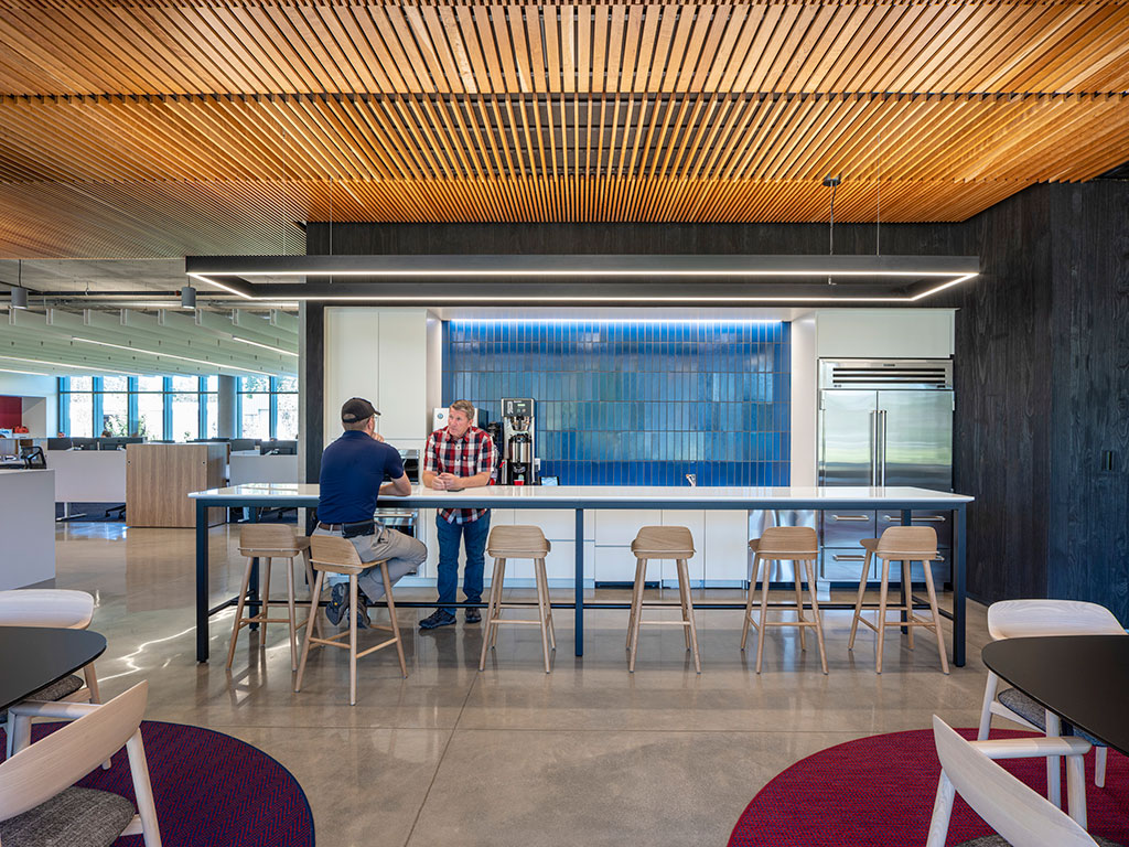
Photo credit: Tim Griffith Architectural Photographer
Throughout the project, the design team engaged Okland in the process, leveraging their expertise to arrive at financially viable, replicable, sustainable design principles and goals which the construction company has extended into employee offerings and company policies.
Credits:
Architect
WRNS Studio
Bryan Shiles
Brian Milman
Tim Jonas
Stephen Kelley
Lauren Bordessa
Alex Jopek
Sade Borghei
Engineers and Consultants
Civil Engineer: Ensign Engineering and Land Surveying
Mechanical and Plumbing Engineer: PVE INC
Landscape Architect: ARCSITIO
Structural Engineer: Dunn Associates, Inc
Electrical Engineer: Spectrum Engineers
Photography: Tim Griffith Architectural Photographer studio@timgriffith.com
Size: 46,318 sq. ft.
Completion: July 2019

