
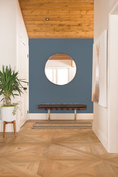
Beyond an annual color of the year selection, PPG’s team of global color experts develop a broader color trends forecast through four trends color palettes and stories, which set the tone for the following year. This year, the selection of Violet Verbena (PPG1169-5) as the PPG PAINTS™ brand’s 2017 Color of the Year was particularly significant because it marked the first time that the color of the year appeared in all four of the 2017 trending color palettes. As a result of the shade’s unique adaptability, Violet Verbena is featured as the focal point of the four color palette stories, symbolizing the larger themes of Hourglass, Essence, Impower and Biocentric.
The HOURGLASS theme is about foundations, origins, and finding stability by updating the familiar. HourGlass trend-lovers look to the classics and historical Relevance for inspiration. HourGlass colors work well in today’s world when blended with a healthy dose of neutrals which continue to be popular in architectural interiors and exteriors.
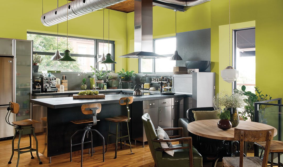
BIOCENTRIC is supported by the philosophy that we are all connected, and that the natural world is once again becoming a dominant design influence. The BIOCENTRIC palette features an organic flight of natural greens accented by an intense yellow on a base of black and white.
The four stories all center on the idea of a Pendulum, which represents an evolving consumer desire to defy convention and blend the once-insolated concepts of gender, relationships, careers, workplaces and living spaces. These palettes, hand-picked by PPG’s color experts, make choosing coordinating colors easy for architects, designers and consumers, no matter the job.
A classic palette with a contemporary twist, in the Hourglass palette, comfort is portrayed in traditions rooted in historical relevance, which extends to interior hues whose popularity has spanned across multiple generations. The palette utilizes rich, elegant hues such as the PPG Paints brand’s Burgundy White (PPG1053-7), Old Mill Blue (PPG1171-6) and Castle Stone (PPG1128-7), blended with a complementary use of neutrals such as Pearl (PPG1087-2) and Go To Gray (PPG1004-1). The combination pairs beautifully with wood, marble and stone tile interiors. Violet Verbena brings a dose of bright, royal modernity to the palette while simultaneously emphasizing the beauty of green, blue and neutral shades.
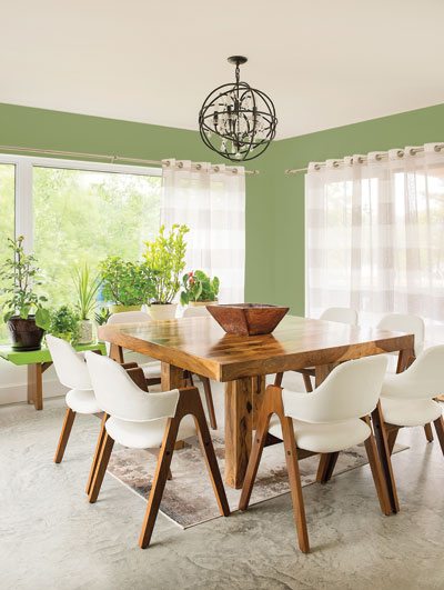
The Essence theme invokes the concepts of purity, minimalism and simplicity. The Essence color trends consist of ocean blues, deep greens and soft blended hues that produce a relaxed, soothing mentality. Many of the palette’s featured colors, Sea Mist (PPG1227-1), Ancestral (PPG1047-4), Almond Cream (1086-3) and Simply Elegant (PPG1155-3), create a calming atmosphere and bring out Violet Verbena’s most sultry undertones.
The Impower palette reflects the changes and personalization (hence the “I’m Power” theme) that every consumer devotes when renovating his or her home. The palette is a compilation of diverse colors, boasting deep tones, light neutrals and everything in between. Similar to Violet Verbena’s versatility, Impower embraces the idea that homes do not have to be defined by one specific color personality. Instead, the palette promotes the mixing of interior design schemes. The palette pairs some of the PPG Paints brand’s boldest colors including Azure Tide (PPG1231-6), Red Licorice (PPG1186-7) and Crushed Pineapple (PPG1213-7) with muted colors such as Willow Tree (PPG1112-6), Gray Violet (PPG1014-5) and Silver Screen (PPG1014-3). Violet Verbena bridges the gap between these shades, allowing them to seamlessly blend together and create a gorgeous aesthetic.
Lastly, the Biocentric color palette portrays the idea that we are all interconnected. Packed with space-inspired hues and saturated organic colors alike, the palette expertly outfits homes with a mix of modern elegance and relaxed charm. Featured food-themed colors Spinach Salad (PPG11-16), Blueberry Muffin (PPG1164-5) and Enchanting Eggplant (PPG13-07) contribute to Biocentric’s organic vibe, while intergalactic hues like Black Flame (PPG1043-7), Cavalry (PPG1041-7) and Witchcraft (PPG1037-7) bring blue-black mystique to the narrative and combine beautifully with Violet Verbena.
PPG: WE PROTECT AND BEAUTIFY THE WORLD™
At PPG (NYSE:PPG), we work every day to develop and deliver the paints, coatings and materials that our customers have trusted for more than 130 years. Through dedication and creativity, we solve our customers’ biggest challenges, collaborating closely to find the right path forward. With headquarters in Pittsburgh, we operate and innovate in more than 70 countries and reported net sales of $14.8 billion in 2015. We serve customers in construction, consumer products, industrial and transportation markets and aftermarkets. To learn more, visit www.ppg.com.
We protect and beautify the world is a trademark of PPG Industries Ohio, Inc.
