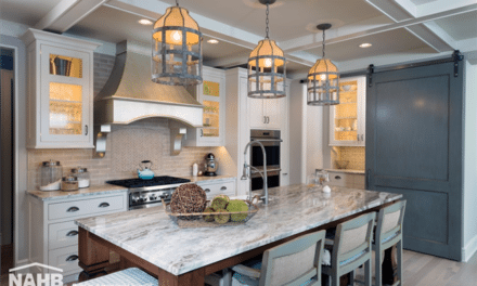
Sherwin-Williams creates balance through color with collections for the new Residential, Commercial, Hospitality, Healthcare, Multi-Family and Education segments. Based on the 2021 Colormix® Forecast, four collections were translated to help professionals bring timely colors to interior and exterior residential and commercial spaces.
“We strive to provide inspiration and resources to every professional to help them create functional and beautiful spaces for their clients,” said Michael Plank, director of color marketing and design services at Sherwin-Williams. “From the front door of a new home to a hotel lobby or hospital waiting room, these color collections bring spaces to life through a balanced collection of inviting, on-trend and revitalizing colors.”
Each collection incorporates the four 2021 Colormix® Forecast palettes – Sanctuary, Tapestry, Encounter and Continuum – to assist designers and professionals in creating balanced environments.
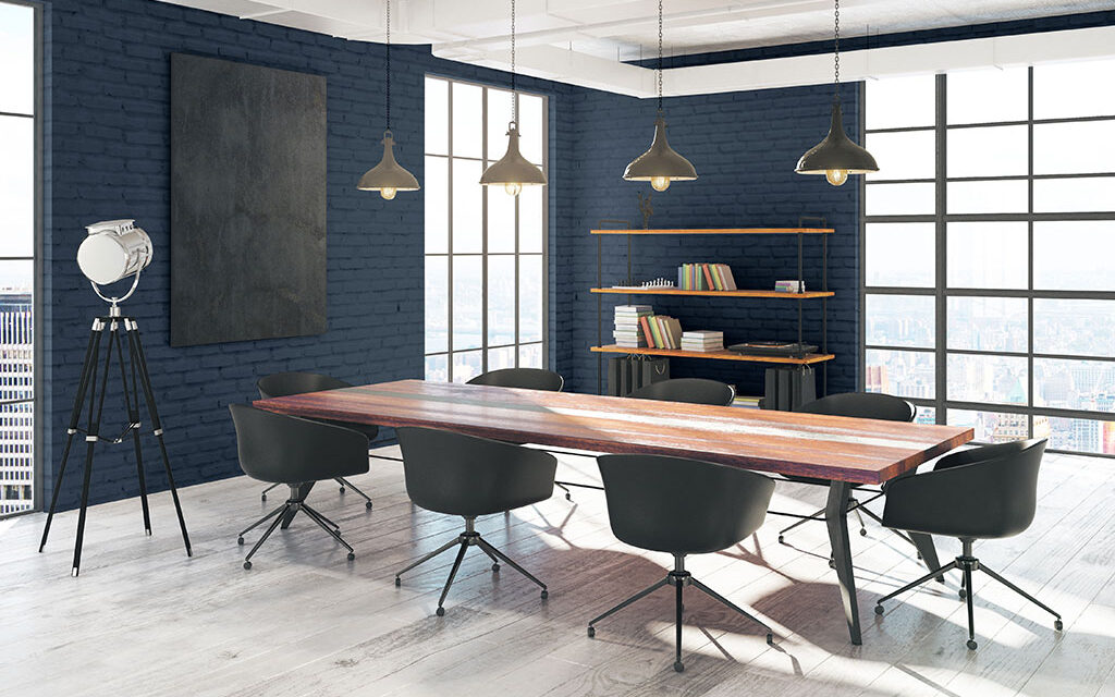
Commercial Color Collection
- We now crave the comforts of home in our commercial environments for when we return to work. The Sanctuary palette brings a dose of coziness to an office environment through its color palette of naturally inspired neutrals like Morris Room Grey SW 0037 and Pure White SW 7005.
- Commercial spaces should reflect the unique and creative personalities of the people who inhabit them. The Tapestry palette pairs bright uplifting colors like Embellished Blue SW 6749 against bold classic hues such as Tricorn Black SW 6258 to create a fresh and vibrant backdrop for work spaces.
- We look to visual cues from the past to preserve the new spaces of the future. The Encounter palette is made up of organic earth tones, like Java SW 6090 and Blustery Sky SW 9140, which are ideal for giving new life to repurposed commercial spaces in small or large settings.
- Technology is essential to offices, but it should blend seamlessly into the environment. As our digital futures find harmony with our everyday, the Continuum palette sets the tone with dark hues like Cyberspace SW 7076 and bright colors such as Novel Lilac SW 6836 to create calming yet forward-thinking spaces.
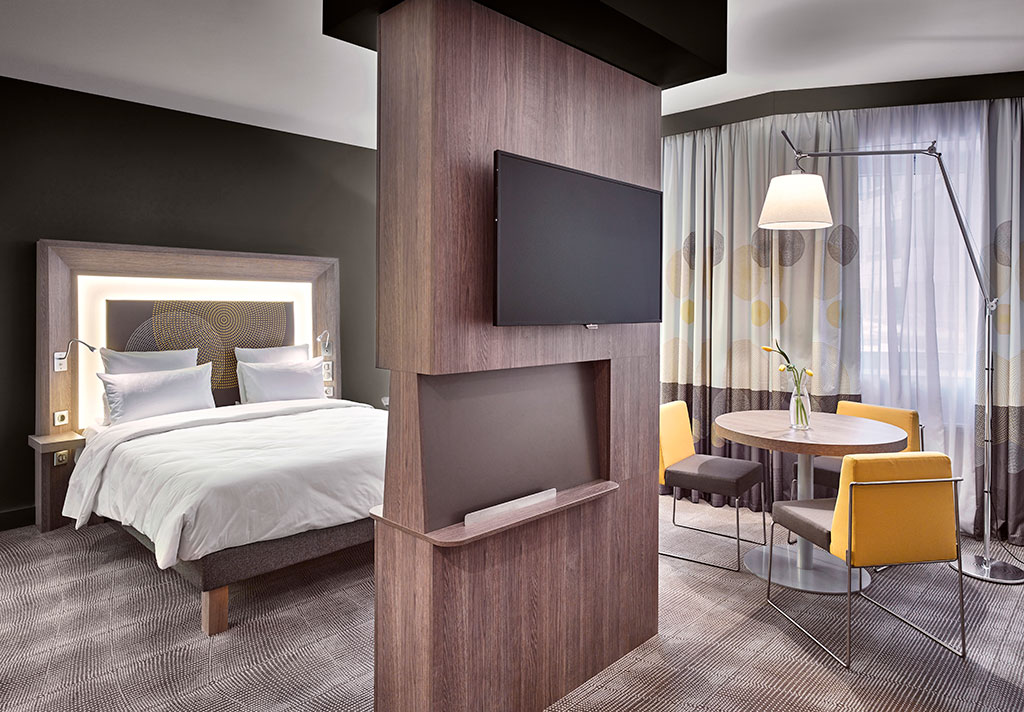
Photo courtesy of Sherwin-Williams
Hospitality Color Collection
- Travel in the future will focus on creating a well-being respite for both mind and body. To create these holistic spaces, the Sanctuary palette uses neutral and biophilic-inspired hues like Canyon Clay SW 6054.
- Traveling to new places brings a sense of joy to everyone. The colors of the Tapestry palette create unique, authentic experiences in lobbies or restaurants through bright hues like Jaipur Pink SW 6577.
- Hotel design embraces the local community by showcasing local artwork, landmarks and food to enhance the visitor’s overall experience. The Encounter palette uses grounding colors such as Alabaster SW 7008 to accentuate pieces from the local environment or a decorative architectural element.
- New science methods and technologies will allow us to adapt and reimagine our travel experience. The colors of the Continuum palette are futuristic, such as Limón Fresco SW 9030, yet also serene to help hotels find their balance between technology and human connections.

Photo courtesy of Sherwin-Williams
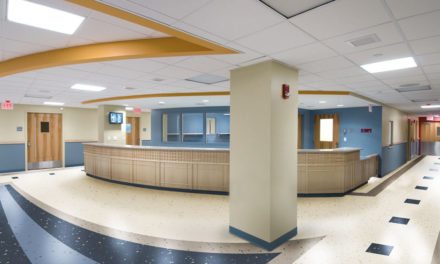
Healthcare Color Collection
- Now more than ever, it is important to provide healthcare environments a sense of comfort and well-being. The Sanctuary palette features a range of colors like Pearl Gray SW 0052 to provide softness as well as biophilic hues such as Oakmoss SW 6180 to be used as accents or focal points throughout a facility.
- Pediatric areas specially benefit from optimism and happiness. The Tapestry palette is all about finding the joy in a space’s surrounding with bright, fun and uplifting colors like Jovial SW 6611.
- As we reflect on the simplicity of the past, we focus on the experiences that mean the most. Grounding earth tones, such as Reddened Earth SW 6053 and Tarnished Trumpet SW 9026, are the backbone of the Encounter palette and look calming in senior living facilities, waiting areas or patient rooms.
- Technology is a vital component to the future of healthcare. The Continuum palette uses watery blues, like Great Falls SW 6495, to balance out a space by bringing a serene quality to any heath environment.

Photo courtesy of Sherwin-Williams
Multi-Family Color Collection
- As the world continues to work remotely, homes become essential to well-being. The Sanctuary palette brings together the principles of biophilia and shows how natural and muted tones like Urbane Bronze SW 7048 on a building’s façade or interior have the remarkable ability to nurture wellness.
- It’s also essential to surround ourselves with environments that make us feel good. The Tapestry palette uses color such as Enjoyable Yellow SW 6666 to tap into our emotions and creative expression.
- For 2021, we explore a more untamed take on natural themes to create modern interiors. The Encounter palette reflects on these themes with a collection of earth tones, like Hardware SW 6172, to make connections with its inhabitants and create a truly one-of-a-kind look.
- An ethereal spectrum with a focus on smart living is at the touch of our fingertips. Continuum’s palette of forward-thinking colors like Moonraker SW 6701 bring innovation and optimism to small spaces.

Photo courtesy of Sherwin-Williams
Education Color Collection
- Students and faculty are searching for comfort in the new normal when they are in the classroom. The Sanctuary palette focuses on the principles of biophilia through natural daylight and by using warm and muted tones, such as Modern Gray SW 7632, within the spaces.
- Whether for a kindergartener or a college student, educational spaces need to reflect the creative personalities of their inhabitants. The Tapestry palette encourages thinking outside the box with bright and bold colors like Cape Verde SW 6482.
- As we reflect on the simplicity of the past, students begun their school year in a journey of their own personal history. The Encounter palette features grounding colors, including Rosemary SW 6187, to provide bold backdrops for classrooms, common areas or respite spaces for students and staff.
- Technology is very much a part of our day-to-day as well as our educational experience. The Continuum palette seamlessly blends this continuous digital future with our everyday hybrid of synthetic and natural through a range of blues, including Great Falls SW 6495 and Wishful Blue SW 6813, to create a sense of well-being and versatility.
For more information and to view the palettes, visit s-w.com/colormix.

