Designing healthcare spaces for kids: Infusing a sense of exploration and curiosity
It’s possible to maintain a youthful sense of whimsy while staying realistic and on-budget for your project
What’s it like to design a healthcare space for children? Is it possible to infuse that space with imagination and whimsy, while simultaneously following the practical rules of a healthcare setting, such as infection control, times of operation, and safety?
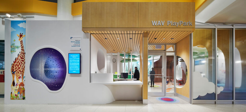
These are the questions that inspired our designers to take a unique approach to the redesign of the Women’s Auxiliary Volunteers (WAV) PlayPark at SickKids Hospital in Toronto. The PlayPark is a volunteer-run space for the siblings of young patients who are at the hospital for treatment. Over the years, the much-loved PlayPark had become outdated. Our designers were tasked with not only updating the look but upgrading the space to be more functional and accessible.
Two of members of the PlayPark design team—Laurena Clark and Olivera Sipka—sat down to discuss their approach and provide advice for others designing similar spaces.
What was different about the SickKids PlayPark, compared to others that you’ve worked on?
Laurena: As designers, we always empathize with, and put ourselves in the position of, the people who will use the spaces we design. But with this project, we realized we needed to get to an even deeper level of emotion. SickKids provided us with touching information—like quotes from kids that have loved the space over the years—that made us more emotionally attached. One young man, who is now in his 20s, wrote about how he was so young when his brother began a stay at SickKids, and this young man felt so lost. Both of his parents were busy with his brother’s care, and the young man never got to see his friends. But he had the PlayPark. He wrote about what a joy it was to visit the PlayPark at such a gloomy time in his life. So, redesigning a space that makes such an impact on the lives of young people is a tremendous responsibility. And my kids are the same age as typical PlayPark visitors, between the ages of 4 and 9. So, on an emotional level, that also impacted my design approach.
Can you talk more about your specific design approach for this project?
Laurena: We were doing so much more than designing a “space.” We were creating an experience for those kids and families. We added zones inspired by nature—like a lake, canyon, and hills—so we could bring a park setting to kids that are inside for long periods of time. Also, the PlayPark isn’t just a space that has a certain function. Most of the spaces we design—such as waiting rooms, for example—have specific functions in mind. And, while a waiting room might have some toys and games, those are isolated activities. As soon as you walk into PlayPark, you’re intrigued to explore. We also had to include so much more depth in the design and the activities available because many kids come to the PlayPark for extended periods of time—days, months, even years. We had to pack a lot more in than you might find in a typical waiting room where a child may only visit for a few hours at a time.
Olivera: We designed every corner to offer something unexpected. We turned storage cabinets into magnetic boards, so kids can play with magnetic images. And we added another storage cabinet where we designed translucent panels that overlap. When you slide them over one another, they produce different colors. You can explore what happens when green overlaps with yellow, for example. We turned every surface into an experience.
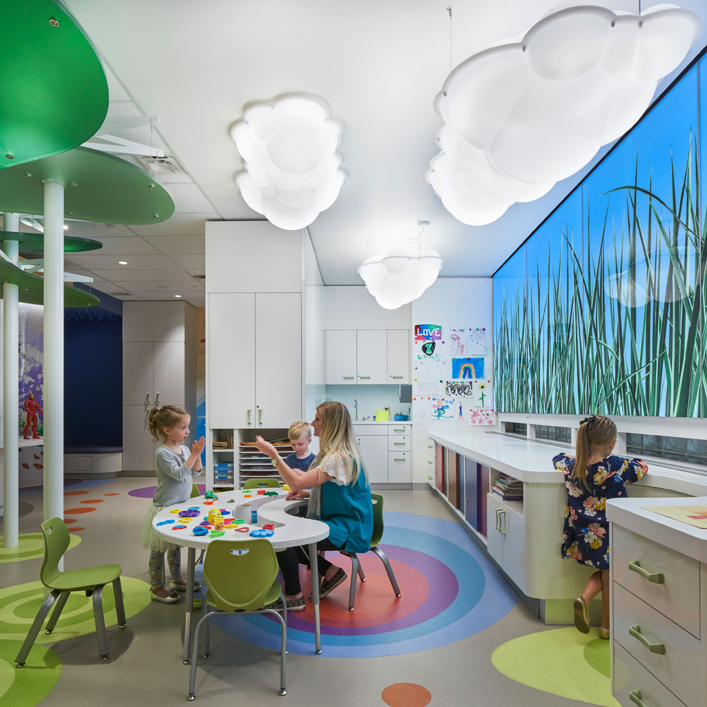
Stantec’s design team took inspiration from nature for PlayPark. Photo credit: Richard Johnson
Can you tell us more about the zones inspired by nature? What does that look like?
Laurena: We created a forest landscape in the central open space, which features trees made of thick resin panels to create a “leafy” canopy. The tree trunks are a perfect place to wind through on a tricycle. We added a quiet “cave nook,” with fiber-optic twinkling lights in the ceiling, to create the sense of sitting beneath the stars. This is a space where kids can sit quietly when they might not want to engage. It was important to us that kids have choices as they go through a difficult time. The art studio area features a meadow theme with a giant LED panel of tall grasses with lights overhead that look like fluffy clouds. The performance space is designed with curves to suggest hills, with an organic-shaped seating nook and original illustrations.
What’s your advice for others designing a space for children?
Laurena: Open communication. Create an environment of trust and respect so team members feel comfortable throwing ideas out, even if they’re not perfect.
Olivera: It’s about listening. Make sure you listen to kids’ experiences. While working on this project, we listened to children, parents, and even teenagers who used to visit the space when they were younger. We met a guy who happened to stop by PlayPark during one of our site visits, and he told us that his favorite childhood memory of the space was looking through a window at a loading dock, because he loved to watch the trucks. In our original design, we wanted to block that view of the loading dock. But, once we heard his feedback, we adjusted our design to provide a little cutout in the cabinet, so kids can watch the trucks.
How did you get into the child-like mindset necessary for PlayPark’s redesign?
Laurena: I just had to shut everything off. For healthcare projects, we’re so used to working within the confines of budget, time, and cleanability. So, I had to stop thinking about all the practical things that block ideas from coming freely.
Olivera: I built on my own experience. I tried to remember what I liked as a kid, and what my kids liked. And then I listened to experiences from PlayPark staff and kids. I made sure to consider other factors—like what kind of materials we could use—afterwards.
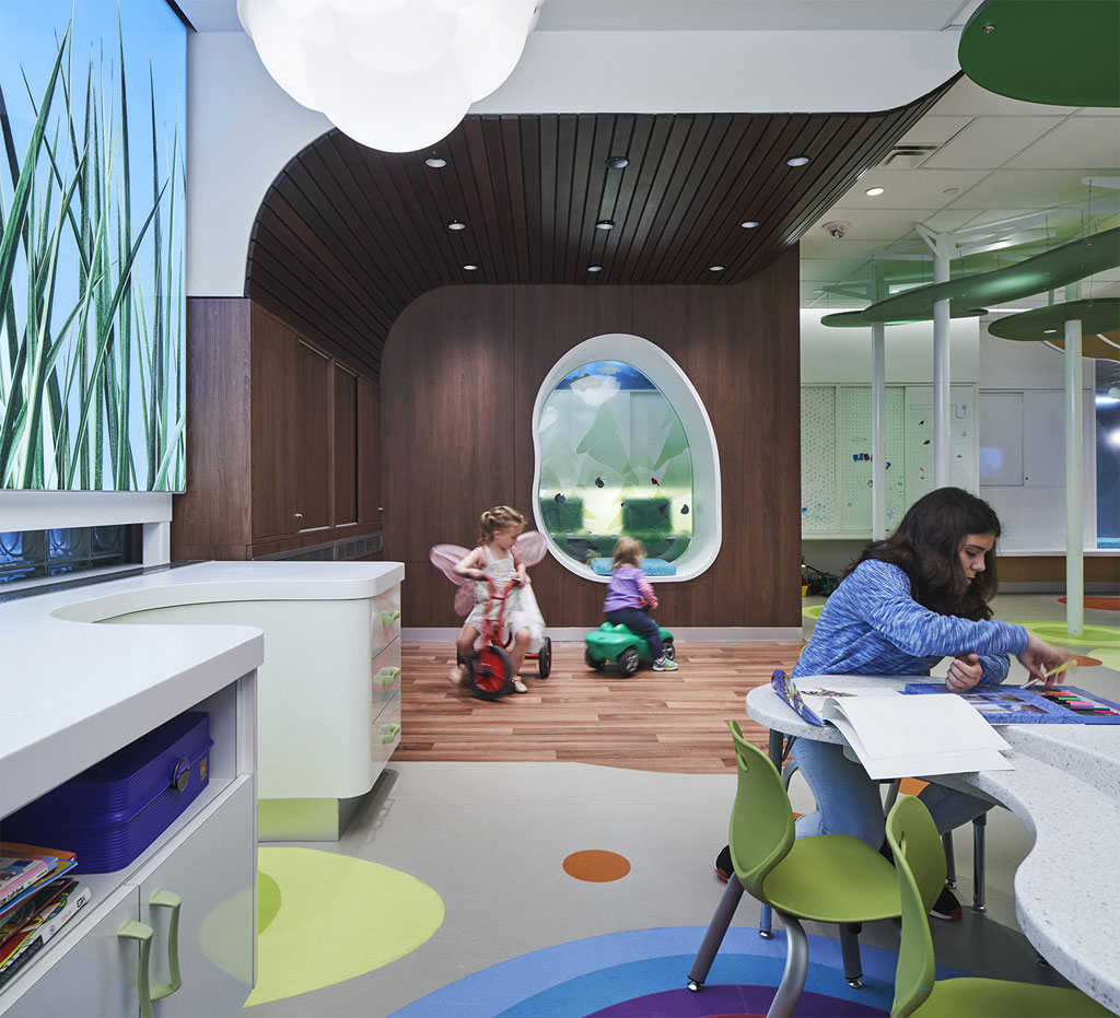
When designing a children’s space, “don’t just focus on technology. When designing for kids, we often tend to look at new technologies, such as interactive screens. But with this project, the focus was on play,” says Olivera Sipka. Photo credit: Richard Johnson
Can you think of something from your own childhood that you brought to this project?
Laurena: I have lots of memories of exploring freely as a child, such as exploring outside, or looking through my mom’s closet and playing dress-up. So, I wanted to bring a feeling of exploration, as well as surprise. During a visit to PlayPark, my kids loved looking through the cupboards and finding the toys that were in there.
Every surface has storage behind it. That alone is an element of exploration. This contrasts with a lot of other pediatric spaces, where you see toys everywhere. It feels busy, and it’s almost overstimulation. Whereas at PlayPark, you have a clean, bright, airy space, and you can interact with surfaces in different ways. All the clutter is hidden. And there’s that element of surprise, as kids discover what’s behind each door.
Do you have any final pieces of advice to offer someone approaching a project like this?
Laurena: It’s possible to create a fun space while simultaneously working within the confines of a hospital. We designed PlayPark to hospital standards, in terms of infection control. We used all the same materials that other healthcare spaces use—like rubber floors and solid surfaces—and we considered cleaning, like you would in any other area of the hospital. Everything was wipeable. You can utilize those materials in a way that creates an environment that doesn’t look institutional.
Olivera: Don’t just focus on technology. When designing for kids, we often tend to look at new technologies, such as interactive screens. But with this project, the focus was on play. It turned out to be more of a whimsical place, where kids have opportunities to be themselves.
Stantec has captured a prestigious Award of Merit from the Association of Registered Interior Designers of Ontario (ARIDO) for the design of PlayPark. Look for a presentation by Laurena Clark at the Interior Design Show (IDS) in Toronto in January 2019, where she’ll be discussing her design approach to PlayPark during her talk.
About the authors
 Laurena Clark
Senior Interior Designer
Laurena Clark has focused her work on healthcare interior design for more than 10 years. Laurena considers the users—from patients to family members to staff—and works to create an environment that supports them as well as encourages better health outcomes.

Olivera Sipka
Senior Associate
Olivera Sipka is focused on healthcare design and has a special interest in developing the design of pediatric facilities as well as designing for behavioral health and senior care. Making sure that her designs always have a positive impact is Olivera’s goal.
About Stantec
Communities are fundamental. Whether around the corner or across the globe, they provide a foundation, a sense of place and of belonging. That’s why at Stantec, we always design with community in mind. We care about the communities we serve—because they’re our communities too. This allows us to assess what’s needed and connect our expertise, to appreciate nuances and envision what’s never been considered, to bring together diverse perspectives so we can collaborate toward a shared success. We’re designers, engineers, scientists, and project managers, innovating together at the intersection of community, creativity, and client relationships. Balancing these priorities results in projects that advance the quality of life in communities across the globe. Stantec trades on the TSX and the NYSE under the symbol STN. Visit us at stantec.com or find us on social media.

