How much daylight is right for today’s tech-enabled schools?
by Shivani Langer, Senior Project Architect, Stantec
May 7, 2019
Wall-to-wall windows might be too much of a good thing for some classrooms
For education facility designers, daylighting is wonderful. It means that buildings potentially use less artificial light and are more sustainable. And research has shown again and again that access to daylight benefits students, their performance, their comfort, and their health. But schools are increasingly technologically-enabled places and artificial lighting efficiency has come a long way. Together, these trends suggest that we pause and rethink daylight design to ensure we are designing with attention to changing learning environments and user comfort.
Post-occupancy studies (POEs) are extremely valuable to designers. They show us whether our most thoughtful design intentions are working out for users as intended. These POEs have been instrumental in providing us lessons learned regarding what design strategies are successful or not so successful as they relate to satisfaction, comfort, and wellbeing of our users and strategies that are successful in lower energy usage in the buildings we design.
Stantec’s Research + Benchmarking group investigates best practices and benchmarks our designs against others so we can apply this knowledge in our future design processes. When we do post-occupancy studies, we send unbiased industry standard Indoor Environmental Quality user surveys to teachers, administrators, and maintenance staff. We also perform occupant, client, facility managers and project team interviews. We gather and analyze the building’s energy and water usage data.
We thought it would be hugely beneficial to go back and look at how our schools perform. Since 2012-13, we’ve studied both old and new elementary and middle schools in Texas school districts where we work—some schools designed by us, some designed by others—to see how they rate in categories such as daylight, views, thermal comfort, acoustics, and maintenance.
Overall, we discovered that our designs rated highly, even on difficult and often subjective metrics like thermal comfort. Our biggest wow moment was discovering one area of dissatisfaction that really stood out: Daylighting.
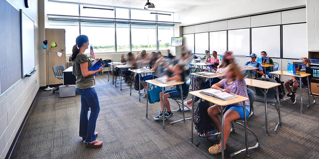
In two of the schools with wall-to-wall glazing and with sunshades and light shelves, we discovered that user satisfaction regarding daylighting was very low, in fact even lower than for traditional classrooms with two windows at the corner of each room. Users said: “There’s too much light, we can’t see the projections” and the like. Further analysis of the survey data and user responses indicated that the major source of dissatisfaction was glare and the inability of the students to see notes on the marker board or projections on the screen in their classrooms.

At left: User comments at classrooms with punched windows and controls, showed much higher satisfaction with daylighting. At right: Blinds were added to classrooms but were left permanently shut above light shelves and inaccessible. Despite this, content on smartboards is not visible from parts of the classroom.
Our site visits showed something equally disconcerting, lack of lighting control. One of the schools we visited, where we had not provided blinds in the top windows above the light shelves, had added those later. These blinds unfortunately are not accessible and are always closed.
So, what do we tell our designers about finding the sweet spot? What’s the optimum window-to-wall ratio we should be targeting? And are there any other side effects of this kind of glazing on function that we should consider?
More research was required.
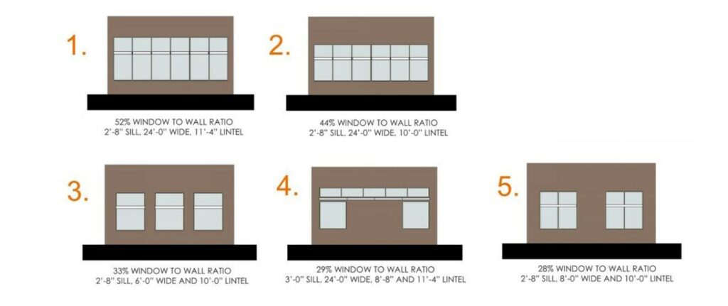
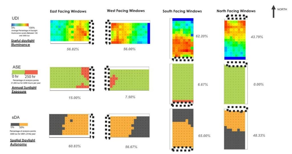
We studied five sizes and configurations of windows in a typical classroom in Houston, Texas, at different orientations, with and without sunshades and light shelves. We studied the effects of daylight from each of these scenarios in the space. We applied daylight analysis metrics as defined in LEED v4 and the WELL Building Standard and looked at the Useful Daylight Illuminance (UDI) metric and Daylight Glare Probability (DGP) models created in LightStanza software.
How much of the daylight is “useful”?
What did we find out from our daylight studies? The size of a window, facing most orientations in this climate, is not directly proportional to the amount of useful light available in a space. The actual “useful” daylight (as defined by the new rating systems) is actually lower in the case of larger windows. Therefore, designing big windows doesn’t necessarily mean adding quality daylight in a space. Because glare is not considered useful, the amount of useful daylight available from a space with a 28% window-to-wall ratio may be higher than one with 52%.

Comparative study of five classroom window sizes and configurations.
We also looked at the impact of the different scenarios of window configurations on mechanical systems and on overall building cost. We looked at how peak and overall cooling loads increase when we increase glazing in different orientations and how those are affected, if at all, by using sunshades and light shelves. Our study showed that boosting glazing area led to larger design loads, potentially leading to the necessity for larger cooling units on a project.
Our study doesn’t mean that we recommend eliminating or minimizing windows too much. And because we understand the inherent benefits of daylight, our study doesn’t examine windows that amount to less than 28% of window-to-wall ratio. But it shows how just increasing window size may not improve the quality of daylight in a space. In fact, if the windows are too large, they may cause discomfort to our users while also adding unnecessary cost of construction and increasing the size of our HVAC systems.

Example of daylight study computer simulations.
Design for K-12 schools means working with limited budgets and catering to many students and staff. The cost of glazing with frames, structure to support masonry above windows, and blinds is not insignificant. It’s important to understand the budget impacts of every linear foot of glazing we add in a classroom and justify it with useful light, while keeping heating and cooling impacts in mind.
Designing daylit spaces that ensure user comfort and wellbeing in a school’s widely used space was the goal of this research. And in this care, we’ve gained valuable insight and information that will inform our classroom window designs moving forward.
About the author
 Shivani Langer, Senior Project Architect, Stantec
Shivani is a LEED-accredited architect with over 16 years of architectural experience including 11 years of experience in educational facility design. She’s worked with many school districts and higher education clients throughout Central Texas on academic, athletic, and transportation facilities, residence halls, biomedical research labs, and support services/office buildings.
She’s also served as architect and LEED administrator for many high-performing education buildings including net zero and net zero ready projects.
Shivani leads Stantec’s Sustainability Research + Benchmarking team and also serves as a BIM Coordinator for the South Central Buildings group. She has led firm-wide efforts for the AIA 2030 Commitment and for post-occupancy evaluations on many education buildings. Her thoroughness, attention to detail, and eye for design makes her a valuable asset to any architectural team.
If she isn’t in the office, you might find Shivani spending her free time walking, hiking, and relaxing with her family outdoors.


