
Business
Today’s open offices often include both individual and communal work areas that encourage interaction and collaboration. These spaces where many people spend most of their time outside of home may feature generous use of natural light and sustainable elements that provide an ecological vibe and a homelike, comforting feel.
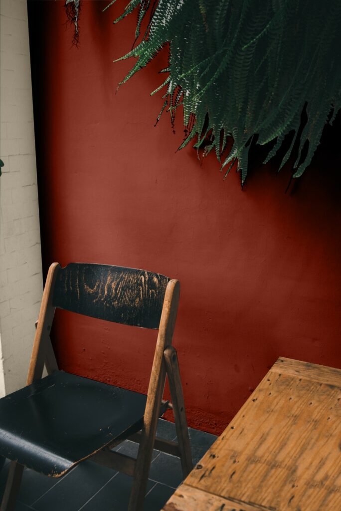
Such interiors lend themselves to rich, complex earth colors that are deeper in value. For example, a deep Half-Caff brown on an accent wall adds warmth to an entrance and a perfect backdrop for a company’s logo or gallery of artwork. On the other hand, a rich Cavern Clay behind a high-top counter offers a coffee-shop atmosphere, and a golden honey yellow creates a pop of interest alongside the grays of structural concrete in a collaborative space.
Natural Ground Palette
Education
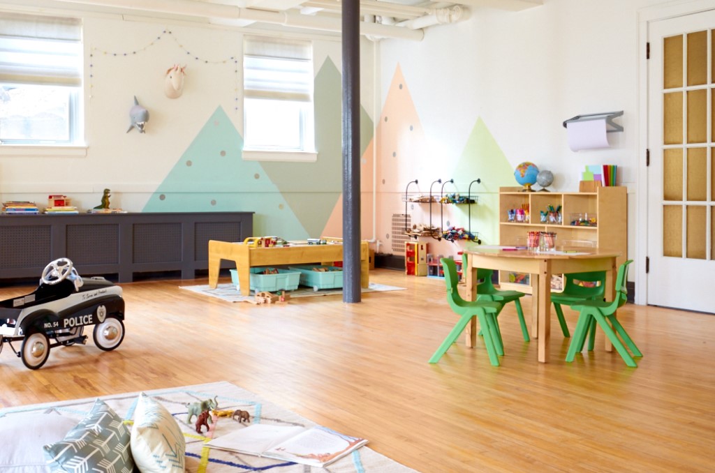
In schools, holistic organic colors that are chalky, beautiful and simple create a softer effect that isn’t distracting, helping to foster a more comfortable atmosphere for learning that encourages concentration and inspires curiosity. Colors like Sumptuous Peach, Copen Blue and Cascade Green provide a neutral backdrop while creating a visual connection to the outdoors. These colors can be used to create anything from a cozy reading nook to a hallway for showcasing student art.
Pops of bold colors, used sparingly, add visual interest and stimulation to educational settings. Fun, energetic colors such as Invigorate orange or Calypso blue can bring life to an accent wall or a row of storage cubbies, or can aid in navigating a school campus.
Nurtured Nature Palette
Health Care
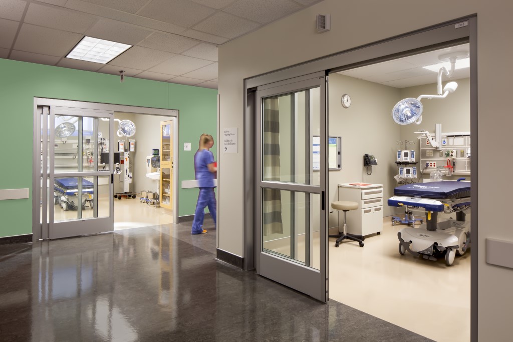
Different health care environments require different palettes to meet the needs of patients, their families and staff alike. However, they are all designed to make patients and guests feel at ease while away from home and to evoke motivation and optimism to get through the journey ahead.
In pediatric and rehabilitation spaces, vibrant colors provide an uplifting sense of wellness. A sunflower yellow, an appealing Forget-Me-Not purple or a deep Begonia pink can enliven an otherwise clinical environment that has an abundance of whites and grays. For acute care areas, mid-tones that recall earthy greens, sky blues and sunset oranges create softer appeal, along with a clean, residential feeling.
Connected Calm Palette
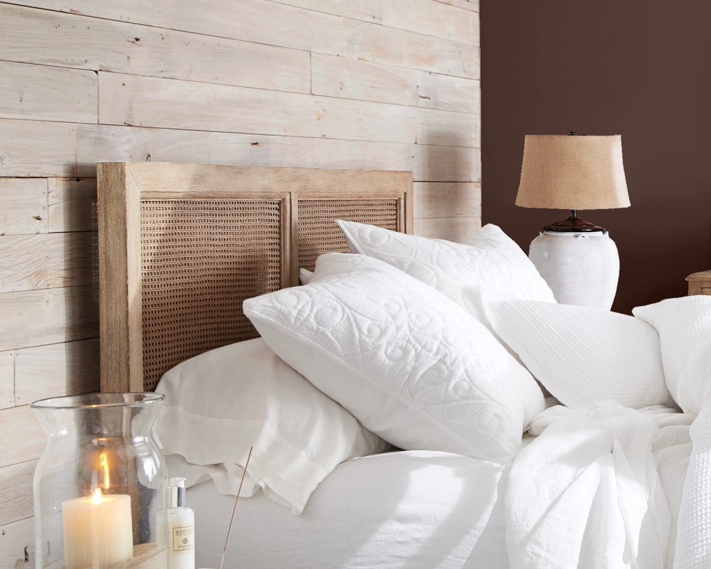
Senior care centers lend themselves to colors that are more hospitality-driven, evoking a welcoming environment. Colors and finishes that are deeper in value and complexity, such as Blustery Sky blue, Tatami Tan or Baked Clay, provide for an earthy, nature-derived atmosphere and complement many types of flooring, including soft patterned carpeting as well as wood and stone elements. The effect is soothing and homelike, with a calm feel that beckons residents to sit and read or chat with friends and visitors.
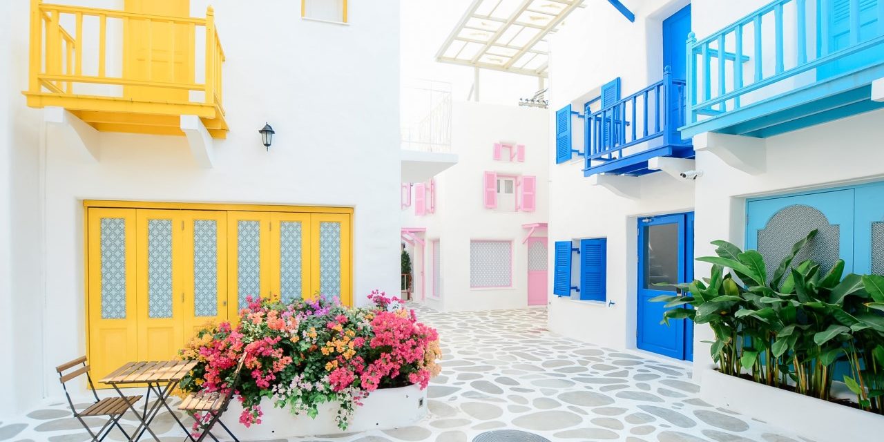
Hospitality
When it comes to hospitality interiors, a variety of color moods — whether nostalgic or tech-driven — appeal to travelers seeking the best of the past with a look to the future.
Playful colors that bring to mind the great American road trips of the ’50s, ’60s and ’70s can provide a fresh take on retro-styled interiors. A wall of Parisian Patina green evokes the color of a classic Volkswagen van, while a breakfast bar painted Youthful Coral brings back the aesthetic of a midcentury kitchen.

Retro Revival Palette
With the popularity of rugged mountain retreats and the desire to connect with the great outdoors, colors of the forest and desert, such as Copper Mountain terra cotta, Palm Leaf green or Prairie Grass add a nostalgic, yet updated, complement to traditional buffalo plaids and Western patterns, offering a welcoming appeal in a guest room, self-serve kitchen or bar area.
Off the Grid Palette
For travelers in search of what’s next, Instagram-inspired colors such as Eros Pink or blue-green Rivulet put a modern, buzzworthy twist on anything from hotel doors to walls in café dining areas.
In today’s commercial spaces, using color effectively not only enhances the aesthetic, but impacts how well people work, connect and feel while spending time in them. These market segment palettes are designed to inspire professionals to think about how to use color in new ways, bringing their clients’ visions to life.
For more information, visit s-w.com/marketcolors.
About the author
 Emily Kantz, interior designer, color marketing & design, Sherwin-Williams
Emily Kantz is a NCIDQ Certified interior designer focused on the commercial, hospitality and healthcare market segments. Emily also holds an Evidence-Based Design Accreditation & Certification and is a LEED accredited professional and has been in the design industry for eleven years and with The Sherwin-Williams Company Color Marketing & Design Department for seven years.

