
According to AARP, one in five Americans will be 65 or older by 2030. These knowledgeable shoppers bring significant buying power and financial resources to upgrade their spaces and improve their communities. However, whether they are out locally in public spaces or looking to downsize, they may not think about how universal design can affect their daily lives. And, as we become more aware, builders, architects and designers are increasingly being called upon to renovate and design spaces for people of all generations and abilities to enjoy.
This is where universal design comes into the picture, enabling professionals to suggest subtle touches that can make aging in place easier, without sacrificing style, such as decorative grab bars in the bath, cabinet storage that pulls out, and two-level counter heights for easy access whether standing or sitting in a wheelchair. Other subtle but important design strategies can include choosing colors that are easier for older eyes to see and that add contrast for easier navigation, and installing purposeful lighting that increases safety.
By incorporating the principles of universal design, and gaining a better understanding of the role of color, sheen and lighting on aging eyes, professionals can create environments that not only meet their clients’ needs, but work for all ages and abilities.
Courtesy of Sherwin-Williams
Principles of universal design
Universal design is the design of products and environments to be usable to all people, to the greatest extent possible, without need for adaptation or specialized design. A space that incorporates universal design principles benefits those of everyone, from senior citizens to young children — while maintaining a seamless, beautiful atmosphere.
There are seven key principles of universal design:
Equitable use: useful and marketable to people with diverse abilities
Flexibility in use: accommodates a wide range of individual preferences and abilities
Simple and intuitive use: easy to understand, regardless of experience, knowledge, language skills or current concentration level
Perceptible information: communicates necessary information, regardless of ambient conditions or users’ sensory abilities
Tolerance for error: minimizes hazards and adverse consequences of accidental or unintended actions
Low physical effort: can be used efficiently and comfortably with a minimum of fatigue
Size and space for approach and use: can be reached, manipulated and used, regardless of body size, posture or mobility.
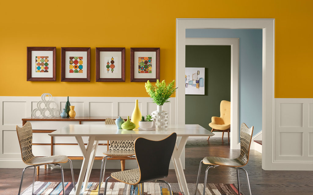
Sherwin-Williams 2018 Colormix® palette Unity
How to apply universal design principals
While considering the space and abilities that need to be accounted for in projects, consider these recommendations that apply the principles of universal design.
Multiple entrances: Have at least one entrance without steps to allow people of all ages and abilities to enter the space.
Several versions: Consider versions of everyday objects that are more versatile such as an adjustable handheld showerhead, which allows for flexibility for people of all ages and sizes.
Sensible heights: Use rocker light switches placed at a sensible height for easy access.
Contrasting colors: Contrast wall color so aging eyes can see fixtures more clearly.
Safeguards: Use a slip-resistant topcoat as an additive on concrete in garages and on front steps.
Reachable items: Keep cabinets, shelves or appliances within reach of people with disabilities.
Open floor plan: Utilize an open floor plan with 36-inch wide doorways and hallways to allow for easy use, even for those in wheelchairs.
The role of color, sheen and light on aging eyes
Effective use of color can play a significant role in universal design. The lens of the human eye becomes progressively more yellow over time, and by age 70, many people see the world through a lens roughly the color of ginger ale[1]. This filtering effect makes it easier to see yellows, oranges and reds, and harder to distinguish between blues and purples. Colors may also look faded and washed out.
When specifying colors, make sure there is contrast between furniture, fixtures, floorcoverings and other items that need to stand out in order to safely navigate the space. An all-white bathroom may feel bright and clean, but the monochromatic color scheme is hard on people with cataracts or glaucoma. A contrasting wall color is best for highlighting fixtures and aids in depth perception to help them get around in the room.
In general, consider clean and bright colors at the warm end of the spectrum, such as yellows, oranges and reds, balanced with pops of cool colors — such as an office with orange walls accented by blue lamps to make them stand out.
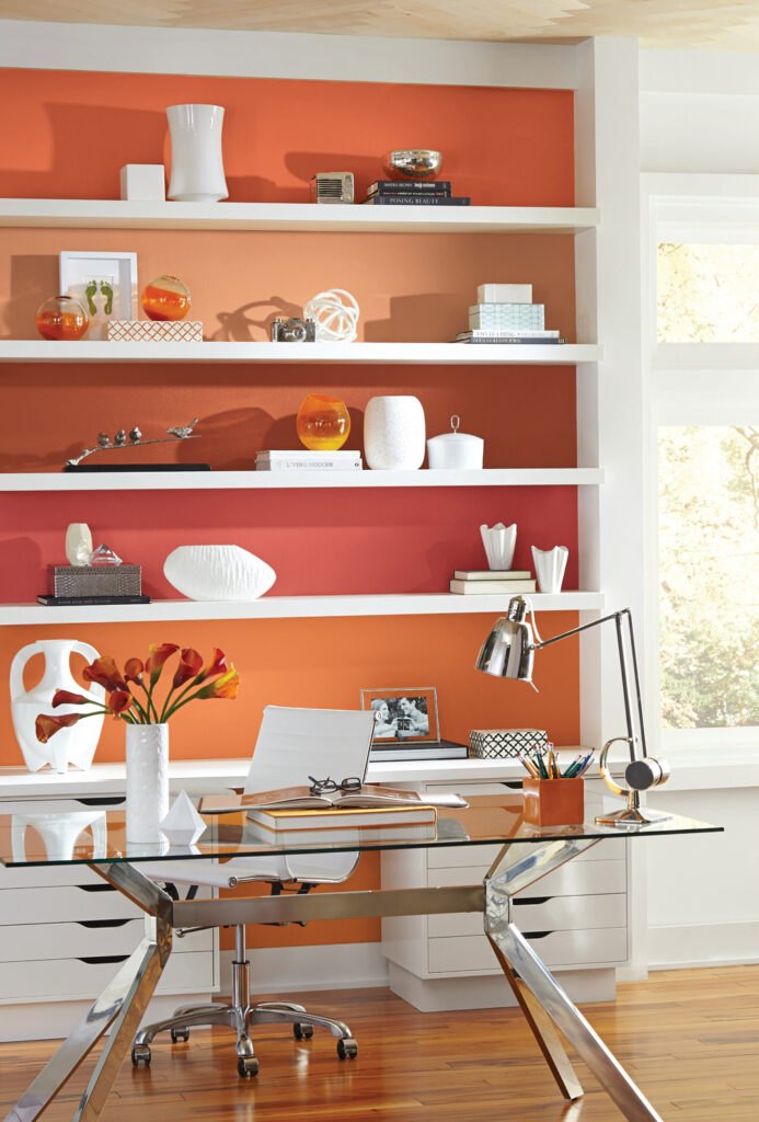
Sherwin-Williams’ Serape SW 6656
When selecting paints, also consider the effect of gloss and sheen on aging eyes, as older people are sensitive to glare from light and other reflective surfaces. A higher sheen can further distort colors, but specifying low-reflective options can minimize this effect. Flat/matte and satin/eggshell paints are the best choices.
Finally, using lighting as a design element is important, as seniors need lighting of all kinds. Include a mix of lighting for different activities: ambient lighting for moving about the house, task lighting for reading recipes or prescription bottles, and natural light to help distinguish colors. All of these options can enhance a space’s look while making it easy to navigate.
By incorporating universal design principles into their plans, professionals can create environments that are more accessible, usable and safe, not only for older people, but for all generations. And while aging eyes see color sheen and light differently, certain colors schemes and finishes can improve functionality in subtle and stylish ways.
[1] According to a 2014 study conducted by elder vision expert, Marilyn Schneck, Ph.D., a scientist at the Smith-Kettlewell Eye Research Institute in San Francisco. The results were published in the March 2014 issue of Optometry and Visual Science, the journal of the American Academy of Optometry.
About the author
Sue Wadden
Director of color marketing at Sherwin-Williams

Sue Wadden is Sherwin-Williams’ director of color marketing for The Paint Stores Group. As the expert on color for Sherwin-Williams, she is responsible for the company’s overall philosophy of color leadership, plays a key role in leading world color trend forecasting, oversees the ColorSnap® color selection system, research and development of all palettes, the Colormix®Color Forecast and Color of the Year, advises Sherwin-Williams STIR® magazine, and engages with media on all topics related to color and design.
Wadden began her career at Sherwin Williams in 1998 as an interior designer and color marketing specialist. She then became a senior color marketing designer for the company, prior to being named color marketing and design manager for Sherwin-Williams Diversified Brands Group, which includes Krylon, Dutch Boy, Pratt & Lambert and HGTV HOME™ by Sherwin-Williams at Lowe’s.
Wadden holds a Bachelor of Arts degree in interior design from the Cleveland Institute of Art. She is active in the Color Marketing Group, the Color Association of the United States, the American Society of Interior Design and the Interior Design Society.

