
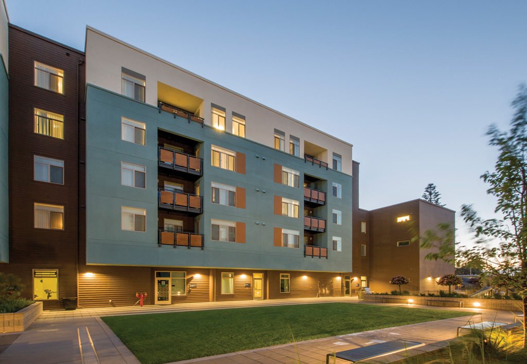
We know the bulk of the people moving into multi-family housing spaces are Millennials and Boomers. Each group values different amenities, color schemes and design styles, but both agree that an experience similar to a hotel is what they want. A beautiful lobby, a concierge, high-end finishes and appliances, and a plethora of amenities are key. They are also committed to sustainability and expect it as part of their residential choices. Whether it be community gardens, recycling programs, Energy Star appliances, programmable thermostats or sustainably-sourced building materials, both groups are cognizant of their impact on the environment and it influences their spending choices.
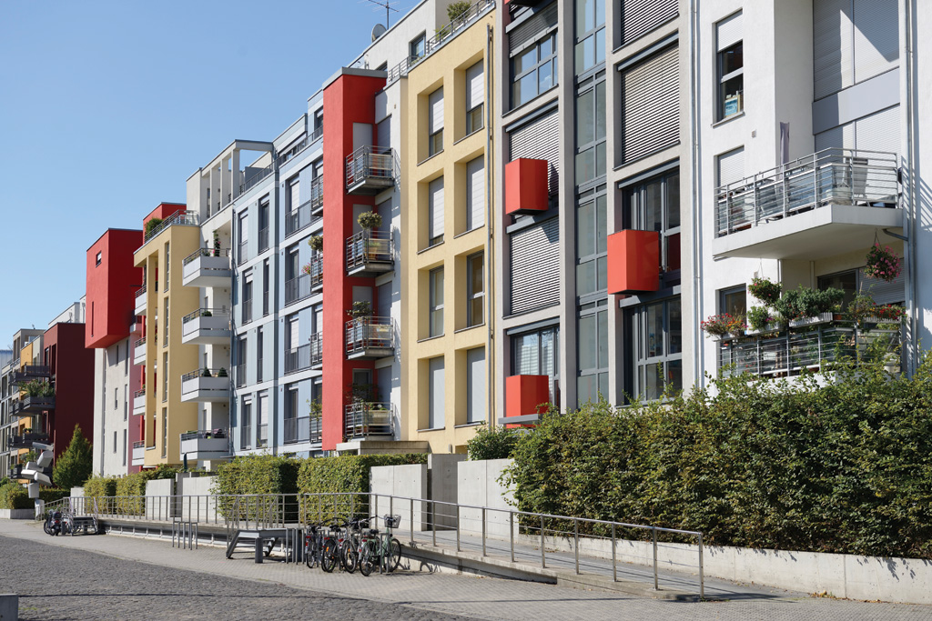
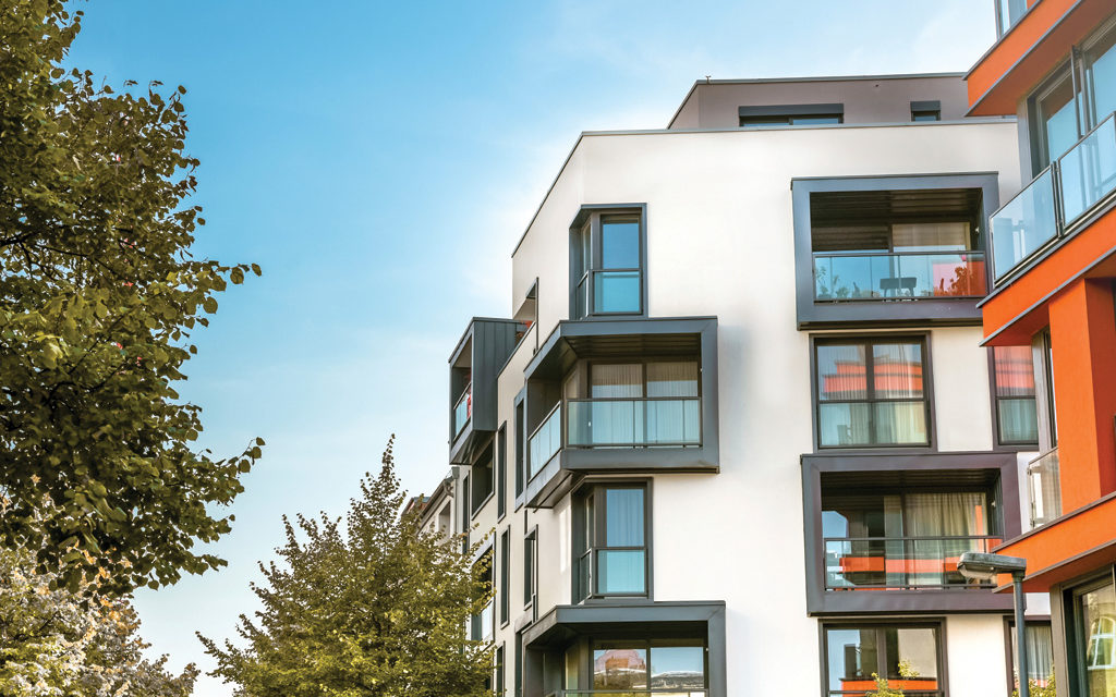
Collectively, Millennials are lifestyle-savvy and seek to find not only a home, but also an experience that will reflect their personality. Color and eccentric architecture add personality and life to a community and can be attractive to those looking to live in multi-family developments. In reality, who wants to live in a building just like all the rest?
Another reason that people move into multi-family housing is the longing for a sense of community. Living with like-minded individuals, finding support or participating in group activities is a draw for moving into a multi-family development.
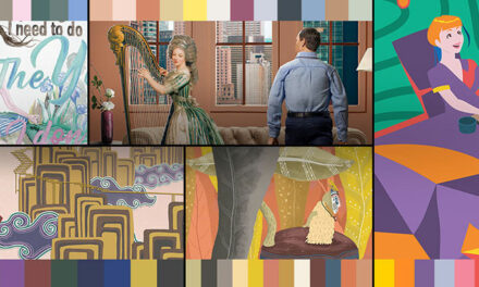
To understand how to make conducive design decisions and color choices in multi-family spaces relevant for both Millennials and Boomers, PPG developed a special color trends report for designers and architects to reference for their upcoming projects. PPG’s 2019 multi-family color trends forecast brings this housing shift to the surface and explores how it influences consumers’ attitudes toward their present and future living accommodations. Ultimately, multi-family design can further engage different types of consumers through PPG’s four “We are” color trends stories:
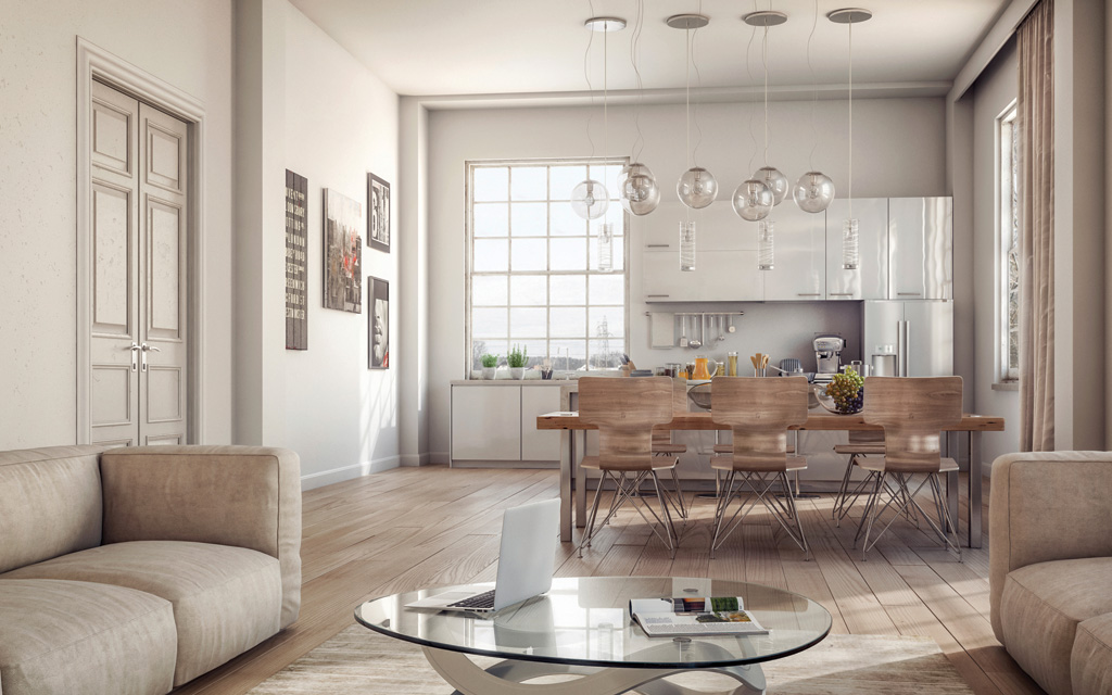
With Class: For architecture in this theme, multi-family urban residences blend upscale elegance with the latest in urban modern condominium designs. These multi-family residences use gold- and pewter-like metal finishes against neutral brick, stucco or slat-work to define a new modern-inspired style. The “With Class” color family is a modernized interpretation of an ivy-league library, where marble, oak woodwork, velvet and leather are the focal materials that pair with balusters, moldings, tufting, blackout curtains and nail studs. Creamy whites, such as PPG paint brand’s Magnolia Blossom, rich granite-like tones and coppery-cognac browns, such as PPG paint brand’s Dark Granite and Muted Copper, are the backdrop for gem-tones in varying degrees of saturation. The PPG 2019 Color of the Year, Night Watch, acts as a contemporary twist on the classic mallard green often found in libraries and lounges. Boomers tend to favor the With Class color palette, as they will want to mimic affluent styling and familiar, rich tones.
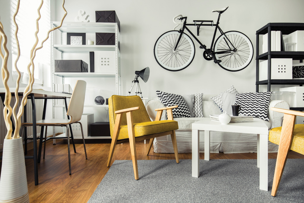
With It: As we are seeing in exterior residential architecture, including multi-family, neutrals within the “With It” palette are the most dominant, such as PPG paint brand’s Pacific Pearl and Synchronicity. This leaves bold color to be expressed through interior paint and furnishings or outdoor accent items. The “With It” theme reflects the optimistic drive, collective nature and diversity of today’s young adults. However, it is important to note that this theme is not defined by a certain age, but rather a collective youthful spirit. Playful, happy colors, such as PPG paint brand’s Mystic Blue and Burnt Red, are used to energize smaller spaces or to update an older building with bold designs.
With Out: This theme focuses on the rise of simplistic, modern design throughout existing older structures within a neighborhood. Habitants of these spaces prefer the “less is more” approach in architecture and color choices, while bringing a healthy amount of foliage, trees and native landscaping to the environment. Frank Lloyd Wright’s legendary project, Falling Water, provides the ideal inspiration. This theme encourages a “design reduction” approach of less ornamentation, less drama, fewer materials – often putting only a single color in focus. The “With Out” color collection boasts an abundance of nature-inspired greens, such as PPG paint brand’s Pine Forest and Antique Slate, as well as organic colors like Cocoa Delight and Cool Concrete.
With Spirit: Residential multi-family architecture in the “With Spirit” theme focuses on the home that emphasizes a strong connection to nature and the surrounding atmosphere. Homes in this space are built in styles that will complement the region, and merge or entangle with the immediate natural landscape. Consumers drawn to the “With Spirit” palette prefer spaces that allow for pure escapism. Multi-family housing that offers working spaces and yoga classes, as well as plenty of quiet and cozy gathering areas are on the up-rise. Earthen clay and wood tones, such as PPG paint brand’s Fire Weed and Nutmeg, provide a grounded feeling that helps tenants connect to their environment. Tinted blacks such as PPG paint brand’s Blackhearth help create a sense of quiet, introspective reflection. This color collection appeals to the spiritual consumer who seeks to infuse their interest in meditation, zen-living, mindfulness and interest in the cosmos into their environment. Intense hues like PPG paint brand’s Imperial Purple, a bluish purple, evoke spiritual overtones, and pair well with colors like Wild Lilac that serve as softer, romantic accents.
To learn more about the PPG brand’s 2019 color trends, or to connect with a color consultant to explore how color can transform multi-family spaces, visit www.PPGVoiceofColor.com.
About the author
 Dee Schlotter
PPG senior color marketing manager, architectural coatings
Dee has worked for PPG for more than 25 years and manages the development of color platforms, systems and tools for brands such as PPG PAINTS™ and GLIDDEN® paints. She conducts national presentations to architects, designers, and consumers in the hotel, retail, new home construction and residential markets. She is a member of the PPG Global Color Styling Team that researches and forecasts colors for the architectural, automotive, aerospace, industrial and consumer products markets. Dee is a member of ASID, IIDA and NKBA.
PPG’s architectural coatings business in the U.S. and Canada is an industry leader in residential and commercial coatings, delivering the latest technologies and operational advancements through its strong portfolio of brands. It manufactures and sells interior and exterior paints, stains, caulks, repair products, adhesives and sealants for homeowners and professionals. Its distribution network includes more than 15,000 touchpoints through company-owned stores, independent dealer locations and all major home improvement centers across the U.S. and Canada. Visit ppg.com/ac for more information.
