
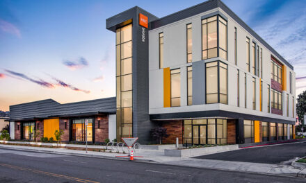
People rely on sight more than any other sense to take in information. The modern world makes it easier and more important than ever to share visual information. Color affects the interpretation of this visual information – both in terms of comprehending and remembering its meaning, and in relating and reacting to it. The color choice for a building’s exterior not only affects the people who work, shop, learn, heal and live inside it, but also those in neighboring buildings and even those passing by it.
The color choice for a building’s exterior may be determined, in part, by community standards, regional preferences, historic requirements or brand identities. The right color is largely an aesthetic, and often subjective, decision. Specifying, producing and applying a finish to match the chosen color combines performance-driven, technical expertise and artistically minded creativity.

Imagine trying to match, or even describe, an exact color without an image or sample to illustrate it. In the late 1700s, before photos were common, ”Werner’s Nomenclature of Colours“ offered a standardized written description for classifying colors as devised by German mineralogist Abraham Werner. In the 1800s, Scottish painter Patrick Syme adapted Werner’s system, adding painted swatches and examples of where to find the colors in the natural world. For example, Werner’s “Pearl Grey” referenced the “backs of black headed and Kittiwake gulls,” the “back of petals of purple Hepatica,” and “porcelain Jasper.”
 The average person can see 10 million colors. Tetrachromacy is a condition that allows some people to see up to 100 million colors. Predicting which colors people will want to see, and will cause them to react favorably, is a valued business. Each year, color forecasts are presented by design-forward industry leaders in fashion, automotive, home décor, consumer packaging and architectural coatings.
Born from selecting ink for printed material, The Pantone Color Institute is a trend forecasting and color consultancy serving many industries. Pantone announced its Color of the Year 2018 as Ultra Violet, “a complex, celestial shade of purple, veering toward the cooler end of the color spectrum, that calls to mind the vastness of the galaxy, the power of spirituality, and creative expression in all its forms.”
Sherwin-Williams’ choice for its 2018 Color of the Year was Oceanside, “a complex, deep color that offers a sense of the familiar with a hint of the unknown, Oceanside, bridges together a harmonious balance of blues and greens that can be found in what’s old and new.”
The Color Marketing Group (CMG), an international association that identifies the direction of color trends, promotes the slogan, “Color sells, and the right color sells better.” Beyond fashion and interiors, CMG’s predictions are closely monitored for exterior color trends.
Unlike Werner and Syme in earlier centuries, defining today’s colors and future trends can be more easily shown than described. CMG noted four color trends for 2018:
- Vapor – Subtle metallic and mica sparkle have become the new neutrals inspired by Europe. From silver to graphite to blue-tones, these standout hues are more matte metallic and offer refined sparkle. The color implications of this trend are derived from earth minerals. These subdued colors lend a feeling of permanence and trust, and when combined with the shimmer and shine of metal, create the unmistakable look of luxury.
- Evolve – Grays are viewed as sophisticated, conservative and intelligent with a North American heritage. Standing at 50 percent black, it feels extremely balanced and is a strong color for design schemes. It creates a subtle effect when paired against deep shades, toning them down. Combining gray with lighter shades adds just the right touch of sophistication.
- Re-Value – Influenced by Latin America, this crisp, clean palette embraces a healthy green with blue roots. CMG noted these as welcoming, nurturing color tones that celebrate a love of the planet and a love of life. The color implications for architectural coatings are rich tones and healing colors like “Newborn’s Eyes” and “Prussian Blue.” These shades evoke a feeling of recharging and renewal.
- Enjoy Life – Completing the color trends’ palettes, these energizing and cheerful tones symbolize the positivity of sunlight and the climate of Asia Pacific. The pure, fresh hues include “Marigold” and “Golden Bounty” as bold, expressive colors that represent newness and light.
Similar shades can be seen in the Pantone Fashion Color Trend Report Fall/Winter 2018. Its Top 10 color palette showcases bold, “autumnal hues that evoke the feeling of leaves on the forest floor, rich plumage and twilight reveal a modern fall palette of deep and rich tones with outbursts of colorful surprise.”
Looking ahead, Sherwin-Williams 2019 Colormix Color Forecast shared six emerging color trends named for the personas they might represent:
- Shapeshifter – “The atmospheric wisps of color, grounded by deep, mysterious blues capture the unique space between technology and spirituality.”
- Wanderer – “Subtle earthy tones of the high plains. Clays, caramels and browns come from canyons to worn leather and woven wool blankets.”
- Aficionado – “This pedigreed palette evokes nostalgia and timeless traditions [in] copper and gold anchor merlot and gray.”
- Enthusiast – “Brings maximum attitude and yet produces harmonious results… features bold pops of vivid blue, green and red.”
- Naturalist – “Ranging from mushroom to passionate pink, the focus on botanicals is slightly classic, with bold details.”
- Raconteur – “Human origins have been translated into this rich palette that spans time… from rich red to muted mauve.”
In line with other forecast from the coatings industry, AkzoNobel announced a golden brown toned “Spiced Honey” as its 2019 Color of the Year. Similarly named, “Spice of Life” is Dunn-Edwards Color of the Year – a rich, dark brown color with fire brick red and orange undertones.
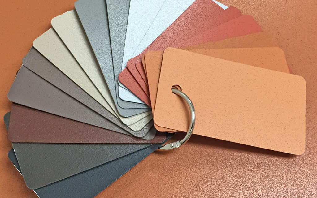
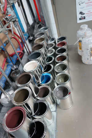
When color trends move from conceptual inspiration to practical application on exterior building products, it’s time to involve a qualified finishing service provider. When one of the 50,000 colors available still does not quite match, finishers with an in-house blending laboratory can scan samples to match anything from a piece of metal to a swatch of fabric, and then formulate the recipe of tints and bases to apply it.
Finishing service providers with computer-controlled mix and match color systems and quality assurance processes may be approved partners with high-performance paint manufacturers. These systems, processes and partnerships not only achieve a precisely verified color match, but do so with confidence that the color will be consistent and meet the paint specification for the project’s requirements – whether specifying Pearl Grey or the Color of the Year.
About the author
Tammy Schroeder, LEED® Green Associate; Linetec
Tammy Schroeder, LEED Green Associate, is a senior marketing specialist at Linetec, the nation’s largest independent architectural metals finishing company. With 18 years of experience in the finishing industry, she serves as an industry educator on high-quality, high-performance architectural coatings and services. These include liquid paint coatings, powder coat, anodize, thermal improvement and stretch forming for aluminum. She enjoys sharing her knowledge with architects, specifiers and architectural product manufacturers work in commercial and residential building markets. Schroeder can be reached via email at tammy.schroeder@linetec.com.
