As one of New Jersey’s largest, non-profit health systems, Virtua Health provides comprehensive healthcare services to achieve its mission of helping people be well, get well, and stay well. Virtua Health provides services through Virtua Medical Group, comprised of 500 physicians and clinicians that work in the group’s urgent care centers, hospitals, ambulatory surgery centers, health and wellness centers, fitness centers, health services, long-term care and rehabilitation centers, and a paramedic program.
With a goal to further its mission to be well, get well and stay well, Virtua Health turned to Francis Cauffman Architects (FCA) to rezone and repurpose a former ACME supermarket that sits adjacent to its Health and Wellness Center in Moorestown, New Jersey into a cancer care center. The new facility accommodates radiation oncology, an infusion treatment suite, a cancer administrative suite, and a third-party infusion practice.
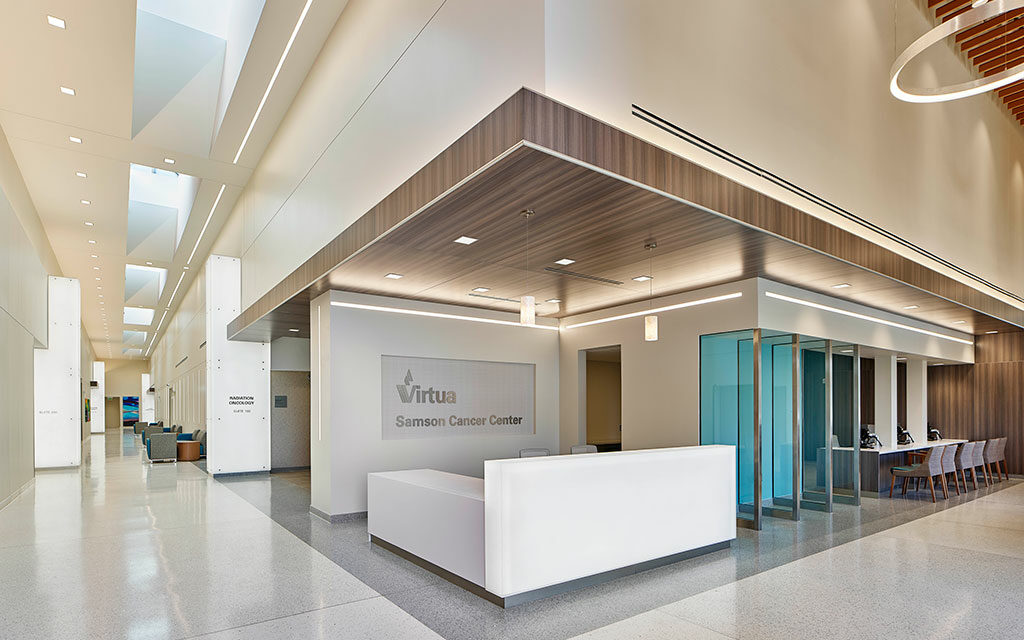
The facility was designed to promote a sense of hope, serenity, and healing, with comforting and welcoming features such as high ceilings, windows that let in natural light and vibrant artwork depicting nature. A new garden is also visible from the infusion patient treatment spaces for another connection to the outdoors.
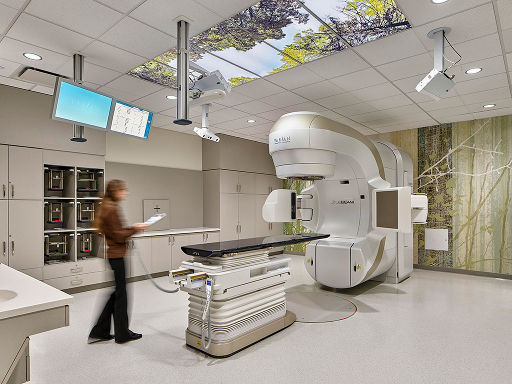
Photo credit: Jeffrey Totaro
Adaptive reuse and speed to market
Virtua Health selected a former supermarket for the location of the Virtua Samson Cancer Center, tasking FCA with repurposing and revitalizing the space, transforming it into an inspiring, patient-first facility. Sitting directly across from Virtua’s Health and Wellness Center, the 66,000-square-foot space was reimagined to promote a sense of hope, serenity, and healing, with high ceilings, windows that let in natural light, and vibrant artwork featuring scenes found in nature. Skylights are used in the central circulation concourse that each destination entrance is located off of. The design team strategically placed treatment rooms depending on those patients that are sensitive to natural light versus those that aren’t impacted by natural light.
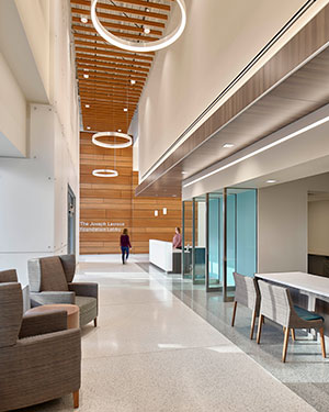
Photo credit: Jeffrey Totaro
The building’s previous structure had very high ceilings, prompting a challenge for smaller rooms that require acoustical privacy. A substructure was implemented to allow the ceiling and lighting to be suspended from it, minimizing the need to construct full-height walls to the full height of the structure.
Continued leadership in health and wellbeing
The Virtua Samson Cancer Center reflects FCA’s commitment to health and wellbeing. Understanding that cancer patients’ needs and perceptions require a unique design sensitivity that differs from healthy patients, FCA took to the building’s exterior to portray a symbol of hope for patients and visitors alike. The “White Box” is a stand-in for the occurrence of cancer in a patient’s life, since the event of cancer is not a normal, everyday event. The “White Box” too is not an everyday, straightforward entry point. The monumental entry is dressed in semi-opaque white panels that collectively create one, uniform object that can be seen from the street. The front elevation is at odds with both the roadway and sidewalk, jutting out at the left edge, instead of being parallel. The front elevation is also imbalanced and off center, with three vertical columns that hold up a misaligned upper mass.
All visitors and staff pass through the “White Box” and engage with the structure each time they arrive and leave the facility. The design intent is to allude to the event of cancer without overwhelming visitors, as the hope is that each appointment and transition through the “White Box” will be positive. As such, the “White Box” alludes to the imbalance of a cancer diagnosis, but is bright, uncluttered, and refined in its presentation and detailing.
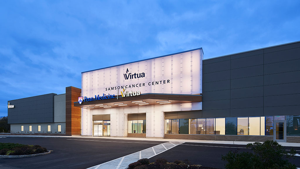
Photo credit: Jeffrey Totaro
Friendly wayfinding
The Virtua Samson Cancer Center was designed with wayfinding in mind. Wayfinding elements in healthcare that go beyond functional necessity serve as opportunities to both differentiate the facility and, make a brand statement. Additionally, an effective wayfinding system boosts trust, loyalty, and satisfaction with patients.
The Main Gallery can be seen from the exterior by way of a full-height glass opening, allowing visitors to find their bearings both within the building and outside the complex as well. The glass opening serves as a visual connection between the exterior and public thoroughfare on the interior and bathes the circulation path with natural light throughout the day. Skylights above the Main Gallery also provide diffused, controlled light to ease the deep distance as it penetrates into the center of the building footprint.
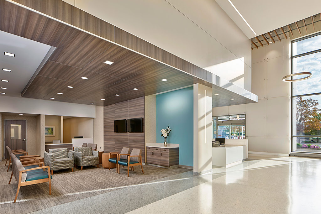
Photo credit: Jeffrey Totaro
The Main Gallery was designed to prioritize access to natural light, improving the patient experience during visits and providing clarity of the interior’s circulation. The tall ceilings of the Main Gallery transition to more intimate seating and lounge waiting areas directly, where a lower ceiling height provides a sense of being embraced and taken care of while waiting.
The Trespa clad canopy provides visitors with a cue to indicate the main entry point. The Trespa panel system is applied on the left of the glass opening to bookend the edge of the glass opening. Since Trespa is a part of the Virtua Health material palette and visual brand, the two elements are organized and situated as stand-ins for the health system itself. The canopy and column can be seen as a pair of hands, providing cover horizontally and shielding from the sun’s glare vertically.

