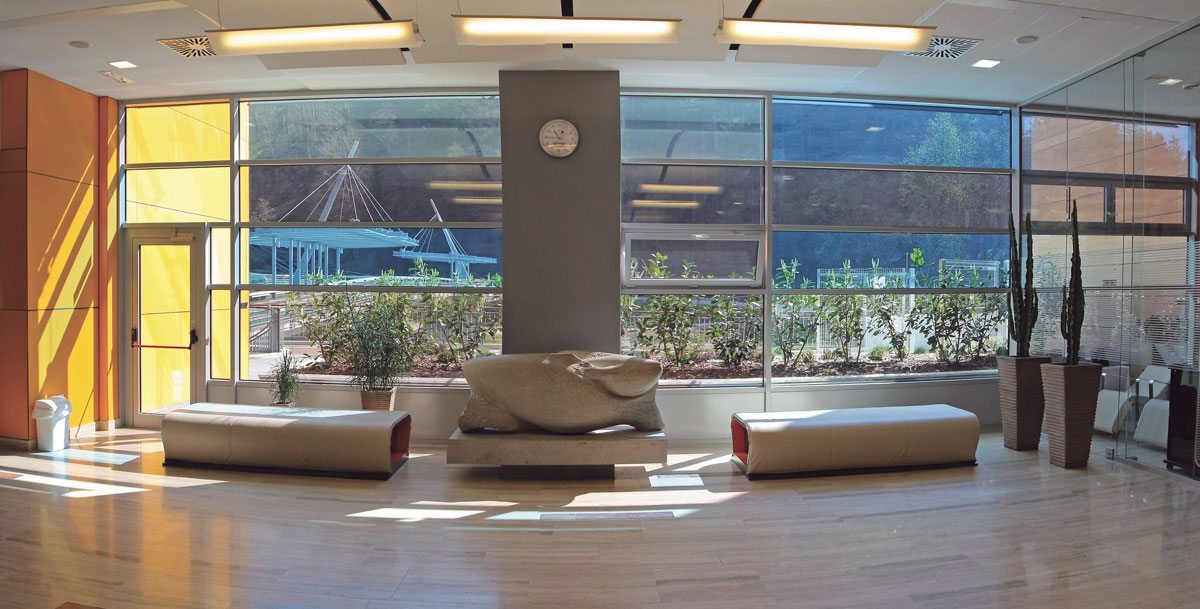
Similar to the design of residential, hospitality or commercial spaces, color is a powerful tool to utilize in healthcare design, and it even has the power to enhance well-being. Understanding the impact that color has on healthcare spaces, PPG develops a specific healthcare color trends report each year for designers and architects to reference for upcoming projects. Our approach to the color selection in the upcoming trends report combines color science with psychology, sociology and human physiology, as well as current general consumer trends and trends in health and wellness to best develop color palettes that will work to symbolize physical and emotional transformation.
For the 2017 healthcare color trends report, PPG took into account that health and wellness services will become more personalized to patients. As this trend and the industry continues to grow, it is important to push the design and color boundaries in the healthcare space even further in 2017. To understand how to accomplish this and make conducive design decisions in healthcare spaces relevant to today’s health and wellness consumers and healthcare patients, PPG defied traditional boundaries and studied successful shifts in architectural and interior design in other landscapes, such as offices, cultural centers, retail spaces and hotels. The more choices available and the more engaged in wellness and aging consumers will become, the more they are going to look for their health providers to offer more than exams, surgeries and prescriptions, but rather integrate themselves seamlessly into their complete wellness lifecycle and also their community.
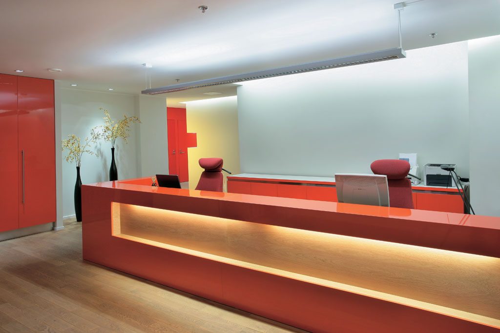
Understanding the impact that color has on healthcare spaces, PPG develops a specific healthcare color trends report each year. Credit: PPG PAINTS™
We are now beginning to see that as consumers are being offered more choices and customized options, they will seek out places to work, shop, study, live and even receive medical care that fit into their unique lifestyle. For healthcare specifically, consumers will become more invested in their wellness, and thus, in turn will look to their health providers to offer more than exams, surgeries and prescriptions. A great example of this is the Oscar Center in New York City, which offers medical care in addition to a community wellness center. In the future, it is anticipated that it will no longer be enough for a hospital or clinic to have excellent medical practitioners on staff. Healthcare providers are choosing to integrate themselves into their patients’ complete wellness life-cycle and become a member of their communities. Healthcare design must reflect this.
PPG’s 2017 healthcare color trends forecast brings this consumer shift to life and explores how it impacts consumers’ attitudes toward their own health and wellness, and ultimately, how healthcare design can further engage different types of consumers through PPG’s four color trends stories:
PPG defied traditional boundaries and studied successful shifts in architectural and interior design in other landscapes, such as offices, cultural centers, retail spaces and hotels. Credit: PPG PAINTS™
Hourglass
In today’s society where information, success and fame can be as instantaneous as an online post (and as fleeting), there is a desire for great minds and excellence. In the wellness space, this equates to premium health care for the discerning customer. The Hourglass trends story addresses this by borrowing architectural elements, colors and materials from academia and also incorporating a nod to historical references. Dark royal such as PPG PAINTS™ Old Mill Blue, rich reds like PPG Paints Burgundy Wine, golden yellows and mallard greens represent prestigious universities and scholastic excellence in this color palette. Hourglass draws on roots from the past and updates them for a more contemporary spirit. A healthy dose of neutral colors are blended into the palette, creating a balance of inspirational accent colors and colors that can be easily incorporated into a space.
Es/sense
The Es/sense color story highlights purity and simplicity in design, representative of a growing niche of holistically-minded health and wellness consumers. Removing distractions is essential to the healing process, an extremely important component to the healthcare industry. The mix of water-like blues, such as PPG Paints Sea Mist, and green hues with varied degrees of blended orange, yellows and pinks, such as PPG Paints Ancestral, creates a calming and refreshing mentality while inciting emotions of love, happiness, and encouragement – something that all healthcare patients need. The majority of the palette are soft colors, evoking subtle and suggestive feelings, a few more vibrant hues add a shot of energy.
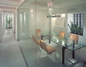
PPG’s approach to the color selection in the upcoming trends report combines color science with psychology, sociology and human physiology, as well as current general consumer trends and trends in health and wellness. Credit: PPG PAINTS™
ImPower
ImPower redefines healthcare design for the unconventional patient who does not define themselves in strict, traditional standards with regard to age or gender. The contrast of dark and light colors in the ImPower palette, as well as the varied spectrum in between, reflects society’s desire to embrace change and the new identities that come with change. Bright, energetic tones like PPG Paints Azure Tide and Red Licorice sit next to subtle midtones while classic reds and blues bump up against mixed blue-greens and green-yellows. ImPower is not about defining yourself by any specific idea or choosing polarities, even in color. Instead, it embraces the idea that we can exist in between.
BioCentric
Despite our increasingly connected and digital world, there is still a strong draw and connection to nature, particularly in healthcare because of nature’s restorative and healing powers. This connection to nature is something that many patients crave when being treated at healthcare facilities. The BioCentric color trends story embraces healthcare that begins with our fundamental origins and addresses how natural elements in architecture and interior design can improve our sense of well-being, reduce stress and benefit our overall health. Earthy, organic hues like PPG Paints Enchanting Eggplant and Spinach Salad, are paired with cosmic blacks, grays and purples, including the PPG Paints 2017 Color of the Year, Violet Verbena.
While all four of the color trends stories reflect various attitudes toward health, wellness and healthcare environments, Violet Verbena transcends these themes, and its calming, restorative powers make it ideal for healthcare environments. Overall, the color’s chameleon-like characteristic ties perfectly to attitudes regarding health and wellness in 2017. To learn more about Violet Verbena and the PPG Paints 2017 healthcare color trends report, or to connect with a color consultant to explore how color can transform healthcare, retail, hotels and homes in 2017, visit www.PPGVoiceofColor.com.
About the author

Dee Schlotter
Dee Schlotter
Sr. Color Marketing Manager, PPG Architectural Coatings, United States
Dee has been at PPG for 25 years and manages the development of color platforms, systems and tools for brands such as PPG PAINTS™, OLYMPIC® Paints and GLIDDEN® Paints. She conducts dozens of national presentations to architects, designers, and consumers in the hotel, retail, new home construction and residential markets. She is a member of the PPG Global Color Styling Team that researches and forecasts colors for the architectural, automotive, aerospace, industrial and consumer products markets. Dee is a member of ASID, IIDA, and NKBA.

