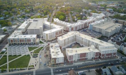
Former Newspaper Site Exhibits Latest Patient-Centric Design
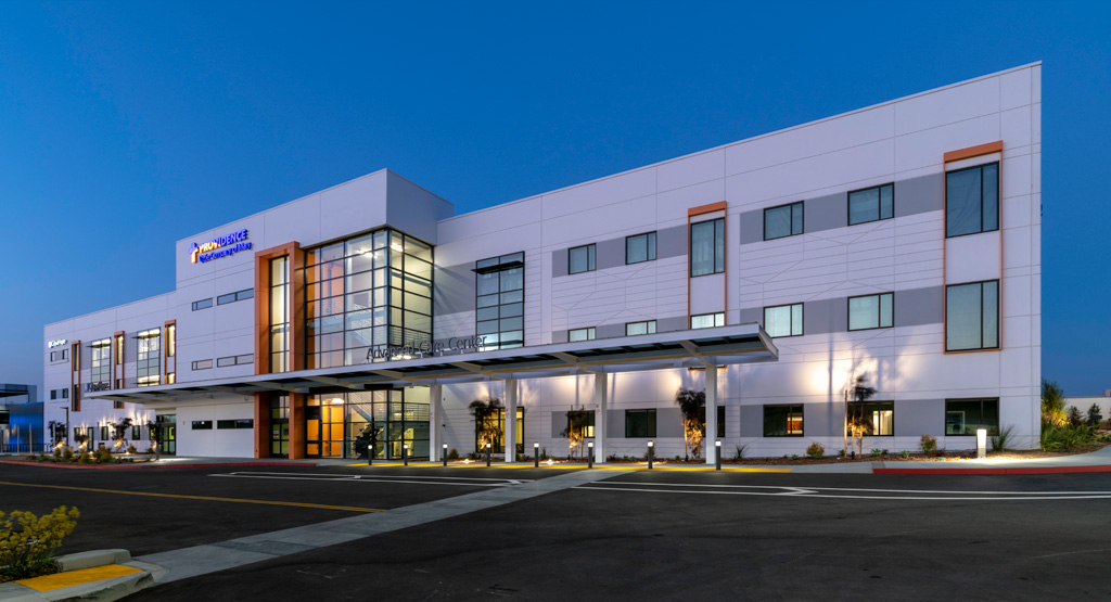
Cuningham Group Architecture, the international design leader now celebrating its 50th anniversary, has unveiled designs for the Providence Breeze Advanced Care Center. The medical facility recently opened in Torrance, California – on the site of the former Daily Breeze newspaper facility – with the City of Hope Cancer Center. Additional tenants will join the facility in 2019, all exhibiting advanced approaches to patient-centric care.
Owned by Providence Health Services, the three-story, 106,000-square-foot (not including parking) Care Center will house a Women’s Center, Imaging Center, Ambulatory Surgery Center, Clinics, Medical and Surgical Oncology, Infusion Center and 2 Linear Accelerators. Cuningham Group is the executive architect and designer of tenant improvements, including all the interior medical facilities. CallisonRTKL is architect of record for the exterior core shell.
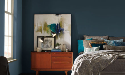
“We worked closely with Providence and its end users – the patients, staff and visitors – to make the patient/provider experience as ‘homey’ as possible,” said Cuningham Group Senior Project Manager Amine Khemakhem. “The center extends our approach to medical design, making it more like a comfortable home or hotel, reducing an ‘institutional’ feeling as much as possible.”
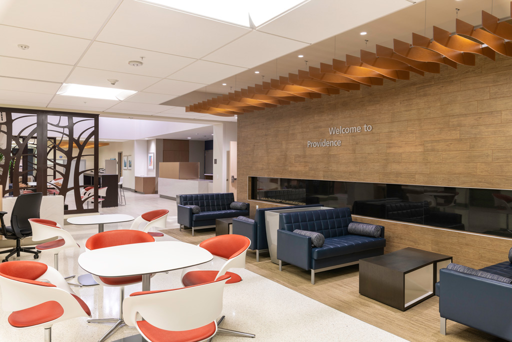
Photo by ©Derek Rath
The state-of-the-art facilities emphasize the latest understandings of healthful design, said Project Architect Julian Barajas.
“Too often, healthcare facilities are high-stress areas,” said Khemakhem. “Approximately 10% of a patient’s time is actual medical care. The rest includes arrival, drop-off, check-in, waiting, and other activities. We aim to influence that 90%, carefully programming it to make it as comfortable as possible.”
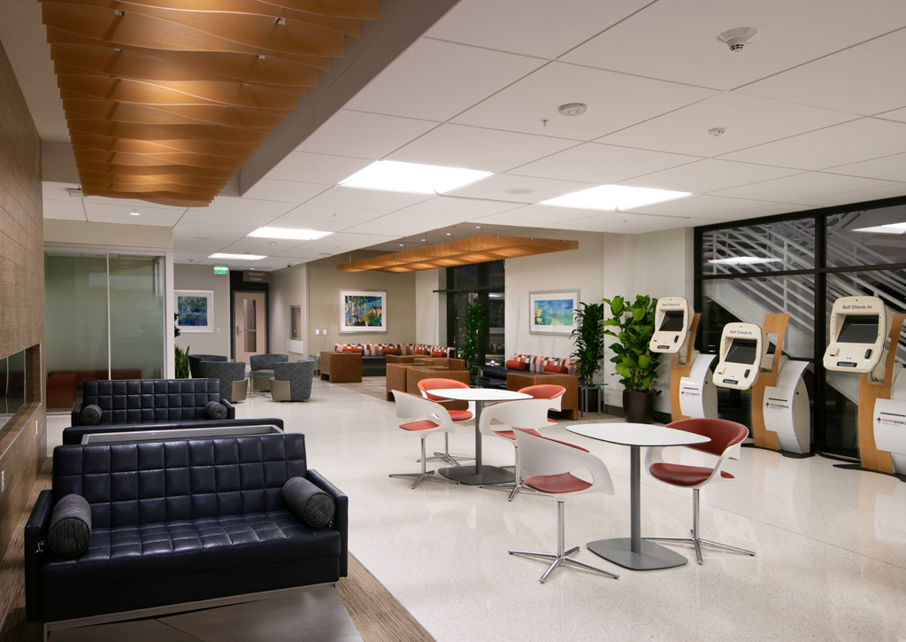
Reception area with concierge service and kiosks. Photo by ©Derek Rath
Design Highlights
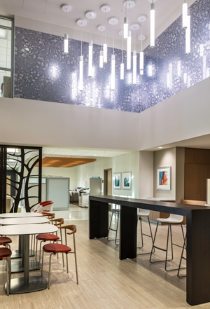
Photo by ©Derek Rath
Patient Centric: Core common areas and entries are created for the public or patients. Staff will arrive though other entries.
Concierge Service: Rather than a traditional registration desk, the center offers a concierge desk – as in a hotel – with a person at a table or where guests can register on a kiosk. The front areas include a coffee shop.
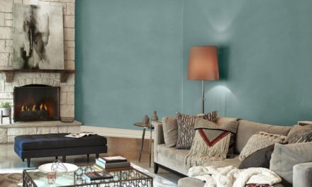
Living Room Seating: Waiting areas are broken up into separate clusters. This creates a home-like, living-room feeling. Even the more clinical spaces emphasize warm, natural materials, with spaces that feel less like a hospital and more like hospitality design.
Spa-Like: The Women’s Center component offers a resort-style approach, with a softer ambience and warm materials to diffuse the stress sometimes associated with mammograms and other treatments. Organic patterned screens in the waiting room hearken to biophilic design. Symbolic images of nature to help to reduce stress. Purple accent walls provide an updated spa feel, and the fireplace is a nice touch to help ground a person.
This more home-like design – not harsh or sterile – extends to the entire complex.

